TECHNICAL ASSET FINGERPRINT
20c027af0291978d4833ddb7
Click to view fullscreen
Press ESC or click to close
FOUND IN PAPERS
EXPERT: healer-alpha-free VERSION 1
RUNTIME: free/openrouter/healer-alpha
INTEL_VERIFIED
\n
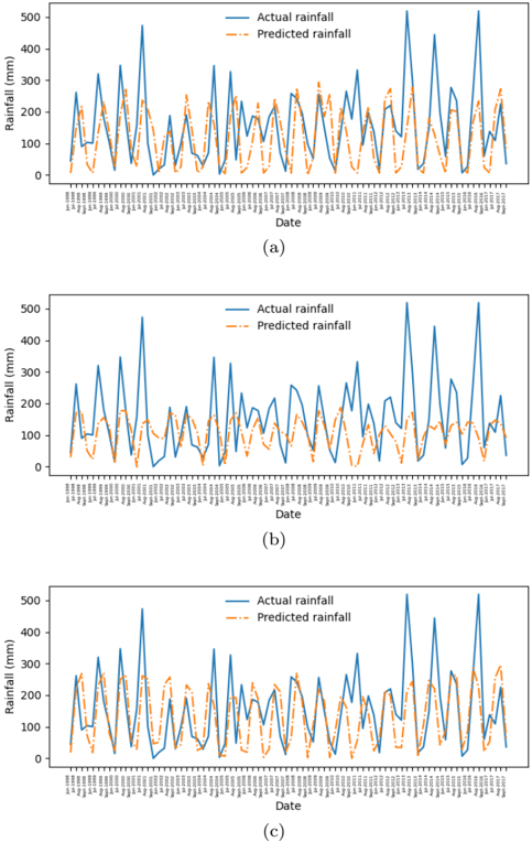
## Time Series Line Charts: Actual vs. Predicted Rainfall
### Overview
The image contains three vertically stacked line charts, labeled (a), (b), and (c). Each chart plots two time series of daily rainfall data over the same date range. The charts compare "Actual rainfall" (observed data) against "Predicted rainfall" (model output). The primary purpose is to visually assess the performance of a rainfall prediction model across three different scenarios or model configurations.
### Components/Axes
* **Chart Type:** Multi-line time series plot.
* **Subplots:** Three distinct charts arranged vertically, labeled (a), (b), and (c) centered below each respective plot.
* **X-Axis (All Charts):**
* **Label:** "Date"
* **Scale:** Categorical/Date scale. The axis is densely populated with date labels in `dd/mm/yyyy` format.
* **Range:** The visible date range starts approximately `01/01/2017` and ends around `31/12/2017` (a full year). The labels are rotated vertically for readability.
* **Y-Axis (All Charts):**
* **Label:** "Rainfall (mm)"
* **Scale:** Linear numerical scale.
* **Range:** 0 to 500 mm, with major tick marks at 0, 100, 200, 300, 400, and 500.
* **Legend (All Charts):**
* **Position:** Top-right corner within the plot area.
* **Items:**
1. **Actual rainfall:** Represented by a solid blue line.
2. **Predicted rainfall:** Represented by a dashed orange line.
### Detailed Analysis
**Chart (a):**
* **Trend Verification:** The blue "Actual" line exhibits high volatility with frequent, sharp peaks and troughs throughout the year. The orange "Predicted" line follows a similar volatile pattern, attempting to match the timing and magnitude of the actual peaks.
* **Data Points & Observations:**
* Both series show multiple significant rainfall events exceeding 300 mm.
* The highest peak for "Actual rainfall" occurs around mid-year, reaching approximately 500 mm. The corresponding "Predicted" peak is slightly lower, around 450 mm.
* The model captures the general seasonal pattern but shows frequent over- and under-predictions. For instance, several predicted peaks are lower than actual peaks, and some predicted troughs are higher than actual troughs.
* The lines are often close but rarely overlap perfectly, indicating point-by-point prediction error.
**Chart (b):**
* **Trend Verification:** The blue "Actual" line is identical to that in chart (a), showing the same high-volatility pattern. The orange "Predicted" line, however, is markedly different. It is much smoother and has a significantly reduced amplitude compared to the actual data.
* **Data Points & Observations:**
* The "Predicted" line rarely exceeds 200 mm, while the "Actual" line frequently surpasses 300 mm and 400 mm.
* The model in this scenario fails to capture the extreme rainfall events. It predicts a dampened, smoothed version of the rainfall pattern.
* The timing of predicted rises and falls is generally aligned with the actual data, but the magnitude is consistently and severely underestimated during peak events.
* This suggests a model that is either overly regularized or trained in a way that causes it to predict the mean or a smoothed trend rather than the volatile extremes.
**Chart (c):**
* **Trend Verification:** Again, the blue "Actual" line is the same as in (a) and (b). The orange "Predicted" line shows a pattern that is intermediate between the predictions in (a) and (b). It is more volatile than (b) but less perfectly aligned than (a).
* **Data Points & Observations:**
* The "Predicted" line captures more of the peak magnitude than in (b), with several predictions reaching between 200-300 mm.
* However, it still consistently under-predicts the highest actual peaks (those above ~350 mm).
* There are notable instances of phase shift or timing error, where a predicted peak occurs a day or two before or after the actual peak.
* The model appears better than the one in (b) at capturing variability but still lacks the precision seen in the best moments of (a).
### Key Observations
1. **Identical Ground Truth:** The "Actual rainfall" time series is identical across all three charts (a, b, c). This indicates the charts are comparing different prediction models or model runs against the same observed dataset.
2. **Model Performance Spectrum:** The three charts demonstrate a clear spectrum of model performance:
* **Chart (a):** Best alignment. The prediction tracks the actual data's volatility and peak magnitudes most closely, though with visible error.
* **Chart (b):** Poorest alignment for extremes. The prediction is a smoothed, low-amplitude version of reality, failing to capture significant rainfall events.
* **Chart (c):** Intermediate performance. Captures more variability than (b) but with less accuracy and more timing errors than (a).
3. **Common Model Limitation:** All three predicted series struggle to fully capture the most extreme rainfall events (peaks near or above 500 mm), often under-predicting their magnitude.
4. **Seasonal Pattern:** The actual data shows a seasonal pattern with clusters of high rainfall events, likely corresponding to a wet season, interspersed with drier periods.
### Interpretation
This set of charts is a classic visual diagnostic tool for evaluating time series forecasting models, specifically for a highly volatile environmental variable like rainfall.
* **What the Data Suggests:** The comparison reveals that the underlying prediction model is sensitive to its configuration, training data, or hyperparameters. The dramatic difference between the smooth prediction in (b) and the volatile ones in (a) and (c) suggests a key factor—such as the amount of training data, model complexity, or the inclusion of certain features—was varied between these experiments.
* **How Elements Relate:** The "Actual" line serves as the immutable ground truth. The "Predicted" lines are hypotheses generated by different models. The vertical alignment allows for direct, date-by-date comparison of model accuracy. The consistent y-axis scale enables comparison of error magnitude across models.
* **Notable Anomalies & Insights:**
* The **systematic under-prediction of extremes** across all models is a critical finding. For applications like flood forecasting, this is a dangerous failure mode. It suggests the models may be biased toward more common, moderate rainfall amounts and are not adequately learning the drivers of rare, extreme events.
* The **smoothing effect in chart (b)** is an anomaly worth investigating. It could indicate a model that has "overfit to the mean" or a prediction method (like a simple moving average) that is inappropriate for capturing the underlying process's true volatility.
* The **phase shifts in chart (c)** point to potential issues with the model's temporal sensitivity or lag in processing input features.
**Conclusion:** While the model in scenario (a) shows the most promise, none of the models perfectly replicate the observed rainfall. The visual analysis strongly argues for further model refinement, particularly focused on improving the prediction of high-magnitude, low-frequency events. The charts effectively communicate that choosing the right model configuration is crucial for this task.
DECODING INTELLIGENCE...