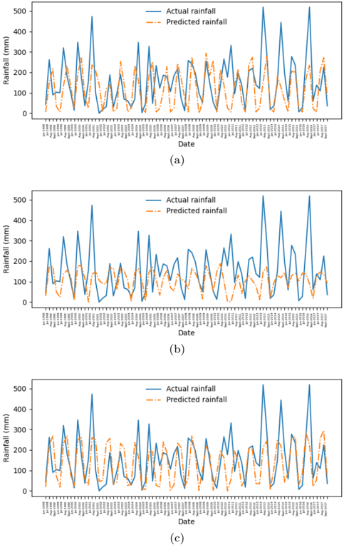
## Line Graphs: Rainfall Comparison (Actual vs. Predicted)
### Overview
Three vertically stacked line graphs (a, b, c) compare actual rainfall (blue solid line) and predicted rainfall (orange dashed line) over time. Each subplot spans a date range with irregular intervals, showing high variability in rainfall measurements.
### Components/Axes
- **X-axis**: Labeled "Date" with timestamps in `YYYY-MM-DD` format (e.g., "1998-01-01"). Dates are densely packed and small, making individual labels unreadable.
- **Y-axis**: Labeled "Rainfall (mm)" with a scale from 0 to 500 mm.
- **Legend**: Positioned at the top-right of each subplot.
- Blue solid line: "Actual rainfall"
- Orange dashed line: "Predicted rainfall"
### Detailed Analysis
1. **Subplot (a)**:
- Actual rainfall peaks sharply (e.g., ~450 mm) and drops abruptly, while predicted rainfall follows a smoother, less volatile trend.
- Notable divergence: Actual rainfall exceeds predictions during peak events (e.g., ~300 mm vs. ~200 mm predicted).
2. **Subplot (b)**:
- Similar pattern to (a), but with slightly lower overall rainfall values.
- Predicted rainfall occasionally underestimates actual values by ~100–200 mm during mid-range events.
3. **Subplot (c)**:
- Highest variability in actual rainfall, with peaks exceeding 400 mm.
- Predicted rainfall consistently lags behind actual values during extreme events (e.g., ~350 mm actual vs. ~250 mm predicted).
### Key Observations
- **Trend Verification**:
- Actual rainfall (blue) exhibits frequent, sharp spikes, while predicted rainfall (orange) shows gradual, rounded peaks.
- Divergence is most pronounced during extreme rainfall events (>300 mm).
- **Outliers**:
- Subplot (c) contains the largest discrepancies, with actual rainfall exceeding predictions by up to 150 mm.
- **Spatial Grounding**:
- Legends are consistently placed at the top-right, ensuring clarity across all subplots.
### Interpretation
The graphs demonstrate that while the prediction model captures general rainfall trends, it underestimates extreme events. The orange dashed line (predicted) smooths out variability, suggesting the model may lack sensitivity to sudden, high-intensity rainfall. This could indicate limitations in handling outliers or short-term forecasting accuracy. Improvements might focus on refining the model’s response to abrupt changes in weather patterns.