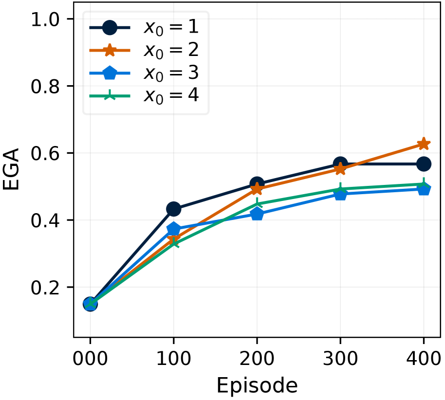
## Line Chart: EGA vs. Episode for Different X0 Values
### Overview
This image presents a line chart illustrating the relationship between Episode number and EGA (likely an abbreviation for a performance metric) for four different initial values of X0. The chart displays how EGA changes over the course of 400 episodes for each X0 value.
### Components/Axes
* **X-axis:** Labeled "Episode", ranging from 0 to 400, with tick marks at 0, 100, 200, 300, and 400.
* **Y-axis:** Labeled "EGA", ranging from 0 to 1.0, with tick marks at 0.2, 0.4, 0.6, 0.8, and 1.0.
* **Legend:** Located in the top-left corner, identifying four data series:
* X0 = 1 (Black circle)
* X0 = 2 (Orange triangle)
* X0 = 3 (Red diamond)
* X0 = 4 (Teal triangle)
* **Gridlines:** A light gray grid is present to aid in reading values.
### Detailed Analysis
Here's a breakdown of each data series, describing the trend and then extracting approximate data points:
* **X0 = 1 (Black):** The line slopes upward, showing a generally increasing EGA value with increasing episode number.
* Episode 0: EGA ≈ 0.18
* Episode 100: EGA ≈ 0.38
* Episode 200: EGA ≈ 0.47
* Episode 300: EGA ≈ 0.52
* Episode 400: EGA ≈ 0.61
* **X0 = 2 (Orange):** The line also slopes upward, but starts higher and plateaus earlier than X0 = 1.
* Episode 0: EGA ≈ 0.25
* Episode 100: EGA ≈ 0.42
* Episode 200: EGA ≈ 0.52
* Episode 300: EGA ≈ 0.57
* Episode 400: EGA ≈ 0.62
* **X0 = 3 (Red):** This line shows an initial increase, then a leveling off.
* Episode 0: EGA ≈ 0.15
* Episode 100: EGA ≈ 0.35
* Episode 200: EGA ≈ 0.45
* Episode 300: EGA ≈ 0.50
* Episode 400: EGA ≈ 0.55
* **X0 = 4 (Teal):** The line shows a moderate increase, remaining the lowest of the four lines throughout the entire range.
* Episode 0: EGA ≈ 0.12
* Episode 100: EGA ≈ 0.30
* Episode 200: EGA ≈ 0.40
* Episode 300: EGA ≈ 0.47
* Episode 400: EGA ≈ 0.53
### Key Observations
* All four lines demonstrate an increasing trend in EGA as the episode number increases, suggesting a learning or improvement process.
* The initial value of X0 significantly impacts the rate of EGA increase. X0 = 2 starts with the highest EGA and reaches the highest value at episode 400.
* X0 = 4 consistently exhibits the lowest EGA values throughout the observed episodes.
* The rate of increase in EGA appears to diminish over time for all X0 values, indicating a potential saturation point.
### Interpretation
The chart likely represents the performance of a system or algorithm over time (episodes), where X0 is an initial parameter setting. The EGA metric measures some aspect of the system's effectiveness. The data suggests that the choice of the initial parameter X0 has a substantial impact on the system's performance. Higher initial values (X0 = 2) lead to faster and potentially better performance, while lower initial values (X0 = 4) result in slower improvement. The diminishing rate of increase suggests that the system is approaching a limit to its performance, regardless of the initial X0 value. The differences in the curves could be due to the algorithm's sensitivity to initial conditions, or the presence of local optima that are easier or harder to reach depending on the starting point. Further investigation would be needed to understand the underlying mechanisms driving these observed trends.