\n
## 3D Scatter Plots: Data Distribution Visualization
### Overview
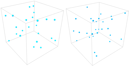
The image presents two separate 3D scatter plots, each visualized within a transparent cubic frame. Each plot contains a collection of cyan-colored spherical data points distributed throughout the 3D space. There are no axis labels, legends, or other explicit annotations. The plots appear to be intended to visually represent the distribution of data in three dimensions.
### Components/Axes
The image lacks any explicit labels for the axes (X, Y, Z). The cubic frames define the boundaries of the 3D space, but do not provide any scale or units. There is no legend to identify the meaning of the cyan spheres.
### Detailed Analysis or Content Details
**Plot 1 (Left):**
The data points in the left plot appear somewhat evenly distributed, but with a slight concentration towards the upper-left-back corner of the cube (relative to the viewer). There are approximately 18-20 data points visible. The points are scattered throughout the volume, with no obvious clustering or patterns beyond the slight concentration mentioned.
**Plot 2 (Right):**
The data points in the right plot are more densely clustered towards the upper-left region of the cube. There are approximately 15-17 data points visible. The distribution appears less uniform than in the left plot, with a noticeable void in the lower-right region.
It is impossible to provide precise coordinates for each data point without axis scales. The points appear to be randomly positioned within the cubic volume.
### Key Observations
* **Distribution Differences:** The two plots exhibit different data distributions. Plot 1 is more evenly spread, while Plot 2 shows a concentration of points in a specific region.
* **Lack of Context:** The absence of axis labels and a legend makes it difficult to interpret the meaning of the data.
* **Point Count:** The number of data points in each plot is similar, but their arrangement differs significantly.
### Interpretation
The image likely represents a comparison of two datasets in three dimensions. The differing distributions suggest that the underlying data generating processes for the two datasets are different. The concentration of points in Plot 2 could indicate a stronger correlation between the variables represented by the axes, or a bias in the data collection process.
Without further information, it is impossible to determine the nature of the variables or the significance of the observed patterns. The image serves as a visual aid for exploring data distribution, but requires additional context for meaningful interpretation. The plots could represent anything from physical measurements to abstract data relationships. The lack of labels prevents any definitive conclusions. It is possible that the two plots represent before and after states of a process, or two different experimental conditions. The difference in distribution could be a result of an intervention or a natural variation.