## Line Charts: Per-Period and Per-Action Regret Analysis
### Overview
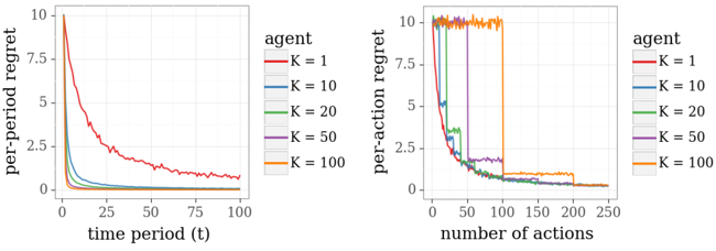
The image contains two side-by-side line charts comparing the performance of an agent across different parameter values (K). The left chart plots "per-period regret" against "time period (t)", while the right chart plots "per-action regret" against "number of actions". Both charts use the same color-coded legend for five distinct K values, showing how regret evolves over different metrics of progression.
### Components/Axes
**Common Elements:**
* **Legend:** Positioned in the top-right corner of each chart. It lists five series labeled "agent" with corresponding K values and colors:
* `K = 1` (Red line)
* `K = 10` (Blue line)
* `K = 20` (Green line)
* `K = 50` (Purple line)
* `K = 100` (Orange line)
**Left Chart:**
* **Title/Y-axis:** "per-period regret"
* **X-axis:** "time period (t)"
* **Y-axis Scale:** Linear, from 0 to 10, with major ticks at 0, 2.5, 5, 7.5, and 10.
* **X-axis Scale:** Linear, from 0 to 100, with major ticks at 0, 25, 50, 75, and 100.
**Right Chart:**
* **Title/Y-axis:** "per-action regret"
* **X-axis:** "number of actions"
* **Y-axis Scale:** Linear, from 0 to 10, with major ticks at 0, 2.5, 5, 7.5, and 10.
* **X-axis Scale:** Linear, from 0 to 250, with major ticks at 0, 50, 100, 150, 200, and 250.
### Detailed Analysis
**Left Chart: Per-Period Regret vs. Time Period (t)**
* **Trend Verification:** All lines show a decaying trend, starting from a high initial regret and decreasing as time period `t` increases. The rate of decay varies significantly with K.
* **Data Series Analysis (Approximate Values):**
* **K=1 (Red):** Starts at ~10. Decays slowly and smoothly. At t=25, regret is ~2.5. At t=50, ~1.5. At t=100, it remains above 0.5, showing the slowest convergence.
* **K=10 (Blue):** Starts at ~10. Decays rapidly. At t=10, regret is already below 1. By t=25, it is near 0.2 and remains very close to 0 for t>50.
* **K=20 (Green):** Starts at ~10. Decays very rapidly, faster than K=10. Reaches near-zero regret by approximately t=15.
* **K=50 (Purple):** Starts at ~10. Shows an extremely sharp initial drop, reaching near-zero regret by approximately t=5.
* **K=100 (Orange):** Starts at ~10. Exhibits the sharpest initial drop, plummeting to near-zero regret almost immediately (t<5).
**Right Chart: Per-Action Regret vs. Number of Actions**
* **Trend Verification:** All lines show a decaying trend, but with distinct "plateau and drop" patterns for higher K values. Regret remains high for a certain number of actions before dropping sharply.
* **Data Series Analysis (Approximate Values):**
* **K=1 (Red):** Starts at ~10. Decays smoothly and gradually. At 50 actions, regret is ~1. At 100 actions, ~0.2. It approaches zero slowly.
* **K=10 (Blue):** Starts at ~10. Decays rapidly with some minor fluctuations. Reaches near-zero regret by approximately 75 actions.
* **K=20 (Green):** Starts at ~10. Decays rapidly, similar to K=10 but slightly faster. Reaches near-zero regret by approximately 60 actions.
* **K=50 (Purple):** Starts at ~10. Maintains a high regret plateau (~10) until approximately 50 actions. Then drops sharply to a lower plateau (~1.5) before decaying to near-zero by ~150 actions.
* **K=100 (Orange):** Starts at ~10. Maintains a high regret plateau (~10) for the longest duration, until approximately 100 actions. Then experiences a very sharp, near-vertical drop to near-zero regret.
### Key Observations
1. **Inverse Relationship with K:** In both charts, higher K values lead to faster initial reduction in regret. K=100 shows the most aggressive early performance.
2. **Different Convergence Profiles:** The "per-period" chart shows smooth, exponential-like decay for all K. The "per-action" chart reveals that for high K (50, 100), the agent incurs high regret for a prolonged period (a plateau) before a dramatic improvement, suggesting a phase of exploration or accumulation before exploitation.
3. **Crossover Point:** In the left chart, the lines for K=10, 20, 50, and 100 all converge to near-zero regret well before t=100, while K=1 remains significantly higher. In the right chart, all series eventually converge to near-zero regret, but the path differs dramatically.
4. **Stability:** The K=1 line (red) is the smoothest in both charts. Lines for higher K values, especially in the right chart during their plateau phases (e.g., orange line before 100 actions), show more high-frequency noise or volatility.
### Interpretation
The data demonstrates a clear trade-off controlled by the parameter K. A low K (e.g., K=1) results in conservative, steady, but slow improvement. A high K (e.g., K=100) enables a strategy that appears to "wait" or "explore" extensively (high per-action regret plateau) before executing a highly effective sequence of actions that causes regret to plummet.
The stark difference between the two charts is critical. The left chart (`per-period regret`) suggests that from a pure time perspective, higher K is always better for rapid learning. However, the right chart (`per-action regret`) reveals the cost: high-K agents are inefficient on a *per-action* basis for a significant initial period. They may be gathering information or building a model before acting decisively. This is a classic exploration-exploitation dilemma visualized. The "plateau and drop" pattern for K=50 and K=100 is the signature of a delayed but then highly efficient exploitation phase.
**Underlying Inference:** The agent with a higher K likely has a larger memory, batch size, or more complex internal model, requiring more data (actions) to "warm up" before it can perform optimally. Once primed, its performance surpasses simpler agents. The choice of K would depend on whether the operational constraint is wall-clock time (favor high K) or the number of allowed actions/interventions (where the cost of the initial high-regret plateau must be weighed against the later efficiency).