## Heatmap: Numerical Grid
### Overview
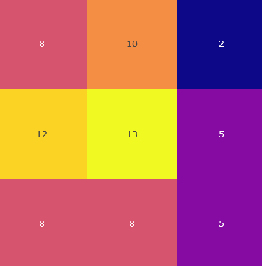
The image is a heatmap representing a 3x3 grid of numerical values. Each cell is colored according to its value, with warmer colors (yellow, orange) indicating higher values and cooler colors (purple, blue) indicating lower values.
### Components/Axes
* **Grid:** A 3x3 grid structure.
* **Values:** Numerical values within each cell.
* **Color Scale:** The color of each cell corresponds to its numerical value.
### Detailed Analysis
Here's a breakdown of the grid and its values:
* **Row 1:**
* Cell 1 (top-left): 8 (coral color)
* Cell 2 (top-center): 10 (orange color)
* Cell 3 (top-right): 2 (dark blue color)
* **Row 2:**
* Cell 1 (middle-left): 12 (yellow color)
* Cell 2 (middle-center): 13 (yellow color)
* Cell 3 (middle-right): 5 (purple color)
* **Row 3:**
* Cell 1 (bottom-left): 8 (coral color)
* Cell 2 (bottom-center): 8 (coral color)
* Cell 3 (bottom-right): 5 (purple color)
### Key Observations
* The highest value is 13, located in the center of the grid.
* The lowest value is 2, located in the top-right corner.
* The values in the middle row are generally higher than those in the other rows.
* The values in the rightmost column are generally lower than those in the other columns.
### Interpretation
The heatmap visually represents the distribution of numerical values across the grid. The color gradient allows for a quick assessment of relative magnitudes, highlighting areas of high and low concentration. The data suggests a concentration of higher values in the central region of the grid, with lower values towards the periphery. This type of visualization is useful for identifying patterns and trends in data that can be represented in a matrix format.