## Heatmap Grid: 3x3 Matrix of Colored Cells with Numerical Values
### Overview
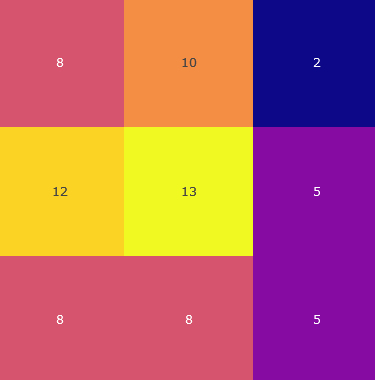
The image displays a 3x3 grid of colored rectangular cells, each containing a centered numerical value. The grid is presented without any external axis labels, titles, or a legend. The colors of the cells vary, suggesting they represent different categories or intensity levels corresponding to the numbers within them.
### Components/Axes
* **Structure:** A 3x3 matrix (3 rows, 3 columns).
* **Cell Content:** Each cell contains a single integer.
* **Color Palette:** The cells use a range of colors, including shades of pink/red, orange, yellow, purple, and dark blue.
* **Missing Elements:** There are no visible axis titles, tick marks, row/column labels, chart title, or a legend explaining the color scale.
### Detailed Analysis
The grid contains the following numerical values, listed by row (top to bottom) and column (left to right):
**Row 1 (Top):**
* Cell (1,1): **8** (Color: Pinkish-red)
* Cell (1,2): **10** (Color: Orange)
* Cell (1,3): **2** (Color: Dark blue)
**Row 2 (Middle):**
* Cell (2,1): **12** (Color: Golden yellow)
* Cell (2,2): **13** (Color: Bright yellow)
* Cell (2,3): **5** (Color: Purple)
**Row 3 (Bottom):**
* Cell (3,1): **8** (Color: Pinkish-red, similar to cell 1,1)
* Cell (3,2): **8** (Color: Pinkish-red, similar to cells 1,1 and 3,1)
* Cell (3,3): **5** (Color: Purple, similar to cell 2,3)
### Key Observations
1. **Value Distribution:** The highest value is **13** (center cell). The lowest value is **2** (top-right cell).
2. **Color-Value Correlation:** There appears to be a visual correlation between color and numerical value:
* The highest values (12, 13) are in shades of yellow.
* Mid-range values (8, 10) are in pink/red and orange.
* Lower values (5, 2) are in purple and dark blue.
3. **Repeating Values & Colors:**
* The value **8** appears three times, all in the same pinkish-red color (cells 1,1; 3,1; 3,2).
* The value **5** appears twice, both in the same purple color (cells 2,3; 3,3).
4. **Spatial Pattern:** The central column (Column 2) contains the two highest values (10, 13, 8). The rightmost column (Column 3) contains the two lowest values (2, 5, 5).
### Interpretation
This image is a **heatmap or matrix visualization** where color is used as a visual encoding for the numerical data within each cell. The lack of labels makes the specific context ambiguous, but the structure is typical for displaying:
* A correlation matrix.
* A confusion matrix from classification models.
* Frequency counts across two categorical variables.
* Intensity measurements across a 2D grid.
**What the data suggests:** The central cell (2,2) with a value of 13 is the focal point, representing the maximum in this dataset. The right column consistently shows lower values, indicating a potential negative trend or lower frequency in that category. The repetition of the value 8 in the same color across three cells suggests those data points belong to the same category or intensity level.
**Notable Anomaly:** The value **2** in the top-right cell (1,3) is a significant outlier, being the lowest value and visually isolated by its dark blue color against the warmer tones of its neighbors. This could indicate a rare event, a low-probability classification, or a missing data point depending on the context.
**Limitations:** Without a legend, the exact meaning of the colors (e.g., is yellow "high" and blue "low"?) and the categories represented by the rows and columns cannot be determined. The interpretation is based solely on the visual patterns of the provided numbers and colors.