## Scatter Plot: Nobel Laureates vs. Random Sample - Citation Impact vs. Effect Size
### Overview
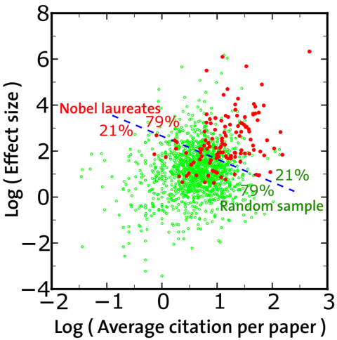
This image is a scatter plot comparing two datasets: "Nobel laureates" (represented by red dots) and a "Random sample" (represented by green dots). The plot visualizes the relationship between the logarithmic average citations per paper (x-axis) and the logarithmic effect size (y-axis) for each data point (presumably individual scientific papers or authors). A dashed blue trend line is overlaid on the data.
### Components/Axes
* **Chart Type:** Scatter plot with logarithmic axes.
* **X-Axis:**
* **Label:** `Log ( Average citation per paper )`
* **Scale:** Linear scale from -2 to 3, with major ticks at -2, -1, 0, 1, 2, 3.
* **Y-Axis:**
* **Label:** `Log ( Effect size )`
* **Scale:** Linear scale from -4 to 8, with major ticks at -4, -2, 0, 2, 4, 6, 8.
* **Legend:**
* **Position:** Top-left corner of the plot area.
* **Entry 1:** `Nobel laureates` - Associated with red filled circles.
* **Entry 2:** `Random sample` - Associated with green open circles.
* **Annotations:**
* **Near Nobel laureates cluster (upper-right quadrant):** `21%` (in red) and `79%` (in red).
* **Near Random sample cluster (center to lower-right):** `21%` (in green) and `79%` (in green).
* **Trend Line:** A dashed blue line with a negative slope, running diagonally from the upper-left to the lower-right of the plot area.
### Detailed Analysis
* **Data Distribution - Nobel Laureates (Red):**
* **Spatial Grounding:** Primarily clustered in the upper-right quadrant of the plot.
* **Trend Verification:** The cluster shows a general positive correlation; points with higher log(citations) tend to have higher log(effect size).
* **Data Points:** The red points are densely packed between approximately X=0.5 to X=2.5 and Y=1 to Y=6. A few outliers exist, with one point near X=2.8, Y=6.5.
* **Annotations:** The `21%` and `79%` labels are placed within this cluster. Their exact referent (e.g., percentage of points above/below a threshold) is not explicitly defined in the chart.
* **Data Distribution - Random Sample (Green):**
* **Spatial Grounding:** Spread widely across the center and lower portions of the plot, with a dense concentration around the origin (X=0, Y=0).
* **Trend Verification:** The overall cloud of green points shows a very weak or slightly negative correlation, as suggested by the overlaid blue dashed line.
* **Data Points:** The green points span a wide range, from approximately X=-1.5 to X=2.5 and Y=-3.5 to Y=4. The highest density is between X=-0.5 to X=1.5 and Y=-1 to Y=2.
* **Annotations:** The `21%` and `79%` labels in green are placed near the right side of the main green cluster.
* **Trend Line (Blue Dashed):**
* **Position:** Starts near (X=-1, Y=4) and ends near (X=2.5, Y=0).
* **Interpretation:** This line indicates a negative relationship between log(citations) and log(effect size) for the dataset it models, which appears to be more aligned with the overall trend of the "Random sample" than the "Nobel laureates."
### Key Observations
1. **Clear Separation:** The "Nobel laureates" dataset is distinctly shifted towards the upper-right compared to the "Random sample," indicating systematically higher values for both average citations per paper and effect size.
2. **Density Contrast:** The "Random sample" points are far more numerous and densely packed, especially around lower values, while the "Nobel laureates" points are fewer and form a looser cluster at higher values.
3. **Divergent Trends:** The two groups exhibit different internal trends. The Nobel laureates show a positive correlation, while the random sample's trend is flat or slightly negative (as per the blue line).
4. **Ambiguous Percentages:** The `21%` and `79%` annotations are prominent but lack a clear key. They may represent the proportion of points in a quadrant defined by unseen thresholds (e.g., median values), but this cannot be confirmed from the image alone.
### Interpretation
This chart presents a Peircean investigation into scientific impact. It suggests that papers by Nobel laureates are not just marginally better but occupy a different region of the impact space—they are both more cited and have a larger measured "effect size" (a term common in meta-analysis, implying the magnitude of a studied phenomenon). The positive correlation within the laureate group implies that for these elite scientists, higher visibility (citations) aligns with greater substantive impact (effect size).
In contrast, the random sample shows no such alignment; higher citations do not predict a larger effect size, and the overall trend is slightly negative. This could imply that for the average scientific paper, citation count is driven by factors other than the core magnitude of the finding (e.g., topic popularity, institutional prestige, or narrative appeal).
The stark visual separation between the two clouds is the most powerful message: the scientific output of Nobel laureates is quantitatively distinct in both metrics. The chart argues that exceptional recognition (a Nobel Prize) correlates with a fundamentally different profile of scholarly impact, characterized by a synergistic relationship between recognition (citations) and measured effect. The purpose of the `21%/79%` annotations remains unclear but may be intended to highlight a specific statistical breakdown within each group, such as the proportion of papers above or below a certain impact threshold.