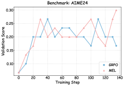
## Line Chart: Benchmark AIME24
### Overview
The image is a line chart comparing the validation scores of two models, GRPO and MEL, over training steps. The chart shows how the validation score changes as the models are trained.
### Components/Axes
* **Title:** Benchmark: AIME24
* **X-axis:** Training Step (ranging from 0 to 140)
* Axis markers: 0, 20, 40, 60, 80, 100, 120, 140
* **Y-axis:** Validation Score (ranging from 0.10 to 0.30)
* Axis markers: 0.10, 0.15, 0.20, 0.25, 0.30
* **Legend:** Located at the bottom-right of the chart.
* GRPO (Blue line with circle markers)
* MEL (Pink line with triangle markers)
### Detailed Analysis
* **GRPO (Blue):**
* Trend: Initially increases, then fluctuates, and finally decreases slightly.
* Data Points:
* (0, ~0.07)
* (20, 0.20)
* (40, ~0.27)
* (60, ~0.20)
* (80, ~0.23)
* (100, ~0.20)
* (120, ~0.27)
* (140, ~0.17)
* **MEL (Pink):**
* Trend: Initially increases, then fluctuates, showing a peak at the end.
* Data Points:
* (0, ~0.07)
* (20, ~0.17)
* (40, ~0.20)
* (60, ~0.23)
* (80, ~0.20)
* (100, ~0.23)
* (120, ~0.17)
* (140, ~0.30)
### Key Observations
* Both models start with similar validation scores.
* GRPO reaches a higher validation score earlier in the training process.
* MEL shows a significant increase in validation score towards the end of the training steps.
### Interpretation
The chart compares the performance of two models, GRPO and MEL, on the AIME24 benchmark. The validation scores indicate how well each model generalizes to unseen data during training. GRPO initially performs better, but MEL shows a strong improvement towards the end of the training, suggesting it might be learning more effectively in the later stages. The fluctuations in validation scores for both models indicate potential overfitting or instability during training. The final validation score of MEL is higher than GRPO, suggesting that MEL is the better model.