## Line Chart: Perplexity Improvement vs. Iteration for Different Model Groups
### Overview
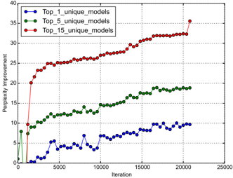
The image is a line chart plotting "Perplexity Improvement" against "Iteration" for three different experimental conditions, each represented by a distinct line. The chart demonstrates how the performance improvement (measured in perplexity reduction) evolves over training iterations for groups defined by the number of unique models used.
### Components/Axes
* **Chart Type:** Line chart with markers.
* **X-Axis:**
* **Label:** "Iteration"
* **Scale:** Linear, from 0 to 25,000.
* **Major Ticks:** 0, 5000, 10000, 15000, 20000, 25000.
* **Y-Axis:**
* **Label:** "Perplexity Improvement"
* **Scale:** Linear, from 0 to 40.
* **Major Ticks:** 0, 5, 10, 15, 20, 25, 30, 35, 40.
* **Legend:**
* **Position:** Top-left corner of the plot area.
* **Entries:**
1. `Top_1_unique_models`: Blue line with circular markers.
2. `Top_5_unique_models`: Green line with circular markers.
3. `Top_15_unique_models`: Red line with circular markers.
* **Grid:** A light gray grid is present for both major x and y ticks.
### Detailed Analysis
The chart tracks three data series over approximately 21,000 iterations.
**1. Top_1_unique_models (Blue Line):**
* **Trend:** Shows a volatile, generally upward trend with significant fluctuations. It starts near 0, experiences a sharp drop below 0 around iteration 1000, and then begins a slow, noisy climb.
* **Key Data Points (Approximate):**
* Iteration 0: ~0
* Iteration 1000: ~ -1 (a dip below zero)
* Iteration 5000: ~5
* Iteration 10000: ~6
* Iteration 15000: ~8
* Iteration 20000: ~10
* **Final Value:** Ends at approximately 10 at the last data point (~21,000 iterations).
**2. Top_5_unique_models (Green Line):**
* **Trend:** Shows a steady, moderately increasing trend with less volatility than the blue line. It begins around 8, dips slightly, then climbs consistently.
* **Key Data Points (Approximate):**
* Iteration 0: ~8
* Iteration 5000: ~12
* Iteration 10000: ~14
* Iteration 15000: ~17
* Iteration 20000: ~19
* **Final Value:** Ends at approximately 19 at the last data point.
**3. Top_15_unique_models (Red Line):**
* **Trend:** Shows a very rapid initial increase followed by a sustained, steady climb. It has the steepest slope in the first 2000 iterations and maintains the highest value throughout.
* **Key Data Points (Approximate):**
* Iteration 0: ~0
* Iteration 2000: ~20 (very steep initial rise)
* Iteration 5000: ~25
* Iteration 10000: ~28
* Iteration 15000: ~32
* Iteration 20000: ~34
* **Final Value:** Ends at approximately 35 at the last data point, showing a final upward tick.
### Key Observations
1. **Clear Performance Hierarchy:** There is a strict ordering in performance improvement: `Top_15` > `Top_5` > `Top_1`. The gap between the lines widens over time.
2. **Diminishing Returns of Scale:** While using more unique models (`Top_15`) yields the best result, the rate of improvement (slope) for the red line slows after the initial burst, suggesting diminishing marginal returns per iteration after a certain point.
3. **Volatility vs. Model Count:** The single-model condition (`Top_1`, blue) exhibits the most noise and instability in its improvement trajectory. The multi-model conditions (`Top_5` and `Top_15`) produce smoother, more monotonic learning curves.
4. **Initial Conditions:** The `Top_5` condition starts at a higher baseline improvement (~8) compared to the near-zero start of the other two, which may indicate a different initialization or a pre-training effect.
### Interpretation
This chart likely illustrates the benefit of **model ensemble or diversity** in a machine learning training context (e.g., language modeling, where perplexity is a common metric). The data suggests that leveraging a pool of multiple unique models (`Top_15`) during training leads to significantly faster and greater performance improvement compared to using fewer models.
The **Peircean insight** here is that the relationship is not merely additive. The dramatic early spike for `Top_15` implies a synergistic effect where diverse models quickly cover different aspects of the problem space, leading to rapid initial gains. The subsequent steady climb indicates continued, collaborative refinement. The volatility of the `Top_1` line highlights the instability of relying on a single model's learning trajectory. The chart argues that investing in maintaining and utilizing a diverse set of models (`Top_15`) is a highly effective strategy for optimizing this particular learning metric, despite the likely higher computational cost. The final upward tick for the red line suggests it may not have fully plateaued, and further gains could be possible with more iterations.