\n
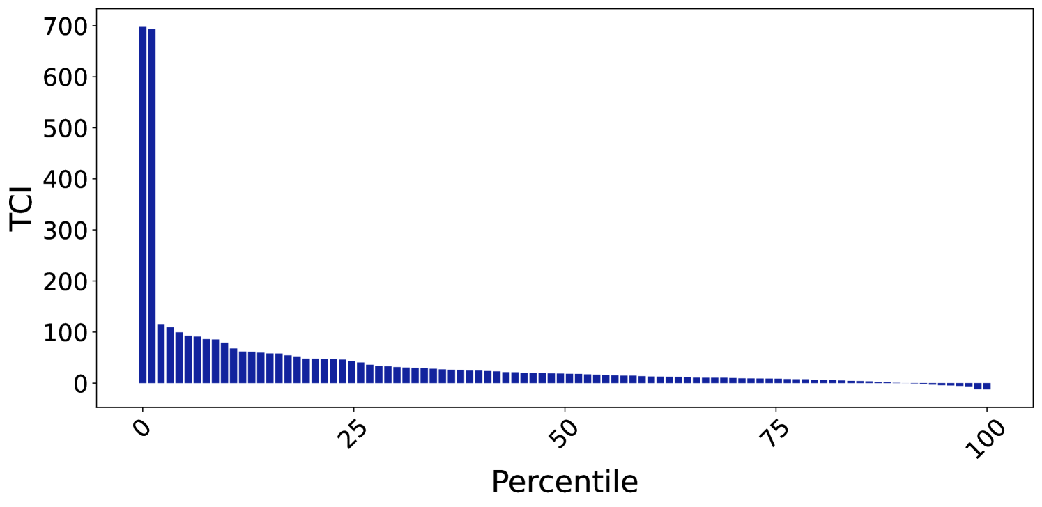
## Bar Chart: TCI vs. Percentile
### Overview
The image presents a bar chart illustrating the distribution of TCI (presumably a metric) across percentiles. The chart displays TCI values on the y-axis and percentile values on the x-axis. The chart shows a steep decline in TCI values as percentile increases, indicating a highly skewed distribution.
### Components/Axes
* **X-axis:** Labeled "Percentile", ranging from 0 to 100, with tick marks at intervals of 25.
* **Y-axis:** Labeled "TCI", ranging from 0 to 700, with tick marks at intervals of 100.
* **Data Series:** A single series of bars representing TCI values for each percentile.
* **Color:** The bars are a uniform dark blue color.
### Detailed Analysis
The chart shows a rapid decrease in TCI values from the 0th percentile to approximately the 25th percentile. Beyond the 25th percentile, the decline in TCI values slows considerably, and the bars become relatively flat.
Here's an approximate reconstruction of the data, noting the difficulty in precise reading from the image:
* **0th Percentile:** Approximately 680 TCI
* **5th Percentile:** Approximately 550 TCI
* **10th Percentile:** Approximately 420 TCI
* **15th Percentile:** Approximately 300 TCI
* **20th Percentile:** Approximately 200 TCI
* **25th Percentile:** Approximately 130 TCI
* **30th Percentile:** Approximately 90 TCI
* **35th Percentile:** Approximately 70 TCI
* **40th Percentile:** Approximately 55 TCI
* **45th Percentile:** Approximately 45 TCI
* **50th Percentile:** Approximately 35 TCI
* **55th Percentile:** Approximately 30 TCI
* **60th Percentile:** Approximately 25 TCI
* **65th Percentile:** Approximately 20 TCI
* **70th Percentile:** Approximately 15 TCI
* **75th Percentile:** Approximately 12 TCI
* **80th Percentile:** Approximately 10 TCI
* **85th Percentile:** Approximately 8 TCI
* **90th Percentile:** Approximately 6 TCI
* **95th Percentile:** Approximately 4 TCI
* **100th Percentile:** Approximately 2 TCI
The trend is a strong negative correlation between percentile and TCI. The initial drop is very steep, and then it flattens out.
### Key Observations
* The distribution of TCI is heavily skewed to the left. A small percentage of observations have very high TCI values, while the majority have low TCI values.
* The TCI values decrease rapidly up to the 25th percentile, suggesting that the most significant changes in TCI occur within the lower percentiles.
* The TCI values stabilize after the 50th percentile, indicating that the metric is relatively consistent for the majority of the population.
### Interpretation
This chart likely represents a measure of some kind of risk, cost, or impact (TCI) across a population or sample. The steep decline suggests that a small portion of the population is responsible for a large proportion of the total TCI. This could indicate a "long tail" distribution, where a few extreme cases dominate the overall metric.
For example, if TCI represents "Total Claimed Insurance", the chart suggests that a small number of claimants account for a large percentage of all insurance payouts. This information could be used to focus resources on managing the risk associated with those high-TCI individuals or events.
The flattening of the curve at higher percentiles suggests that beyond a certain point, increasing the percentile does not significantly reduce the TCI. This could indicate a saturation effect or a natural limit to the metric.