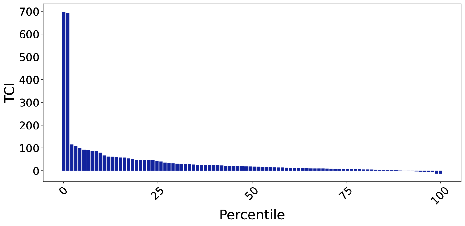
## Bar Chart: TCI Distribution Across Percentiles
### Overview
The chart displays a distribution of TCI (Total Composite Index) values across percentiles from 0 to 100. The y-axis represents TCI values (0–700), while the x-axis represents percentiles. A single data series is visualized using blue bars, with a dashed line tracing the trend of the bars.
### Components/Axes
- **X-axis (Percentile)**: Labeled "Percentile," ranging from 0 to 100 in increments of 25. No gridlines or tick marks are visible.
- **Y-axis (TCI)**: Labeled "TCI," scaled from 0 to 700 in increments of 100. No gridlines or tick marks are visible.
- **Data Series**: A single blue bar series representing TCI values. A dashed line overlays the chart, starting at the highest bar and tapering off toward the right.
### Detailed Analysis
- **0 Percentile**: The tallest bar reaches approximately **700 TCI**, with a slight drop to **690 TCI** in the adjacent bar.
- **1–25 Percentiles**: Bars decrease sharply from ~100 TCI at 1 percentile to ~50 TCI at 25 percentile. Values are irregular but follow a general downward trend.
- **25–100 Percentiles**: Bars decline gradually, with values dropping to near-zero by 100 percentile. The dashed line mirrors this trend, starting at ~700 TCI and ending near 0.
### Key Observations
1. **Steep Initial Drop**: TCI decreases dramatically from 700 to ~100 between 0 and 1 percentile.
2. **Gradual Decline**: After 1 percentile, TCI declines steadily but less sharply, reaching ~50 at 25 percentile and near 0 by 100 percentile.
3. **Dashed Line**: The dashed line aligns with the bar trend, suggesting it represents a smoothed or fitted trendline.
### Interpretation
The data indicates that TCI is highest at the lowest percentile (0) and decreases monotonically as percentile increases. The steep drop at the beginning suggests a concentration of high TCI values in the lowest percentile range, followed by a more uniform distribution of lower values. The dashed line reinforces the overall downward trend but does not indicate any anomalies or inflection points. This pattern could imply that TCI is inversely correlated with percentile ranking, possibly reflecting a competitive or hierarchical system where higher percentiles correspond to lower TCI scores.