\n
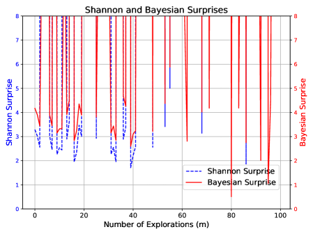
## Line Chart: Shannon and Bayesian Surprises
### Overview
The image presents a line chart comparing Shannon Surprise and Bayesian Surprise over a range of explorations (m). The chart displays two distinct lines representing each surprise metric, plotted against the number of explorations, ranging from 0 to 100. A secondary y-axis on the right side of the chart displays the scale for Bayesian Surprise.
### Components/Axes
* **Title:** "Shannon and Bayesian Surprises" - positioned at the top-center of the chart.
* **X-axis:** "Number of Explorations (m)" - ranging from 0 to 100, with tick marks at intervals of 10.
* **Left Y-axis:** "Shannon Surprise" - ranging from 0 to 8, with tick marks at intervals of 1.
* **Right Y-axis:** "Bayesian Surprise" - ranging from 0 to 8, with tick marks at intervals of 1.
* **Legend:** Located in the bottom-right corner.
* "Shannon Surprise" - represented by a dashed blue line.
* "Bayesian Surprise" - represented by a solid red line.
* **Gridlines:** Horizontal and vertical gridlines are present to aid in reading values.
### Detailed Analysis
**Shannon Surprise (Dashed Blue Line):**
The Shannon Surprise line exhibits a highly oscillatory pattern. It starts at approximately 2 at m=0, rapidly fluctuates between approximately 2 and 7 for the first 40 explorations. After m=40, the line generally trends downwards, reaching a minimum of approximately 1.5 around m=90, with continued oscillations.
* m=0: ~2
* m=10: ~6
* m=20: ~3
* m=30: ~5
* m=40: ~2.5
* m=50: ~3
* m=60: ~2
* m=70: ~4
* m=80: ~2
* m=90: ~1.5
* m=100: ~2.5
**Bayesian Surprise (Solid Red Line):**
The Bayesian Surprise line also shows significant oscillations, but generally maintains higher values than the Shannon Surprise. It begins at approximately 7.5 at m=0, fluctuates wildly between approximately 1 and 8 for the first 40 explorations, and then generally decreases, reaching a minimum of approximately 1 around m=90, with continued oscillations.
* m=0: ~7.5
* m=10: ~8
* m=20: ~2
* m=30: ~6
* m=40: ~3
* m=50: ~7
* m=60: ~2
* m=70: ~6
* m=80: ~2
* m=90: ~1
* m=100: ~3
### Key Observations
* Both Shannon and Bayesian Surprises exhibit high variability throughout the exploration process.
* Bayesian Surprise generally has higher values than Shannon Surprise, although there are periods where this is not the case.
* Both lines show a general decreasing trend in surprise as the number of explorations increases, particularly after m=40.
* The oscillations suggest that each exploration provides varying degrees of new information or unexpectedness.
### Interpretation
The chart illustrates the concept of surprise in the context of information gathering or exploration. Shannon Surprise and Bayesian Surprise are both measures of how unexpected an event is, but they differ in their underlying assumptions and calculations. The high degree of oscillation in both lines suggests that the exploration process is highly dynamic and that each exploration can reveal significantly different levels of novelty. The decreasing trend in surprise over time indicates that as more explorations are conducted, the system becomes more predictable, and the likelihood of encountering truly surprising events diminishes. The fact that Bayesian Surprise is generally higher than Shannon Surprise could indicate that the Bayesian approach is more sensitive to prior beliefs or expectations. The chart could be used to evaluate the effectiveness of an exploration strategy or to understand how information is gained over time. The large fluctuations suggest that the environment being explored is complex and non-deterministic.