## Line Chart: Shannon and Bayesian Surprises
### Overview
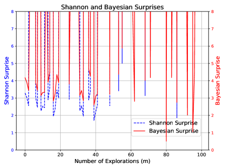
This is a dual-axis line chart comparing two metrics—"Shannon Surprise" and "Bayesian Surprise"—over a sequence of explorations. The chart visualizes how these two distinct measures of "surprise" or information gain evolve as the number of explorations increases.
### Components/Axes
* **Chart Title:** "Shannon and Bayesian Surprises" (centered at the top).
* **X-Axis:**
* **Label:** "Number of Explorations (m)"
* **Scale:** Linear, ranging from 0 to 100.
* **Major Tick Marks:** At intervals of 20 (0, 20, 40, 60, 80, 100).
* **Primary Y-Axis (Left):**
* **Label:** "Shannon Surprise"
* **Scale:** Linear, ranging from 0 to 8.
* **Major Tick Marks:** At integer intervals (0, 1, 2, 3, 4, 5, 6, 7, 8).
* **Secondary Y-Axis (Right):**
* **Label:** "Bayesian surprise"
* **Scale:** Linear, ranging from 0 to 8.
* **Major Tick Marks:** At integer intervals (0, 1, 2, 3, 4, 5, 6, 7, 8).
* **Legend:**
* **Placement:** Bottom-right corner of the chart area.
* **Items:**
1. A blue dashed line labeled "Shannon Surprise".
2. A red solid line labeled "Bayesian Surprise".
* **Grid:** A light gray grid is present, aligning with the major ticks of both the x-axis and the primary y-axis.
### Detailed Analysis
**1. Shannon Surprise (Blue Dashed Line):**
* **Trend:** The line exhibits moderate volatility in the first half of the explorations (m=0 to ~40), generally fluctuating between values of 2 and 4 on the left y-axis. After approximately m=40, the line drops significantly and stabilizes at a much lower level, mostly between 1 and 2, with a few isolated points slightly higher.
* **Key Data Points (Approximate):**
* Starts near 3 at m=0.
* Peaks around 4 at m≈10, m≈20, and m≈30.
* Has a notable dip to ~2 at m≈18.
* Shows a sharp, sustained drop starting around m=38, falling to ~1.5 by m=42.
* Remains low (1-2 range) from m=42 to m=100, with a minor peak near 2.5 at m≈55.
**2. Bayesian Surprise (Red Solid Line):**
* **Trend:** This line is characterized by extreme, high-frequency volatility. It consists almost entirely of sharp, vertical spikes that frequently reach the maximum value of 8 on the right y-axis, interspersed with rapid drops to values near or below 2. There is no clear upward or downward long-term trend; the pattern of intense spiking is consistent across the entire range of explorations.
* **Key Data Points (Approximate):**
* The line spikes to 8 or near-8 more than 15 times across the x-axis range.
* Notable deep troughs (values ≤ 2) occur at approximately m=5, m=15, m=40, m=65, and a very deep one near m=80 where it drops to ~0.5.
* The spikes are densely packed, especially between m=0-40 and m=60-100.
### Key Observations
1. **Dichotomy in Behavior:** The two metrics display fundamentally different behaviors. Shannon Surprise shows a regime shift (from moderate volatility to low, stable values), while Bayesian Surprise maintains a consistent pattern of high-amplitude, high-frequency spikes throughout.
2. **Divergence Point:** The most significant event in the chart is the divergence that occurs around m=40. At this point, the Shannon Surprise metric drops and stays low, while the Bayesian Surprise continues its spiking pattern unabated.
3. **Value Range:** Both metrics utilize the full 0-8 scale, but they do so in completely different ways. Shannon Surprise occupies the lower-to-mid range (1-4) for most of the chart, while Bayesian Surprise repeatedly hits the ceiling (8) and floor (0-2) of its scale.
4. **Visual Density:** The red line (Bayesian) creates a dense, "barcode-like" visual texture due to its rapid oscillations, whereas the blue line (Shannon) is more sparse and easier to follow visually.
### Interpretation
This chart likely illustrates a comparison between two different mathematical frameworks for quantifying "surprise" or information gain in a sequential learning or exploration process.
* **What the Data Suggests:** The stark contrast implies that the two measures are sensitive to different aspects of the data or the learning process. The **Bayesian Surprise** (red) appears to be a highly reactive, instantaneous measure. Its constant spiking suggests that nearly every new exploration (data point) provides a significant update to the Bayesian model, causing a large "surprise" value. This could indicate a model that is constantly being surprised by new evidence, perhaps due to a high initial uncertainty or a complex underlying distribution.
* The **Shannon Surprise** (blue), based on information theory, seems to measure a more cumulative or smoothed uncertainty. Its drop and stabilization after m=40 suggest that, from the model's perspective, the *informational content* or *reduction in entropy* gained from each new exploration diminishes significantly after a certain point. The system may have learned the broad structure of the environment by then, so new samples provide less "new" information in a Shannon sense, even if they still cause large Bayesian updates.
* **Relationship and Anomaly:** The key relationship is their divergence. The anomaly is not a single data point but the entire behavioral dichotomy. This visual evidence argues that "surprise" is not a monolithic concept. The choice of metric (Bayesian vs. Shannon) fundamentally changes the narrative of the learning process: one tells a story of constant, dramatic updates, while the other tells a story of initial learning followed by saturation. The chart powerfully demonstrates that the interpretation of system behavior is contingent on the chosen analytical lens.