## Scatter Plot Charts: Model Accuracy vs. Token Count and Deep-Thinking Ratio
### Overview
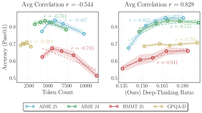
The image contains two side-by-side scatter plots with overlaid linear regression trend lines and shaded confidence intervals. Both charts plot "Accuracy (Pass@1)" on the y-axis against different x-axis variables. The left chart examines the relationship with "Token Count," while the right chart examines the relationship with "(Ours) Deep-Thinking Ratio." A shared legend at the bottom identifies four distinct data series.
### Components/Axes
* **Shared Y-Axis:** Labeled "Accuracy (Pass@1)". The scale runs from 0.5 to approximately 0.85, with major tick marks at 0.5, 0.6, 0.7, and 0.8.
* **Left Chart X-Axis:** Labeled "Token Count". The scale runs from approximately 2000 to 11000, with major tick marks at 2500, 5000, 7500, and 10000.
* **Right Chart X-Axis:** Labeled "(Ours) Deep-Thinking Ratio". The scale runs from approximately 0.135 to 0.185, with major tick marks at 0.135, 0.150, 0.165, and 0.180.
* **Legend (Bottom Center):** Contains four entries, each with a colored line and marker:
* **Light Blue (Cyan):** AIME 25
* **Green:** AIME 24
* **Red:** HMMT 25
* **Gold/Yellow:** GPQA-D
* **Chart Titles (Top Center):**
* Left Chart: "Avg Correlation r = -0.544"
* Right Chart: "Avg Correlation r = 0.828"
* **In-Chart Annotations:** Each data series has its Pearson correlation coefficient (`r`) annotated near its trend line.
### Detailed Analysis
#### Left Chart: Accuracy vs. Token Count
* **Overall Trend:** The average correlation is negative (`r = -0.544`), suggesting that, across these benchmarks, accuracy generally decreases as token count increases.
* **Series-Specific Trends & Data Points (Approximate):**
* **AIME 25 (Light Blue):** Shows a negative correlation (`r = -0.407`). The trend line slopes downward. Data points are clustered between ~4000 and ~10000 tokens, with accuracy ranging from ~0.76 to ~0.83.
* **AIME 24 (Green):** Shows a strong negative correlation (`r = -0.704`). The trend line slopes downward more steeply than AIME 25. Data points are between ~3000 and ~7000 tokens, with accuracy from ~0.78 to ~0.84.
* **HMMT 25 (Red):** Shows a very strong negative correlation (`r = -0.783`). The trend line has the steepest downward slope. Data points span from ~4000 to ~11000 tokens, with accuracy dropping from ~0.68 to ~0.51.
* **GPQA-D (Gold):** Shows a moderate negative correlation (`r = -0.284`). The trend line has a gentle downward slope. Data points are clustered at the lower token count range (~2000-3500), with accuracy between ~0.68 and ~0.71.
#### Right Chart: Accuracy vs. Deep-Thinking Ratio
* **Overall Trend:** The average correlation is strongly positive (`r = 0.828`), suggesting that accuracy increases as the "Deep-Thinking Ratio" increases.
* **Series-Specific Trends & Data Points (Approximate):**
* **AIME 25 (Light Blue):** Shows a very strong positive correlation (`r = 0.862`). The trend line slopes upward sharply. Data points range from a ratio of ~0.135 (accuracy ~0.68) to ~0.175 (accuracy ~0.85).
* **AIME 24 (Green):** Shows a strong positive correlation (`r = 0.715`). The trend line slopes upward. Data points range from ~0.145 (accuracy ~0.77) to ~0.185 (accuracy ~0.83).
* **HMMT 25 (Red):** Shows an extremely strong positive correlation (`r = 0.941`). The trend line has a consistent upward slope. Data points range from ~0.135 (accuracy ~0.55) to ~0.180 (accuracy ~0.66).
* **GPQA-D (Gold):** Shows a strong positive correlation (`r = 0.795`). The trend line slopes upward. Data points are clustered between ratios of ~0.150 and ~0.185, with accuracy from ~0.69 to ~0.71.
### Key Observations
1. **Inverse Relationship Between Charts:** The two charts show opposing trends. The left chart indicates a negative relationship between token count and accuracy, while the right chart indicates a strong positive relationship between the "Deep-Thinking Ratio" and accuracy.
2. **Benchmark Performance Hierarchy:** In both charts, the AIME series (24 and 25) consistently achieve the highest accuracy levels, followed by GPQA-D, with HMMT 25 showing the lowest accuracy.
3. **Correlation Strength:** The strongest correlations (in magnitude) are found in the right chart, particularly for HMMT 25 (`r=0.941`) and AIME 25 (`r=0.862`). The left chart's strongest correlation is for HMMT 25 (`r=-0.783`).
4. **Data Distribution:** The GPQA-D data points are confined to a narrow range on both x-axes compared to the other series.
### Interpretation
The data suggests a critical insight into the model's performance. The negative correlation with **Token Count** implies that simply processing more tokens (potentially indicating longer or more verbose reasoning) does not improve, and may even harm, accuracy on these mathematical benchmarks (AIME, HMMT) and the GPQA-D dataset. This could point to issues with distraction, error propagation, or inefficiency in long-context reasoning.
Conversely, the strong positive correlation with the **"(Ours) Deep-Thinking Ratio"** is the key finding. This metric, presumably a proprietary measure of how much the model engages in deliberate, structured reasoning versus superficial processing, is a powerful predictor of success. The near-perfect linear relationship for HMMT 25 (`r=0.941`) is particularly striking. This indicates that the *quality* or *style* of computation (deep thinking) is far more important than the *quantity* of computation (token count) for achieving high accuracy. The charts collectively argue that optimizing for this "Deep-Thinking Ratio" is a more effective path to improving model performance than simply scaling up context length or output verbosity.