\n
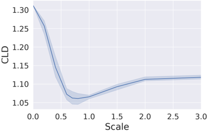
## Line Chart: CLD vs. Scale
### Overview
The image presents a line chart illustrating the relationship between "Scale" on the x-axis and "CLD" on the y-axis. A blue line represents the central tendency, and a shaded region around it indicates the variability or confidence interval. The chart shows a decreasing trend initially, followed by a leveling off and a slight increase.
### Components/Axes
* **X-axis:** Labeled "Scale", ranging from 0.0 to 3.0, with tick marks at 0.5 increments.
* **Y-axis:** Labeled "CLD", ranging from 0.0 to 1.35, with tick marks at 0.25 increments.
* **Data Series:** A single blue line representing the relationship between Scale and CLD.
* **Confidence Interval:** A light blue shaded region surrounding the blue line, representing the variability of the data.
### Detailed Analysis
The blue line starts at approximately 1.31 at Scale = 0.0. The line then exhibits a steep downward slope until approximately Scale = 0.75, where CLD reaches a minimum value of around 0.95. From Scale = 0.75 to Scale = 1.5, the line plateaus, remaining relatively constant around a CLD value of approximately 1.05. Between Scale = 1.5 and Scale = 2.0, the line shows a slight upward trend, increasing to a CLD value of around 1.12. From Scale = 2.0 to Scale = 3.0, the line remains relatively flat, hovering around a CLD value of approximately 1.12.
Here's a more detailed breakdown of approximate data points:
* Scale = 0.0, CLD ≈ 1.31
* Scale = 0.5, CLD ≈ 1.15
* Scale = 0.75, CLD ≈ 0.95
* Scale = 1.0, CLD ≈ 1.02
* Scale = 1.5, CLD ≈ 1.07
* Scale = 2.0, CLD ≈ 1.12
* Scale = 3.0, CLD ≈ 1.12
The shaded region (confidence interval) is widest around Scale = 0.5, indicating greater uncertainty in this region. It narrows as Scale increases, suggesting more consistent data points at higher Scale values.
### Key Observations
* The most significant change in CLD occurs between Scale = 0.0 and Scale = 0.75, with a substantial decrease.
* The data stabilizes after Scale = 1.5, indicating that increasing the Scale beyond this point has minimal impact on CLD.
* The confidence interval suggests higher variability in the data at lower Scale values.
### Interpretation
The chart suggests an inverse relationship between Scale and CLD, at least initially. As the Scale increases, CLD decreases, but this effect diminishes as the Scale reaches higher values. The leveling off of the curve indicates a potential saturation point, where further increases in Scale do not significantly alter CLD. The confidence interval provides a measure of the reliability of the data, with wider intervals indicating greater uncertainty.
The specific meaning of "Scale" and "CLD" is not provided in the image, but the chart suggests that "Scale" might be a parameter influencing "CLD", and there's an optimal range for "Scale" where "CLD" is relatively stable. This could represent a system where increasing a certain input ("Scale") initially improves a performance metric ("CLD"), but beyond a certain point, the improvement plateaus or even reverses. Further context about the variables would be needed to provide a more definitive interpretation.