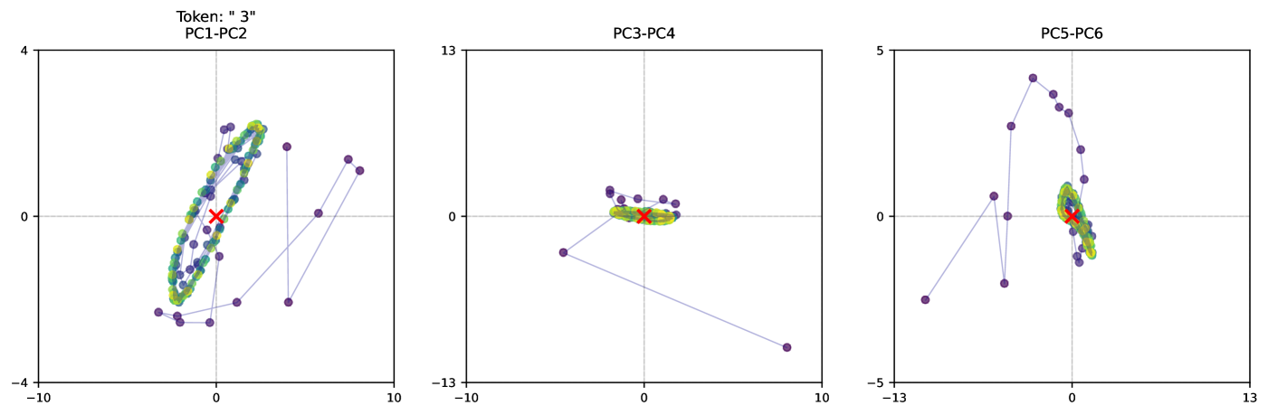
## Scatter Plot: Principal Component Analysis of Token "3"
### Overview
The image presents three scatter plots, each displaying the relationship between two principal components (PCs) derived from an unspecified dataset related to "Token: '3'". The plots show the trajectory of data points connected by lines, with a density plot overlaid near the center and a red 'X' marking the centroid. The plots are arranged horizontally, showing PC1-PC2, PC3-PC4, and PC5-PC6 respectively.
### Components/Axes
* **Titles:**
* Top-left: "Token: " 3""
* Plot 1: PC1-PC2
* Plot 2: PC3-PC4
* Plot 3: PC5-PC6
* **Axes (Plot 1: PC1-PC2):**
* X-axis: Ranges from approximately -10 to 10.
* Y-axis: Ranges from approximately -4 to 4.
* Gridlines at 0 on both axes.
* **Axes (Plot 2: PC3-PC4):**
* X-axis: Ranges from approximately -10 to 10.
* Y-axis: Ranges from approximately -13 to 13.
* Gridlines at 0 on both axes.
* **Axes (Plot 3: PC5-PC6):**
* X-axis: Ranges from approximately -13 to 13.
* Y-axis: Ranges from approximately -5 to 5.
* Gridlines at 0 on both axes.
* **Data Points:** Represented by purple dots connected by blue lines.
* **Density Plot:** A colored density plot (ranging from blue to green to yellow) is overlaid near the center of each plot, indicating the concentration of data points.
* **Centroid:** Marked by a red 'X' in each plot.
### Detailed Analysis
**Plot 1: PC1-PC2**
* **Trend:** The data points form a roughly elliptical shape, with a dense cluster near the center. The trajectory starts from the bottom-left, moves upwards and forms a loop, then extends outwards before returning to the center.
* **Data Points:**
* Initial point: Approximately (-8, -2)
* Loop center: Around (0, 0)
* Outermost point on the right: Approximately (6, 2)
* Final point: Near (0, 0)
**Plot 2: PC3-PC4**
* **Trend:** The data points are clustered more tightly around the center, with a few outliers extending outwards. The trajectory is less defined than in Plot 1.
* **Data Points:**
* Initial point: Approximately (-8, -8)
* Cluster center: Around (0, 0)
* Outermost point on the right: Approximately (8, -10)
* Final point: Near (0, 0)
**Plot 3: PC5-PC6**
* **Trend:** The data points form a partial loop, starting from the bottom-left, moving upwards and to the right, then returning towards the center.
* **Data Points:**
* Initial point: Approximately (-12, -3)
* Loop center: Around (0, 0)
* Outermost point on the top: Approximately (-2, 4)
* Final point: Near (0, 0)
### Key Observations
* All three plots have a central cluster of data points, indicated by the density plot and the centroid marker.
* The trajectories of the data points vary across the plots, suggesting different patterns of variation in the corresponding principal components.
* Plots 1 and 3 show more defined trajectories than Plot 2, indicating stronger relationships between the respective principal components.
### Interpretation
The plots visualize the relationships between different pairs of principal components for "Token: '3'". Principal components are orthogonal linear combinations of the original variables, capturing the directions of maximum variance in the data.
* **PC1-PC2 (Plot 1):** The elliptical shape suggests a strong correlation or cyclical relationship between PC1 and PC2. The data points move in a defined loop, indicating a recurring pattern in these components.
* **PC3-PC4 (Plot 2):** The tight clustering around the center suggests that PC3 and PC4 do not exhibit strong directional trends or correlations. The data points are more randomly distributed, indicating less structured variation in these components.
* **PC5-PC6 (Plot 3):** The partial loop suggests a directional trend between PC5 and PC6, but less pronounced than in Plot 1. The data points move in a curved path, indicating a relationship that is not as cyclical or strongly correlated as PC1 and PC2.
The red 'X' marks the centroid, representing the average value of the principal components. The density plots highlight the regions where the data points are most concentrated, providing further insight into the distribution of the data.
Overall, the plots provide a visual representation of the relationships between different principal components, allowing for the identification of patterns and trends in the data related to "Token: '3'". The varying shapes and distributions of the data points suggest that different pairs of principal components capture different aspects of the underlying data structure.