\n
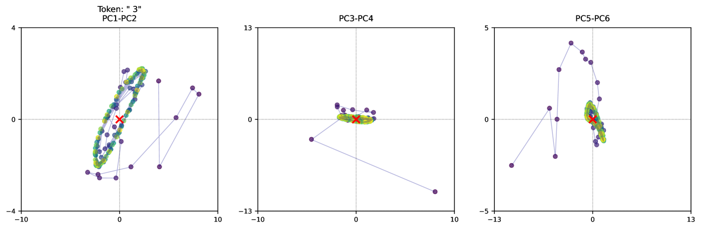
## Scatter Plots: Principal Component Analysis (PCA) Visualizations
### Overview
The image presents three scatter plots, each representing a Principal Component Analysis (PCA) projection of data. Each plot displays data points in a two-dimensional space defined by different principal components. The plots aim to visualize the variance and relationships within the data based on these components. A "Token: '3'" label is present at the top-left of the image, suggesting this data relates to a specific token or category labeled "3".
### Components/Axes
Each plot shares the following characteristics:
* **Axes:** Both the x and y axes range from approximately -10 to 10 (PC1-PC2), -13 to 10 (PC3-PC4), and -13 to 13 (PC5-PC6). The axes are labeled with the corresponding principal component numbers (e.g., PC1, PC2, PC3, etc.).
* **Data Points:** Each plot contains a cluster of purple data points.
* **Mean Indicator:** A red 'x' marks the mean of the data points in each plot.
* **Connecting Lines:** Thin, light-blue lines connect consecutive data points in a sequential manner within each plot.
* **Ellipses:** A green ellipse is drawn around the cluster of purple data points in each plot, likely representing the standard deviation or confidence interval.
### Detailed Analysis or Content Details
**Plot 1: PC1-PC2**
* **Trend:** The data points form a roughly elliptical shape, concentrated around the origin (0,0). The connecting lines show a cyclical pattern, suggesting a potential ordering or trajectory within the data.
* **Data Points:** The points are distributed between approximately -3 and 4 on the y-axis and -10 to 10 on the x-axis.
* **Mean:** The mean is located at approximately (0, 0).
**Plot 2: PC3-PC4**
* **Trend:** The data points are more dispersed than in the first plot, forming a less defined elliptical shape. The connecting lines show a more linear trend, with a slight downward slope.
* **Data Points:** The points are distributed between approximately -2 and 2 on the y-axis and -10 to 10 on the x-axis.
* **Mean:** The mean is located at approximately (0, 0).
**Plot 3: PC5-PC6**
* **Trend:** The data points are more vertically oriented, with a wider spread along the y-axis. The connecting lines show a more complex pattern, with some points extending further along the y-axis.
* **Data Points:** The points are distributed between approximately -5 and 5 on the y-axis and -10 to 13 on the x-axis.
* **Mean:** The mean is located at approximately (0, 0).
### Key Observations
* The mean of the data is consistently near the origin (0,0) for all three PCA projections.
* The spread of the data varies across the different principal component pairs. PC5-PC6 shows the largest spread along the y-axis, indicating greater variance in that component.
* The connecting lines suggest an underlying order or trajectory within the data, which is more pronounced in the first plot.
### Interpretation
These PCA plots are used to reduce the dimensionality of the data while preserving the most important variance. Each plot represents a different projection of the data onto a pair of principal components. The "Token: '3'" label suggests that these plots specifically represent the PCA results for data associated with token "3".
The varying spread of the data points across the different plots indicates that different principal components capture different amounts of variance in the data. The elliptical shapes suggest that the data is relatively well-clustered in each projection, but the shape and orientation of the ellipses vary, indicating different relationships between the variables.
The connecting lines provide additional information about the data, suggesting an underlying order or trajectory. This could be useful for identifying patterns or trends in the data. The consistent location of the mean near the origin suggests that the data is centered around a common point in the principal component space.
The plots demonstrate how the data associated with token "3" is distributed across different dimensions of variance, as captured by the principal components. This information can be used to understand the underlying structure of the data and to identify potential relationships between the variables.