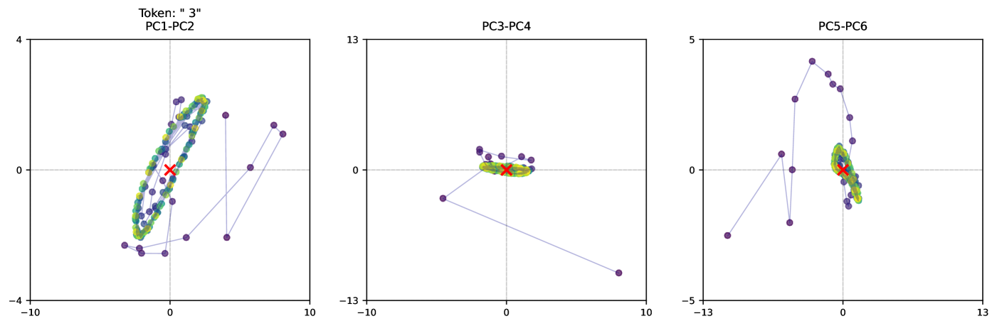
## Scatter Plots: Token "3" PCA Analysis (PC1-PC6)
### Overview
The image contains three scatter plots visualizing principal component analysis (PCA) of a dataset labeled "Token: '3'". Each plot represents a pair of principal components (PC1-PC2, PC3-PC4, PC5-PC6) with data points colored by category (green, yellow, blue, purple) and a red cross marker. Lines connect points in some plots, suggesting relationships or transitions.
---
### Components/Axes
1. **Axes Labels**:
- **Plot 1 (PC1-PC2)**: X-axis labeled "PC1", Y-axis labeled "PC2"
- **Plot 2 (PC3-PC4)**: X-axis labeled "PC3", Y-axis labeled "PC4"
- **Plot 3 (PC5-PC6)**: X-axis labeled "PC5", Y-axis labeled "PC6"
2. **Legend**:
- Colors: Green, Yellow, Blue, Purple (no explicit labels provided)
- Position: Top of each plot
3. **Markers**:
- Red cross (✖) in all plots, centrally located
- Purple dots with connecting lines in Plot 1 and 3
4. **Axis Ranges**:
- PC1-PC2: X: -10 to 10, Y: -4 to 4
- PC3-PC4: X: -10 to 10, Y: -13 to 13
- PC5-PC6: X: -13 to 13, Y: -5 to 5
---
### Detailed Analysis
#### Plot 1 (PC1-PC2)
- **Data Points**:
- Green/yellow cluster: Concentrated near (0, 0) with spread ~±3 on both axes
- Purple points: Scattered, with one point at (-8, -4) and another at (8, 4)
- **Lines**: Connect purple points in a diagonal pattern from (-8, -4) to (8, 4)
- **Red Cross**: At (0, 0), overlapping the green/yellow cluster
#### Plot 2 (PC3-PC4)
- **Data Points**:
- Green/yellow cluster: Tightly grouped near (0, 0) with spread ~±2 on both axes
- Purple points: Scattered, with one point at (-10, -10) and another at (10, 10)
- **Lines**: Connect purple points in a diagonal pattern from (-10, -10) to (10, 10)
- **Red Cross**: At (0, 0), overlapping the green/yellow cluster
#### Plot 3 (PC5-PC6)
- **Data Points**:
- Green/yellow cluster: Concentrated near (0, 0) with spread ~±3 on both axes
- Purple points: Scattered, with one point at (-12, -5) and another at (12, 5)
- **Lines**: Connect purple points in a diagonal pattern from (-12, -5) to (12, 5)
- **Red Cross**: At (0, 0), overlapping the green/yellow cluster
---
### Key Observations
1. **Central Red Cross**: Consistently positioned at (0, 0) across all plots, suggesting a reference point (e.g., mean or centroid).
2. **Cluster Density**:
- Green/yellow clusters are tightly grouped in all plots, indicating high similarity within this category.
- Purple points are dispersed, suggesting greater variability or outliers.
3. **Line Patterns**: Diagonal lines in Plots 1 and 3 imply a linear relationship between extreme purple points.
4. **Axis Scaling**: PC5-PC6 has the widest axis range (±13), indicating greater variance in these components.
---
### Interpretation
1. **Data Structure**:
- The red cross likely represents a central value (e.g., mean or median) for the token "3" across all principal components.
- Green/yellow clusters suggest a dominant subgroup with minimal variance, while purple points represent outliers or distinct categories.
2. **Dimensional Relationships**:
- PC1-PC2 and PC5-PC6 show similar cluster patterns, implying these components capture related variance.
- PC3-PC4 has a tighter cluster, suggesting this component pair explains less variability.
3. **Line Significance**:
- Diagonal lines may indicate transitions or dependencies between extreme values (e.g., high PC1 ↔ high PC2).
4. **Anomalies**:
- Purple points at plot edges (e.g., (-12, -5) in PC5-PC6) could represent rare or extreme cases in the dataset.
---
### Conclusion
The PCA visualization reveals a clear separation between a central cluster (green/yellow) and dispersed outliers (purple). The red cross serves as a reference for interpreting deviations. The consistent diagonal line patterns across plots suggest systematic relationships between principal components, warranting further investigation into the underlying data structure.