## Diagram: Design-to-Code Workflow (Mobile App UI)
### Overview
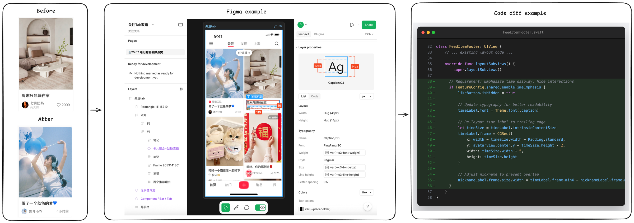
The image illustrates a three-stage workflow for a mobile app UI design and implementation: **Before** (original UI), **Figma example** (design tool), and **Code diff example** (code changes). It shows how a UI design in Figma is translated into code modifications, with a focus on post content and layout adjustments.
### Components/Axes
The diagram is divided into three panels:
#### 1. Left Panel: *Before/After* (Mobile App Screens)
- **Top (Before)**: A mobile app screen with a post:
- Image: Living room interior.
- Text: *“周末只想赖在家”* (Weekend just want to stay at home).
- Username: *“七月奶奶”* (July Grandma).
- Timestamp: *“2天前”* (2 days ago).
- Likes: *“2009”*.
- **Bottom (After)**: A mobile app screen with a post:
- Image: Person with blue balloons.
- Text: *“做了一个蓝色的梦💙”* (Made a blue dream💙).
- Username: *“酒井小乔”* (Sakai Xiaoqiao).
- Timestamp: *“4小时前”* (4 hours ago).
#### 2. Middle Panel: *Figma example* (Design Tool Interface)
- **Left Sidebar**:
- Project: *“关注Tab改造”* (Follow Tab Renovation), *“关注关系”* (Follow Relationship).
- Pages: *“25.07 笔记封面去点赞”* (25.07 Note Cover Remove Likes).
- Layers: *“关注tab”* (Follow tab), *“Rectangle 11115319”*, *“双列”* (Double column), *“列”* (Column), *“笔记”* (Note), *“卡片聚合-合集/直播”* (Card Aggregation - Collection/Live), *“Frame 2053141301”*, *“两个推荐理由”* (Two Recommendation Reasons), *“无头像气泡”* (No Avatar Bubble), *“Component / Bar / Tab”*, *“导航栏”* (Navigation Bar).
- **Center (Mobile App Design)**:
- Tabs: *“关注”* (Follow), *“发现”* (Discover), *“上海”* (Shanghai), search icon.
- Posts: *“做了一个蓝色的梦💙”*, *“周末只想赖在家”*, *“叮咚~小猫邀您一起喝下午茶🍵”* (Dingdong~ Little cat invites you to drink afternoon tea🍵), *“叮咚,你的福到啦🧧”* (Dingdong, your fortune is here🧧).
- Bottom Nav: *“首页”* (Home), *“热门”* (Hot), *“+”*, *“消息”* (Messages), *“我”* (Me).
- **Right Sidebar**:
- Layer properties: *“Caption/C3”*, Layout (Width: *“Hug (41px)”*, Height: *“Hug (14px)”*).
- Typography: Font *“PingFang SC”*, Weight *“var(--c3-font-weight)”*, Style *“Regular”*, Size *“var(--c3-font-size)”*, Line height *“var(--c3-line-height)”*, Letter spacing *“0%”*.
- Colors: Hex, Text colors *“var(--placeholder)”*.
#### 3. Right Panel: *Code diff example* (Swift Code Editor)
- **File**: `FeedItemFooter.swift` (class `FeedItemFooter: UIView`).
- **Code Changes** (lines 32–53):
- `layoutSubviews()` method:
- Hide `likeButton` (if `FeatureConfig.shared.enableTimeEmphasis` is true).
- Update `timeLabel` font to `Theme.font(.caption)`.
- Re-layout `timeLabel` to the trailing edge (x: `width - timeSize.width - Padding.standard`, y: `avatarView.center.y - timeSize.height / 2`).
- Adjust `nicknameLabel` width to prevent overlap with `timeLabel`.
### Detailed Analysis
- **UI Evolution**: The “Before/After” panels show a change in post content (image, text, user, timestamp), indicating a UI update (e.g., new post or design refresh).
- **Figma Design**: The Figma panel details the design structure (layers, components) and properties (layout, typography) for the mobile app, ensuring consistency between design and development.
- **Code Implementation**: The code diff shows Swift code changes to adjust UI elements (time label, like button, nickname label) for better readability and layout, aligning with the Figma design.
### Key Observations
- **Design-to-Code Alignment**: The Figma design (middle panel) and code changes (right panel) are tightly coupled, with code implementing design specifications (e.g., typography, layout).
- **UI Refinement**: The code focuses on enhancing time display and preventing UI overlap, indicating a focus on user experience and readability.
- **Content Variation**: The “Before/After” panels show different post content, suggesting a dynamic UI (e.g., new posts or feature updates).
### Interpretation
This diagram demonstrates a typical **design-to-code workflow** for mobile app development:
1. **Design Phase**: Figma is used to create and refine the UI (layers, components, properties), defining visual and structural specifications.
2. **Implementation Phase**: Code changes (Swift) translate the design into functional UI, adjusting layout, typography, and interactions.
3. **UI Evolution**: The “Before/After” shows how post content (images, text, users) changes, likely due to design updates or feature enhancements.
The workflow highlights the importance of design tools (Figma) in defining UI specifications and how code implements those specifications, ensuring consistency between design and development. The code changes focus on improving time display and preventing overlap, emphasizing user experience and readability.
*(Note: All Chinese text is transcribed directly, with English translations provided for clarity.)*