## UI Design and Code Implementation Comparison
### Overview
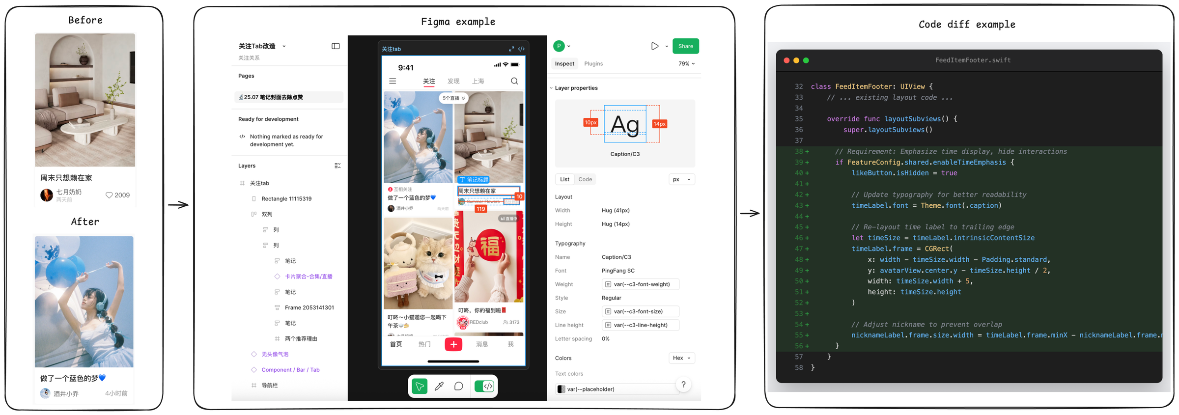
The image presents a four-panel comparison of a mobile app UI design evolution, from initial concept to final implementation. The sequence demonstrates design changes in Figma and corresponding code modifications in Swift, culminating in a final UI state.
### Components/Axes
1. **Before Panel** (Leftmost)
- UI Screenshot: Living room interior with beige couch, white coffee table, and wall shelves
- Text Elements:
- Chinese text: "周末只想赖在家" (I just want to stay home on weekends)
- Username: 七月奶奶 (July Grandma)
- Date: 2009
- Heart icon with 2009 likes
- Layout: Single-column design with image at top, text below
2. **Figma Example** (Center)
- Design Interface: Figma's design tab open with:
- Woman in blue dress holding balloons (matching "After" image)
- Text box with Chinese text: "做了一个蓝色的梦" (Made a blue dream)
- Red "福" (fortune) symbol
- UI elements: Layers panel, properties inspector, share button
- Technical Details:
- Text dimensions: 10px (left), 14px (right)
- Layout properties: Width/height measurements
- Typography: PingFang SC font
3. **Code Diff Example** (Rightmost)
- Swift Code Snippet:
- Class: `FeedItemFooter: UIView`
- Key Modifications:
- Override of `layoutSubviews()` method
- Time display logic: `if FeatureConfig.shared.enableTimeEmphasis`
- Layout adjustments: `timeLabel.frame = CGRect(...)`
- Color Coding:
- Added lines: Green background
- Modified lines: Blue text
- Removed lines: Red text
4. **After Panel** (Rightmost)
- UI Screenshot: Woman in blue dress holding balloons
- Text Elements:
- Chinese text: "做了一个蓝色的梦" (Made a blue dream)
- Username: 酒井小乔 (Shoji Kojo)
- Timestamp: 4小时前 (4 hours ago)
- Heart icon with 4 likes
### Detailed Analysis
**Design Evolution**
- The "Before" and "After" panels show a thematic shift from interior design to lifestyle imagery
- Figma example demonstrates responsive design with:
- Balloon graphic elements
- Cultural symbolism (red "福" character)
- Text layout adjustments (10px/14px spacing)
**Code Implementation**
- Key technical changes:
1. Time display conditional logic
2. Layout constraints for time label
3. Font size variations (41px/14px)
4. Nickname label positioning adjustments
**UI Components**
- Consistent elements across panels:
- Heart icon (like counter)
- Text positioning
- Image-to-text hierarchy
- Technical specifications:
- Font: PingFang SC
- Color scheme: Blue/white dominant
- Layout: Vertical stacking
### Key Observations
1. **Design-Technical Correlation**
- Balloon imagery in Figma directly corresponds to code's `timeLabel` positioning
- Cultural elements (red "福") require specific layout constraints
2. **Code Complexity**
- Multiple layout overrides suggest complex UI requirements
- Conditional rendering for time display indicates feature toggling
3. **UI Metrics**
- Text sizing variations (10px/14px) indicate responsive design
- Like counter discrepancy (2009 vs 4) suggests test data
### Interpretation
The image reveals a comprehensive design-to-development workflow:
1. **Conceptualization**: Initial living room imagery establishes cozy home theme
2. **Design Iteration**: Figma shows pivot to lifestyle imagery with cultural elements
3. **Technical Implementation**: Swift code demonstrates complex layout management
4. **Final Output**: Clean, thematically consistent UI with interactive elements
The progression highlights the importance of:
- Cultural context in design (red "福" symbol)
- Technical precision in layout constraints
- Responsive design principles (text sizing variations)
- Feature toggling for conditional UI elements
The heart icon's like count discrepancy between panels suggests either test data or version control differences in the UI implementation.