## Line Chart: Success Rate vs. Average Inference Count per Episode
### Overview
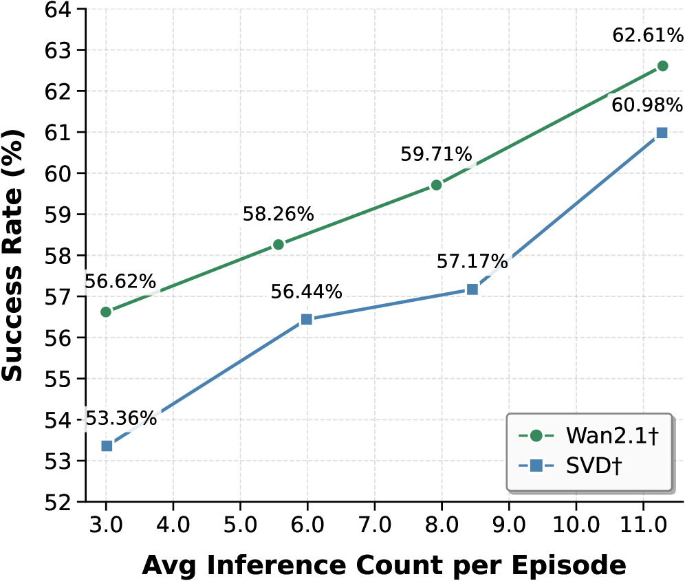
The image is a line chart comparing the performance of two methods, labeled "Wan2.1†" and "SVD†", by plotting their Success Rate (%) against the Average Inference Count per Episode. The chart demonstrates a positive correlation between the number of inferences and the success rate for both methods.
### Components/Axes
* **Chart Type:** Line chart with markers.
* **X-Axis (Horizontal):**
* **Title:** "Avg Inference Count per Episode"
* **Scale:** Linear, ranging from 3.0 to 11.0.
* **Major Tick Marks:** 3.0, 4.0, 5.0, 6.0, 7.0, 8.0, 9.0, 10.0, 11.0.
* **Y-Axis (Vertical):**
* **Title:** "Success Rate (%)"
* **Scale:** Linear, ranging from 52 to 64.
* **Major Tick Marks:** 52, 53, 54, 55, 56, 57, 58, 59, 60, 61, 62, 63, 64.
* **Legend:**
* **Placement:** Bottom-right corner of the chart area.
* **Entry 1:** A green dashed line with a circle marker, labeled "Wan2.1†".
* **Entry 2:** A blue dashed line with a square marker, labeled "SVD†".
* **Data Series & Points:**
* **Series 1 (Wan2.1† - Green line, circle markers):**
* Point 1: x ≈ 3.0, y = 56.62%
* Point 2: x ≈ 6.0, y = 58.26%
* Point 3: x ≈ 8.0, y = 59.71%
* Point 4: x ≈ 11.0, y = 62.61%
* **Series 2 (SVD† - Blue line, square markers):**
* Point 1: x ≈ 3.0, y = 53.36%
* Point 2: x ≈ 6.0, y = 56.44%
* Point 3: x ≈ 8.5, y = 57.17%
* Point 4: x ≈ 11.0, y = 60.98%
### Detailed Analysis
* **Trend Verification:**
* **Wan2.1† (Green):** The line shows a consistent, nearly linear upward slope from left to right. The rate of increase is steady across the measured range.
* **SVD† (Blue):** The line also slopes upward overall. The increase is steeper between the first two points (3.0 to 6.0), then flattens slightly between 6.0 and 8.5, before rising sharply again between 8.5 and 11.0.
* **Data Point Extraction:** All data points are explicitly labeled on the chart with their percentage values. The x-axis positions for the points are approximate based on their visual placement relative to the axis ticks.
### Key Observations
1. **Performance Gap:** The Wan2.1† method consistently achieves a higher Success Rate than the SVD† method at every comparable average inference count.
2. **Converging Trend:** The performance gap between the two methods appears to narrow slightly as the average inference count increases. At x=3.0, the gap is 3.26 percentage points (56.62% vs 53.36%). At x=11.0, the gap is 1.63 percentage points (62.61% vs 60.98%).
3. **SVD†'s Non-Linear Response:** The SVD† method shows a less uniform response to increased inferences, with a notable plateau between approximately 6.0 and 8.5 inferences per episode.
### Interpretation
The chart presents a clear performance comparison in a technical context, likely from a machine learning or AI research paper (suggested by terms like "Inference Count" and "Success Rate"). The data suggests that:
* **Resource-Performance Trade-off:** For both methods, investing more computational resources (higher average inference count per episode) yields a higher success rate. This is a common trade-off in iterative or sampling-based algorithms.
* **Method Superiority:** Wan2.1† is the more effective method under the tested conditions, providing a higher success rate for the same computational budget (inference count).
* **Algorithmic Behavior:** The differing slopes and shapes of the lines hint at underlying algorithmic differences. Wan2.1†'s steady improvement suggests a more predictable scaling behavior. SVD†'s plateau could indicate a point of diminishing returns or a phase where additional inferences provide minimal gain before another performance jump, which might be an important characteristic for system optimization. The narrowing gap at higher inference counts could imply that SVD† benefits more from very large computational budgets, though it remains inferior in the measured range.