## Line Chart: Model Performance Scores (DROP vs. ECLeKTic)
### Overview
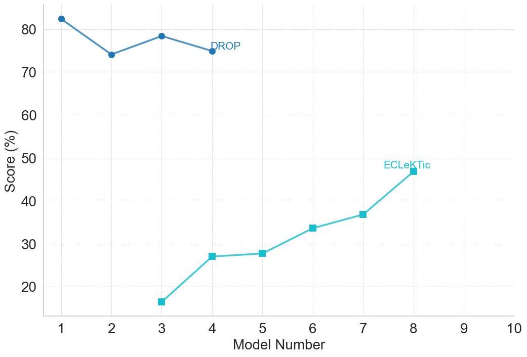
This image is a 2D line chart displaying the performance scores of two distinct evaluation metrics or datasets, labeled "DROP" and "ECLeKTic", across a sequential progression of "Model Numbers". The chart uses a minimalist design with a white background, faint gridlines, and inline labeling rather than a traditional separate legend box.
### Components/Axes
**1. Y-Axis (Vertical - Left)**
* **Label:** "Score (%)" (Rotated 90 degrees counter-clockwise, centered vertically).
* **Scale:** Linear scale.
* **Markers:** Major tick marks at 20, 30, 40, 50, 60, 70, and 80.
* **Range:** The visible axis line starts slightly below 20 (approx. 10) and ends slightly above 80 (approx. 85).
**2. X-Axis (Horizontal - Bottom)**
* **Label:** "Model Number" (Centered horizontally below the axis markers).
* **Scale:** Discrete/Sequential integer scale.
* **Markers:** 1, 2, 3, 4, 5, 6, 7, 8, 9, 10.
* **Range:** 1 to 10.
**3. Gridlines**
* Faint, light-gray, dashed lines extend from every major tick mark on both the X and Y axes, forming a complete grid to aid in reading values.
**4. Legend / Series Identifiers (Inline)**
* There is no standalone legend box. Series are identified by text placed directly adjacent to the data lines.
* **Series 1:** Dark blue text "DROP" is positioned to the right of the final data point of the dark blue line.
* **Series 2:** Light blue/cyan text "ECLeKTic" is positioned just above and to the left of the final data point of the light blue/cyan line.
---
### Detailed Analysis
#### Trend Verification & Data Extraction
**Series 1: DROP**
* **Visual Trend:** The dark blue line (with circular markers) occupies the upper portion of the chart. It begins at a high point, experiences a notable dip, recovers partially, and then dips slightly again, ending abruptly at Model 4. Overall, it remains relatively flat within the 74-83% range.
* **Data Points (Approximate values based on grid alignment):**
* Model 1: ≈ 82.5% (Positioned slightly above the 80 gridline)
* Model 2: ≈ 74.0% (Positioned just below the midway point between 70 and 80)
* Model 3: ≈ 78.5% (Positioned just below the 80 gridline)
* Model 4: ≈ 75.0% (Positioned exactly midway between 70 and 80)
**Series 2: ECLeKTic**
* **Visual Trend:** The light blue/cyan line (with square markers) occupies the lower-to-middle portion of the chart. It begins at Model 3 at a very low score and exhibits a consistent, positive upward slope through Model 8. The rate of improvement varies, with steeper climbs between Models 3-4 and Models 7-8, and a flatter plateau between Models 4-5.
* **Data Points (Approximate values based on grid alignment):**
* Model 3: ≈ 16.5% (Positioned below the 20 gridline)
* Model 4: ≈ 27.0% (Positioned above the midway point between 20 and 30)
* Model 5: ≈ 28.0% (Positioned slightly higher than Model 4, just below 30)
* Model 6: ≈ 34.0% (Positioned slightly below the midway point between 30 and 40)
* Model 7: ≈ 37.0% (Positioned above the midway point between 30 and 40)
* Model 8: ≈ 47.0% (Positioned above the midway point between 40 and 50)
#### Reconstructed Data Table
| Model Number | DROP Score (%) | ECLeKTic Score (%) |
| :--- | :--- | :--- |
| 1 | ≈ 82.5 | *No Data* |
| 2 | ≈ 74.0 | *No Data* |
| 3 | ≈ 78.5 | ≈ 16.5 |
| 4 | ≈ 75.0 | ≈ 27.0 |
| 5 | *No Data* | ≈ 28.0 |
| 6 | *No Data* | ≈ 34.0 |
| 7 | *No Data* | ≈ 37.0 |
| 8 | *No Data* | ≈ 47.0 |
| 9 | *No Data* | *No Data* |
| 10 | *No Data* | *No Data* |
---
### Key Observations
1. **Disjointed Data Ranges:** The most striking feature is the lack of continuity across the X-axis for both metrics. "DROP" is only measured for Models 1 through 4. "ECLeKTic" is only measured for Models 3 through 8.
2. **Overlap:** The only models where both scores are recorded simultaneously are Models 3 and 4.
3. **Performance Disparity:** Where they overlap (Models 3 and 4), the DROP score is vastly superior (approx. 50-60 percentage points higher) to the ECLeKTic score.
4. **Opposing Trajectories:** While DROP shows a slight overall degradation or stagnation from Model 1 to 4, ECLeKTic shows significant, continuous improvement from Model 3 to 8.
### Interpretation
* **What the data suggests:** The chart tracks the evolution of a system (likely machine learning models, given the terminology) across sequential iterations (Models 1 through 10). "DROP" appears to be an "easier" benchmark or a task the earlier models were already highly optimized for, starting at >80%. "ECLeKTic" appears to be a much more difficult benchmark, where early models (Model 3) fail significantly (<20%), but subsequent iterations show steady learning and capability gains, approaching 50% by Model 8.
* **Reading between the lines (Peircean Investigative):** The abrupt stop of the "DROP" metric at Model 4 strongly implies a shift in research or development focus. Because the models were already performing adequately on DROP (~75-80%), the developers likely deemed it a "solved" or less informative metric for future iterations. Conversely, the introduction of "ECLeKTic" at Model 3 suggests a new, harder benchmark was introduced to test capabilities that DROP could not measure. The fact that Models 9 and 10 are on the axis but have no data points suggests this chart may be a snapshot of ongoing work, or that testing for those specific models on these specific benchmarks was abandoned or is pending.