## Line Chart: mAP on OpenMIC (PaSST)
### Overview
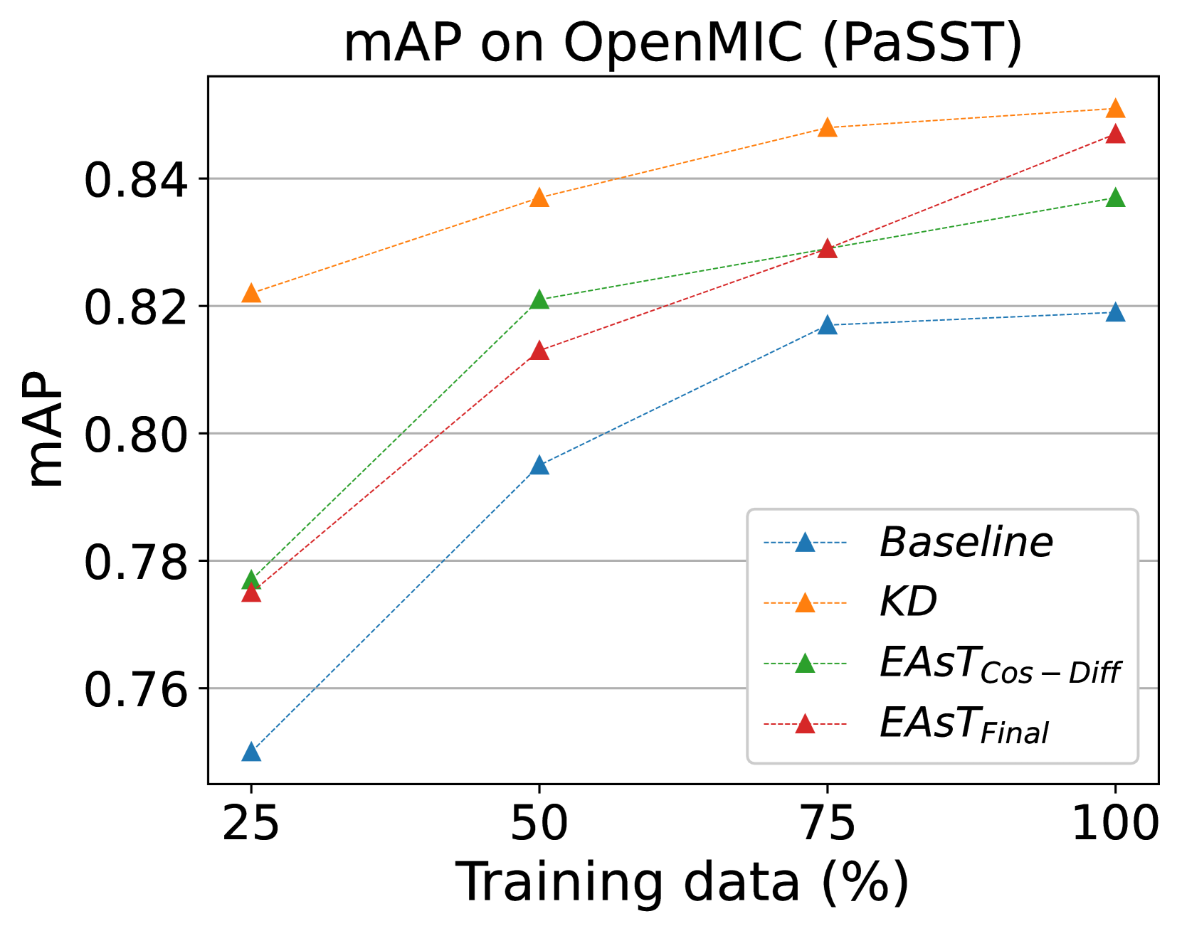
The chart illustrates the mean Average Precision (mAP) performance of four different models on the OpenMIC dataset (PaSST) as a function of training data percentage. The x-axis represents the percentage of training data used (25%, 50%, 75%, 100%), while the y-axis shows mAP values ranging from 0.76 to 0.84. Four distinct data series are plotted, each corresponding to a different model or approach.
### Components/Axes
- **X-axis**: Training data (%) with markers at 25, 50, 75, and 100.
- **Y-axis**: mAP values with increments of 0.02 (0.76, 0.78, 0.80, 0.82, 0.84).
- **Legend**: Located in the bottom-right corner, with four entries:
- **Baseline**: Blue dashed line with triangle markers.
- **KD**: Orange dotted line with triangle markers.
- **EAST_Cos – Diff**: Green dash-dot line with triangle markers.
- **EAST_Final**: Red dashed line with triangle markers.
### Detailed Analysis
1. **Baseline (Blue Dashed Line)**:
- Starts at ~0.75 mAP at 25% training data.
- Increases steadily to ~0.79 at 50%, ~0.82 at 75%, and plateaus at ~0.82 at 100%.
2. **KD (Orange Dotted Line)**:
- Begins at ~0.82 mAP at 25%.
- Rises consistently to ~0.84 at 50%, ~0.85 at 75%, and stabilizes at ~0.85 at 100%.
3. **EAST_Cos – Diff (Green Dash-Dot Line)**:
- Starts at ~0.78 mAP at 25%.
- Increases to ~0.82 at 50%, ~0.83 at 75%, and reaches ~0.84 at 100%.
4. **EAST_Final (Red Dashed Line)**:
- Begins at ~0.77 mAP at 25%.
- Shows the steepest growth, reaching ~0.81 at 50%, ~0.83 at 75%, and surpasses all others at ~0.85 at 100%.
### Key Observations
- All models improve mAP as training data increases, with diminishing returns observed at higher data percentages.
- **EAST_Final** outperforms other methods at 100% training data.