## Heatmap Series: Algorithm Performance Across Parameter Space
### Overview
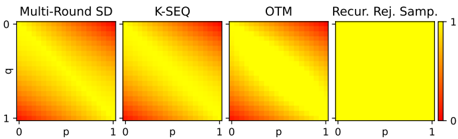
The image displays a series of four horizontally arranged heatmaps, each visualizing the performance or output of a different algorithm or method across a two-dimensional parameter space defined by variables `p` and `q`. A shared color scale on the right indicates the value magnitude.
### Components/Axes
* **Chart Type:** Four separate heatmaps (2D color plots) arranged in a single row.
* **Titles (Top of each subplot, left to right):**
1. `Multi-Round SD`
2. `K-SEQ`
3. `OTM`
4. `Recur. Rej. Samp.` (Likely abbreviation for "Recursive Rejection Sampling")
* **Axes (Identical for all four subplots):**
* **X-axis Label:** `p` (positioned below each subplot).
* **X-axis Scale:** Linear scale from `0` to `1`, with tick marks at 0 and 1.
* **Y-axis Label:** `q` (positioned to the left of the first subplot, implied for others).
* **Y-axis Scale:** Linear scale from `0` to `1`, with tick marks at 0 and 1. The axis is inverted, with `0` at the top and `1` at the bottom.
* **Color Bar/Legend (Far right):**
* A vertical bar showing the color gradient mapping.
* **Scale:** Linear from `0` (bottom) to `1` (top).
* **Color Mapping:** `0` corresponds to a deep red, transitioning through orange to bright yellow at `1`.
* **Label:** The numbers `0` and `1` are placed at the bottom and top of the bar, respectively.
### Detailed Analysis
Each heatmap represents a function `f(p, q)` where the color at coordinate `(p, q)` indicates the output value.
1. **Multi-Round SD:**
* **Trend:** Shows a strong diagonal gradient. The lowest values (deep red) are concentrated in the bottom-left corner (`p≈0, q≈1`). Values increase smoothly towards the top-right corner (`p≈1, q≈0`), which is bright yellow (value ≈1). The gradient appears roughly linear along the anti-diagonal.
* **Data Points (Approximate):**
* `(p=0, q=1)`: Value ≈ 0 (Red)
* `(p=0.5, q=0.5)`: Value ≈ 0.5 (Orange)
* `(p=1, q=0)`: Value ≈ 1 (Yellow)
2. **K-SEQ:**
* **Trend:** Very similar diagonal gradient to Multi-Round SD. Low values (red) at bottom-left (`p≈0, q≈1`), high values (yellow) at top-right (`p≈1, q≈0`). The transition zone (orange) may be slightly broader or differently shaped compared to the first plot, but the overall pattern is consistent.
* **Data Points (Approximate):** Follows the same pattern as Multi-Round SD.
3. **OTM:**
* **Trend:** Again, a strong diagonal gradient matching the pattern of the first two. Red at bottom-left (`p≈0, q≈1`), yellow at top-right (`p≈1, q≈0`). The visual similarity suggests these three methods (`Multi-Round SD`, `K-SEQ`, `OTM`) have comparable performance characteristics across this parameter space.
* **Data Points (Approximate):** Follows the same pattern as Multi-Round SD.
4. **Recur. Rej. Samp.:**
* **Trend:** This heatmap is fundamentally different. It is almost uniformly bright yellow across the entire domain, indicating a value very close to `1` for nearly all combinations of `p` and `q`. There is a very faint, small region of slightly darker orange/red at the extreme bottom-left corner (`p≈0, q≈1`), suggesting a minor drop in value only at that specific point.
* **Data Points (Approximate):**
* `(p=0, q=1)`: Value ≈ 0.8-0.9 (Orange-Yellow, slight uncertainty due to faint color)
* All other `(p, q)` points: Value ≈ 1 (Yellow)
### Key Observations
1. **Two Distinct Patterns:** The four methods split into two clear groups. `Multi-Round SD`, `K-SEQ`, and `OTM` exhibit nearly identical diagonal performance gradients. `Recur. Rej. Samp.` shows near-perfect, uniform performance.
2. **Parameter Sensitivity:** The first three methods are highly sensitive to both parameters `p` and `q`, with performance degrading as `p` decreases and `q` increases simultaneously. The fourth method is largely insensitive to these parameters.
3. **Spatial Grounding:** The legend (color bar) is positioned to the right of all subplots, confirming the shared scale. The axis labels (`p`, `q`) are consistently placed. The critical low-performance region for the first three methods is consistently the bottom-left corner of each subplot.
### Interpretation
This visualization likely compares the success rate, accuracy, or efficiency of different sequential decision-making or sampling algorithms as a function of two underlying probability or difficulty parameters (`p` and `q`).
* **What the data suggests:** The algorithms `Multi-Round SD`, `K-SEQ`, and `OTM` appear to be variants of a similar approach, as their performance profiles are nearly indistinguishable. Their success depends on a favorable combination of `p` and `q` (high `p`, low `q`). In contrast, `Recursive Rejection Sampling` is robust and maintains near-optimal performance across almost the entire parameter space, indicating it may be a more reliable or general-purpose method, albeit potentially at a different computational cost (which this chart does not show).
* **Notable Anomaly:** The uniform high performance of `Recur. Rej. Samp.` is the most striking feature. It suggests this method's effectiveness is not constrained by the trade-off between `p` and `q` that limits the others. The very slight dip at `(0,1)` might represent a theoretical worst-case scenario that is rarely encountered.
* **Underlying Message:** The chart makes a visual argument for the superiority or robustness of the `Recursive Rejection Sampling` method over the other three presented, given the defined parameters `p` and `q`. It demonstrates that while the first three methods have a clear "sweet spot" and failure modes, the fourth operates effectively in nearly all conditions within the tested bounds.