## Bar Chart: Test Accuracy vs. Width Variation
### Overview
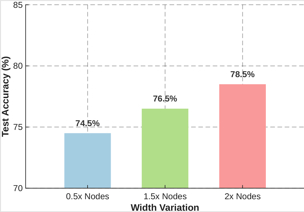
The image is a bar chart comparing test accuracy (%) across three width variations of a model: 0.5x Nodes, 1.5x Nodes, and 2x Nodes. The y-axis represents test accuracy (%), ranging from 70% to 85%, while the x-axis categorizes the width variations. Each bar is color-coded (blue, green, red) and labeled with its corresponding accuracy percentage.
### Components/Axes
- **X-axis (Width Variation)**:
- Labels: "0.5x Nodes", "1.5x Nodes", "2x Nodes"
- Position: Bottom of the chart, centered under each bar.
- **Y-axis (Test Accuracy %)**:
- Labels: "70", "75", "80", "85" (with dashed gridlines at 75% and 80%).
- Position: Left side of the chart, vertical.
- **Legend**:
- Not explicitly visible in the image. However, the color coding (blue, green, red) is directly tied to the x-axis categories.
- **Bars**:
- Three vertical bars, each representing a width variation.
- Colors:
- 0.5x Nodes: Blue
- 1.5x Nodes: Green
- 2x Nodes: Red
### Detailed Analysis
- **0.5x Nodes**:
- Test Accuracy: 74.5% (blue bar).
- Position: Leftmost bar, slightly below the 75% gridline.
- **1.5x Nodes**:
- Test Accuracy: 76.5% (green bar).
- Position: Middle bar, between 75% and 80% gridlines.
- **2x Nodes**:
- Test Accuracy: 78.5% (red bar).
- Position: Rightmost bar, near the 80% gridline.
### Key Observations
1. **Increasing Accuracy with Width**:
- Test accuracy rises consistently as the number of nodes increases:
- 0.5x → 1.5x: +2.0% (74.5% → 76.5%)
- 1.5x → 2x: +2.0% (76.5% → 78.5%)
2. **Color Coding**:
- The progression from blue (lowest) to red (highest) visually reinforces the trend.
3. **Gridlines**:
- Dashed lines at 75% and 80% help contextualize the accuracy values.
### Interpretation
The data demonstrates a **linear relationship** between model width (number of nodes) and test accuracy. Each incremental increase in nodes (from 0.5x to 2x) correlates with a 2% improvement in accuracy. This suggests that expanding the model's width enhances performance, though the marginal gains appear consistent across the range.
**Notable Insights**:
- The 2x Nodes configuration achieves the highest accuracy (78.5%), indicating that larger models may be more effective for this task.
- The absence of a legend implies that the color coding is directly tied to the x-axis labels, simplifying interpretation.
- The chart does not show diminishing returns, but with only three data points, further analysis would be needed to confirm trends beyond this range.
**Technical Implications**:
- The results could inform decisions about model scaling, balancing computational costs (more nodes) against performance gains.
- The consistent 2% improvement per node increment suggests a predictable relationship, which could be leveraged for resource allocation in training or deployment.