# Technical Document Extraction: Machine Learning Training Loss Plot
## 1. Component Isolation
* **Header:** None.
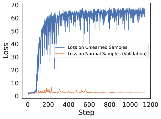
* **Main Chart Area:** A line graph plotting "Loss" against "Step" for two distinct data series.
* **Legend:** Located in the center-right of the plot area (approximate spatial coordinates [x=0.65, y=0.55] relative to the plot frame).
* **Axes:**
* **Y-axis (Vertical):** Representing "Loss".
* **X-axis (Horizontal):** Representing "Step".
## 2. Axis and Label Extraction
| Axis | Title | Markers |
| :--- | :--- | :--- |
| **Y-Axis** | Loss | 0, 10, 20, 30, 40, 50, 60, 70 |
| **X-Axis** | Step | 0, 200, 400, 600, 800, 1000, 1200 |
## 3. Legend and Data Series Identification
The legend contains two entries:
1. **Blue Line:** "Loss on Unlearned Samples"
2. **Orange/Brown Line:** "Loss on Normal Samples (Validation)"
## 4. Trend Verification and Data Analysis
### Series A: Loss on Unlearned Samples (Blue Line)
* **Visual Trend:** The line starts at a very low value (near 0-2) and remains flat until approximately Step 100. Between Step 100 and Step 300, it exhibits a sharp, volatile upward slope. From Step 300 to Step 1150, the line plateaus at a high value with significant high-frequency oscillation (noise).
* **Key Data Points:**
* **Steps 0 - 80:** Loss is stable and low, approximately 2.0.
* **Step 100:** Rapid ascent begins.
* **Step 200:** Reaches approximately 40.0, with downward spikes hitting 10.0.
* **Step 400:** Reaches a mean plateau of approximately 60.0.
* **Steps 600 - 1150:** Fluctuates rapidly between 55.0 and 68.0.
### Series B: Loss on Normal Samples (Validation) (Orange/Brown Line)
* **Visual Trend:** This line remains consistently low throughout the entire duration. It shows minor volatility (small peaks) between Step 100 and Step 600, after which it becomes extremely stable and flat.
* **Key Data Points:**
* **Steps 0 - 100:** Loss is approximately 3.0.
* **Steps 100 - 600:** Periodic small spikes occur, reaching a maximum of approximately 7.0 (around Step 250).
* **Steps 600 - 1150:** The line stabilizes almost perfectly at a value of approximately 3.0.
## 5. Comparative Summary
The chart illustrates a machine learning process (likely "Machine Unlearning") where the model is being forced to forget specific data.
* The **Unlearned Samples (Blue)** show a massive increase in loss, indicating the model is successfully losing its ability to predict those specific samples correctly.
* The **Normal Samples (Orange)** maintain a low and stable loss, indicating that the model's general performance and accuracy on standard validation data remain intact despite the unlearning process occurring on other samples.