## Line Chart: Language Model Loss Scaling Projections
### Overview
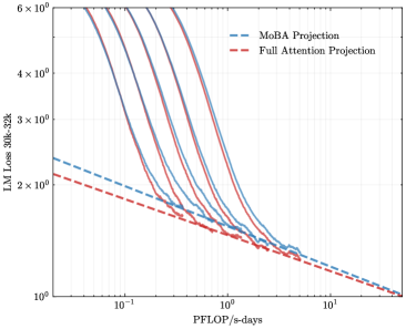
The image is a log-log line chart comparing the projected loss of a 30-billion parameter language model with a 32k context window ("LM Loss 30B-32k") against computational effort measured in "PFLOP/s-days". It displays multiple solid-line data series and two dashed-line projection models, illustrating scaling laws and efficiency comparisons.
### Components/Axes
* **Chart Type:** Log-Log Line Chart.
* **Y-Axis (Vertical):**
* **Label:** `LM Loss 30B-32k`
* **Scale:** Logarithmic, base 10.
* **Range & Ticks:** From `10^0` (1) to `6 x 10^0` (6). Major ticks are at 1, 2, 3, 4, 5, 6.
* **X-Axis (Horizontal):**
* **Label:** `PFLOP/s-days`
* **Scale:** Logarithmic, base 10.
* **Range & Ticks:** From `10^-1` (0.1) to `10^1` (10). Major ticks are at 0.1, 1, 10.
* **Legend:**
* **Position:** Top-right corner of the chart area.
* **Items:**
1. `McBA Projection` - Represented by a blue dashed line (`--`).
2. `Full Attention Projection` - Represented by a red dashed line (`--`).
* **Data Series (Solid Lines):** There are approximately 7-8 solid lines in various colors (including shades of purple, blue, green, and orange/brown). These are not individually labeled in the legend and likely represent empirical training runs or different model configurations.
### Detailed Analysis
* **Trend Verification:** All lines, both solid and dashed, exhibit a consistent downward slope from left to right. This indicates that as computational effort (PFLOP/s-days) increases, the language model loss decreases.
* **Projection Lines (Dashed):**
* The **red dashed line (Full Attention Projection)** starts at a loss value of approximately **2.2** at 0.1 PFLOP/s-days and slopes downward, ending near a loss of **1.0** at 10 PFLOP/s-days.
* The **blue dashed line (McBA Projection)** starts higher, at a loss of approximately **2.5** at 0.1 PFLOP/s-days. It has a steeper initial slope than the red line, crossing below it around 1-2 PFLOP/s-days, and converges to a similar final loss value near **1.0** at 10 PFLOP/s-days.
* **Empirical Data Lines (Solid):**
* The solid lines are clustered between the two projection lines at lower compute values (left side of the chart).
* They show a steeper descent than the projection lines in the mid-range (0.5 to 5 PFLOP/s-days).
* As compute increases towards 10 PFLOP/s-days, all solid lines converge tightly with each other and with the two projection lines, ending in a narrow band between loss values of approximately **1.0 and 1.1**.
* **Spatial Grounding:** The legend is placed in the top-right, avoiding overlap with the data. The most significant separation between the two projection lines occurs in the top-left quadrant of the chart (low compute, high loss). The convergence of all lines happens in the bottom-right quadrant (high compute, low loss).
### Key Observations
1. **Convergence at Scale:** The most prominent pattern is the convergence of all data series and both projection models at the high-compute end of the chart (~10 PFLOP/s-days). This suggests that with sufficient computational resources, the predicted performance of different methods becomes very similar.
2. **Initial Efficiency Difference:** The McBA Projection (blue dashed) predicts worse performance (higher loss) than the Full Attention Projection (red dashed) at lower compute budgets. However, its steeper slope suggests it may scale more efficiently, eventually matching Full Attention performance.
3. **Empirical vs. Projected:** The solid empirical lines generally fall between the two projections at low compute but align more closely with the Full Attention Projection trend as compute increases. They demonstrate a faster rate of improvement (steeper slope) in the mid-range than either projection model alone.
4. **Log-Log Linearity:** The relationships appear approximately linear on this log-log scale, which is characteristic of power-law scaling relationships commonly observed in neural network training.
### Interpretation
This chart visualizes a core question in AI scaling research: how do different architectural or training approaches compare in their efficiency and ultimate performance as compute increases?
* **What the data suggests:** The data indicates that while there may be measurable efficiency differences between methods (like "McBA" vs. "Full Attention") at smaller scales, these differences diminish as the computational budget grows very large. The ultimate performance ceiling, as measured by loss, appears to be similar for the approaches shown.
* **Relationship between elements:** The solid lines represent actual or simulated training outcomes. The dashed lines are theoretical scaling laws fitted to predict performance. The chart tests these predictions against the data. The close alignment at high compute validates the projections' asymptotic predictions, while the divergence at low compute highlights the challenge of extrapolating scaling laws across different regimes.
* **Notable implications:** The convergence implies that for sufficiently large models trained with massive compute, the choice between these specific methods may become less critical for final loss. However, the initial gap is significant for resource-constrained training, where the Full Attention Projection appears more favorable. The steeper slope of the empirical data suggests real-world training might benefit from factors not fully captured by either simplified projection model.