\n
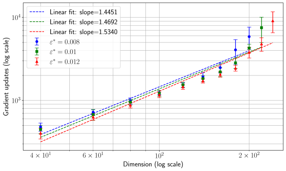
## Chart: Gradient Updates vs. Dimension (Log Scale)
### Overview
The image presents a chart illustrating the relationship between gradient updates (on a logarithmic scale) and dimension (also on a logarithmic scale). Three different data series are plotted, each representing a different value of ε* (epsilon star). Each data point includes error bars, and linear fits are shown for each series.
### Components/Axes
* **X-axis:** Dimension (log scale), ranging from approximately 4 x 10¹ to 2 x 10². Axis markers are at 40, 60, 100, and 200.
* **Y-axis:** Gradient updates (log scale), ranging from approximately 10³ to 10⁴. Axis markers are at 1000 and 10000.
* **Legend:** Located in the top-left corner.
* Blue line with circular markers: ε* = 0.008, Linear fit: slope = 1.4451
* Green line with triangular markers: ε* = 0.01, Linear fit: slope = 1.4692
* Red line with inverted triangular markers: ε* = 0.012, Linear fit: slope = 1.5340
* **Grid:** A grid is present on the chart to aid in reading values.
### Detailed Analysis
The chart displays three data series, each showing an upward trend. The trend is approximately linear, as indicated by the linear fit lines. Error bars are present for each data point, indicating the uncertainty in the measurements.
**Data Series 1 (ε* = 0.008 - Blue):**
* At Dimension = 40, Gradient Updates ≈ 1800 (with error bars extending roughly from 1500 to 2100).
* At Dimension = 60, Gradient Updates ≈ 2600 (with error bars extending roughly from 2200 to 3000).
* At Dimension = 100, Gradient Updates ≈ 4000 (with error bars extending roughly from 3500 to 4500).
* At Dimension = 200, Gradient Updates ≈ 7500 (with error bars extending roughly from 6500 to 8500).
**Data Series 2 (ε* = 0.01 - Green):**
* At Dimension = 40, Gradient Updates ≈ 2000 (with error bars extending roughly from 1700 to 2300).
* At Dimension = 60, Gradient Updates ≈ 2800 (with error bars extending roughly from 2400 to 3200).
* At Dimension = 100, Gradient Updates ≈ 4300 (with error bars extending roughly from 3800 to 4800).
* At Dimension = 200, Gradient Updates ≈ 8000 (with error bars extending roughly from 7000 to 9000).
**Data Series 3 (ε* = 0.012 - Red):**
* At Dimension = 40, Gradient Updates ≈ 2200 (with error bars extending roughly from 1900 to 2500).
* At Dimension = 60, Gradient Updates ≈ 3100 (with error bars extending roughly from 2700 to 3500).
* At Dimension = 100, Gradient Updates ≈ 4800 (with error bars extending roughly from 4300 to 5300).
* At Dimension = 200, Gradient Updates ≈ 9000 (with error bars extending roughly from 8000 to 10000).
### Key Observations
* All three data series exhibit a positive correlation between dimension and gradient updates.
* The slope of the linear fit increases with increasing ε*. This suggests that larger values of ε* require more gradient updates for a given dimension.
* The error bars indicate a significant degree of variability in the gradient updates, particularly at higher dimensions.
* The red line (ε* = 0.012) consistently shows the highest gradient updates for any given dimension.
### Interpretation
The chart demonstrates that the number of gradient updates required to train a model increases with the dimensionality of the input data. The rate of increase (the slope of the linear fit) is influenced by the value of ε*. A larger ε* leads to a steeper slope, indicating a greater sensitivity to dimensionality. This could be related to the difficulty of optimizing the model in higher-dimensional spaces, requiring more iterations (gradient updates) to converge. The error bars suggest that the relationship is not perfectly linear and that there is inherent noise or variability in the training process. The consistent ordering of the lines (red > green > blue) suggests that ε* is a significant factor in determining the computational cost of training. The logarithmic scales used for both axes suggest that the relationship may be exponential or power-law in nature, and the linear fits are approximations over the observed range of dimensions.