## Dual-Axis Line Chart: Model Training Metrics (R² vs. Information Gain)
### Overview
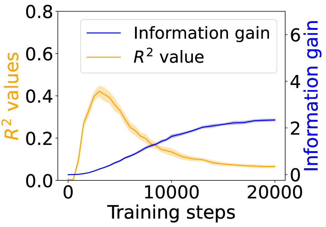
This is a dual-axis line chart plotting two different metrics against the number of training steps for a machine learning model. The chart illustrates the relationship and potential trade-off between the model's explanatory power (R² value) and the information it gains during training.
### Components/Axes
* **X-Axis (Bottom):** Labeled "Training steps". The scale runs from 0 to 20,000, with major tick marks at 0, 10,000, and 20,000.
* **Primary Y-Axis (Left):** Labeled "R² values" in orange text. The scale runs from 0.0 to 0.8, with major tick marks at 0.0, 0.2, 0.4, 0.6, and 0.8.
* **Secondary Y-Axis (Right):** Labeled "Information gain" in blue text. The scale runs from 0 to 6, with major tick marks at 0, 2, 4, and 6.
* **Legend:** Positioned in the top-left corner of the chart area.
* A blue line is labeled "Information gain".
* An orange line is labeled "R² value".
* **Data Series:**
1. **Orange Line (R² value):** Represents the R-squared metric. It is accompanied by a semi-transparent orange shaded area, likely representing a confidence interval or standard deviation across multiple runs.
2. **Blue Line (Information gain):** Represents the information gain metric. It is accompanied by a semi-transparent blue shaded area, similarly indicating uncertainty or variance.
### Detailed Analysis
**Trend Verification & Data Points:**
* **R² Value (Orange Line):**
* **Visual Trend:** The line starts near 0, rises sharply to a peak early in training, and then gradually declines, approaching a low, stable value by 20,000 steps.
* **Approximate Data Points:**
* Step 0: ~0.0
* Step ~2,500 (Peak): ~0.42 (The peak of the orange line and its shaded area reaches just above the 0.4 tick mark).
* Step 5,000: ~0.30
* Step 10,000: ~0.15
* Step 15,000: ~0.10
* Step 20,000: ~0.08
* **Uncertainty Band:** The orange shaded area is widest around the peak (Step ~2,500), suggesting higher variance in R² values during this phase. It narrows as training progresses.
* **Information Gain (Blue Line):**
* **Visual Trend:** The line starts near 0 and shows a steady, monotonic increase throughout training, with the rate of increase slowing in later steps, suggesting a plateau.
* **Approximate Data Points:**
* Step 0: ~0.0
* Step 2,500: ~0.5
* Step 5,000: ~1.0
* Step 10,000: ~2.0
* Step 15,000: ~2.5
* Step 20,000: ~2.8
* **Uncertainty Band:** The blue shaded area is relatively narrow throughout, indicating consistent measurements of information gain across runs.
**Spatial Grounding:** The two lines intersect at approximately step 8,000, where both metrics have a value of ~0.18 on the R² scale and ~1.8 on the Information gain scale.
### Key Observations
1. **Inverse Relationship Post-Peak:** After the initial phase (first ~2,500 steps), the two metrics exhibit a clear inverse relationship. As Information gain continues to increase, the R² value decreases.
2. **Early Peak in R²:** The model's best fit to the training data (highest R²) occurs very early in the training process, followed by a steady degradation.
3. **Plateauing Information Gain:** The Information gain metric shows diminishing returns, with its growth curve flattening significantly after 15,000 steps.
4. **Variance is Highest at R² Peak:** The model's performance (R²) is most variable during the phase where it achieves its highest explanatory power.
### Interpretation
This chart suggests a classic machine learning phenomenon, potentially indicative of **overfitting** or a shift in the model's learning dynamics.
* **What the data suggests:** The early peak in R² implies the model quickly learns patterns that explain the training data well. However, as training continues, the model may be starting to memorize noise or specific details of the training set that do not generalize, leading to a worse fit (lower R²) on the underlying data distribution, even as it continues to extract novel information (increasing Information gain).
* **Relationship between elements:** The inverse trend highlights a potential trade-off. Maximizing for one metric (Information gain) may come at the cost of the other (R²). The intersection point (~8,000 steps) could represent a balance point, though the "optimal" stopping point depends on the ultimate goal—whether it's generalization (which might favor an earlier stop near the R² peak) or comprehensive data understanding (which might favor a later stop).
* **Notable Anomalies:** The most striking feature is the pronounced and sustained decline of R² after its early peak. This is not typical for a well-regularized training process where R² on the training set usually increases or plateaus. This pattern strongly warrants investigation into the model architecture, regularization techniques, or the nature of the dataset itself. The narrowing uncertainty bands suggest the training process becomes more deterministic over time, even as the primary performance metric (R²) worsens.