\n
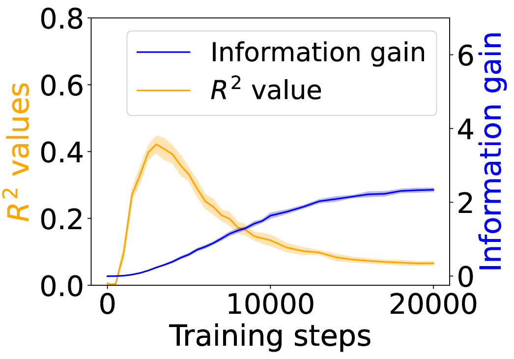
## Line Chart: Training Performance Metrics
### Overview
This image presents a line chart illustrating the relationship between training steps and two performance metrics: Information Gain and R² value. The chart displays how these metrics evolve during the training process, likely of a machine learning model. The chart uses a dual y-axis to accommodate the different scales of the two metrics.
### Components/Axes
* **X-axis:** "Training steps" ranging from 0 to approximately 20000.
* **Left Y-axis:** "R² values" ranging from 0 to 0.8.
* **Right Y-axis:** "Information gain" ranging from 0 to 6.
* **Legend:** Located in the top-left corner, identifying two lines:
* "Information gain" (Blue line)
* "R² value" (Orange line)
### Detailed Analysis
**R² Value (Orange Line):**
The orange line, representing the R² value, starts at approximately 0 at 0 training steps. It exhibits a rapid increase, peaking at around 0.42 at approximately 5000 training steps. Following the peak, the R² value gradually declines, stabilizing around 0.28 at 20000 training steps. The trend is initially strongly upward, then becomes downward, eventually flattening.
* 0 Training Steps: R² ≈ 0.0
* 5000 Training Steps: R² ≈ 0.42
* 10000 Training Steps: R² ≈ 0.35
* 15000 Training Steps: R² ≈ 0.30
* 20000 Training Steps: R² ≈ 0.28
**Information Gain (Blue Line):**
The blue line, representing Information Gain, begins at approximately 0 at 0 training steps. It demonstrates a consistent, though decelerating, upward trend throughout the entire training period. The slope of the line decreases as the number of training steps increases, indicating diminishing returns in information gain.
* 0 Training Steps: Information Gain ≈ 0.0
* 5000 Training Steps: Information Gain ≈ 1.5
* 10000 Training Steps: Information Gain ≈ 2.2
* 15000 Training Steps: Information Gain ≈ 2.6
* 20000 Training Steps: Information Gain ≈ 2.8
### Key Observations
* The R² value initially increases rapidly, suggesting a quick improvement in model fit during the early stages of training. However, this improvement plateaus and eventually reverses, indicating potential overfitting or diminishing returns.
* Information gain consistently increases, but at a decreasing rate, suggesting that the model continues to learn but with less significant gains as training progresses.
* The two metrics exhibit contrasting trends. While R² peaks and then declines, information gain continues to rise, albeit at a slower pace.
### Interpretation
The chart suggests a typical training dynamic where a model initially learns quickly (as indicated by the rising R² value), but eventually reaches a point of diminishing returns or begins to overfit (as indicated by the declining R² value). The continuous increase in information gain suggests that the model is still extracting useful information from the training data, even as its ability to generalize (as measured by R²) plateaus.
The divergence between the two metrics could indicate that the model is becoming increasingly complex and is memorizing the training data rather than learning underlying patterns. This could be a signal to consider regularization techniques or early stopping to prevent overfitting and improve the model's generalization performance. The flattening of the information gain curve at higher training steps suggests that further training may not yield significant improvements in model performance.