## [Diagram]: State Transition Diagram with Finite State Automaton (FSA)
### Overview
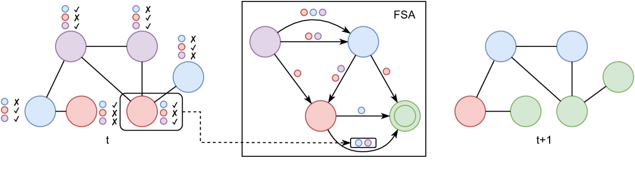
The image is a technical diagram illustrating a state transition process across two time steps, `t` and `t+1`, mediated by a Finite State Automaton (FSA). It consists of three main components: a graph at time `t` (left), an FSA processing unit (center), and the resulting graph at time `t+1` (right). The diagram uses colored nodes (blue, red, purple, green) and small icon sets (blue, red, purple circles with checkmarks `✓` or crosses `✗`) to represent states and conditions.
### Components/Axes
1. **Left Graph (Time `t`):**
* **Nodes:** 6 circular nodes connected by lines (edges). Colors: 2 purple, 2 blue, 2 red.
* **Node Labels/Icons:** Each node has an associated vertical set of three small icons to its left or right. The icons are colored circles (blue, red, purple) paired with a checkmark (`✓`) or a cross (`✗`).
* **Time Label:** The letter `t` is positioned below the central cluster of nodes.
* **Highlighted Element:** One red node is enclosed in a rounded rectangle. A dashed line connects this box to the FSA diagram.
2. **Center Diagram (FSA):**
* **Container:** A rectangular box labeled "FSA" in the top-right corner.
* **States:** 4 circular nodes: 1 purple, 1 blue, 1 red, 1 green (double-circled, indicating an accepting/final state).
* **Transitions:** Directed arrows connect the states. Each arrow is labeled with one or two small colored circle icons (blue, red, purple).
* **Input/Output:** A dashed line from the left graph enters the FSA box, pointing to the red state. An arrow from the green final state points to a small box containing a blue and a purple circle icon.
3. **Right Graph (Time `t+1`):**
* **Nodes:** 5 circular nodes connected by lines. Colors: 2 blue, 1 red, 2 green.
* **Node Labels/Icons:** No icon sets are present next to these nodes.
* **Time Label:** The label `t+1` is positioned below the graph.
### Detailed Analysis
* **Left Graph (`t`) Node Details (Clockwise from top-left):**
1. **Purple Node (Top-Left):** Icons: Blue `✓`, Red `✗`, Purple `✓`.
2. **Purple Node (Top-Right):** Icons: Blue `✗`, Red `✓`, Purple `✓`.
3. **Blue Node (Right):** Icons: Blue `✓`, Red `✗`, Purple `✗`.
4. **Red Node (Bottom, in box):** Icons: Blue `✓`, Red `✗`, Purple `✗`.
5. **Red Node (Bottom-Left):** Icons: Blue `✗`, Red `✓`, Purple `✓`.
6. **Blue Node (Left):** Icons: Blue `✗`, Red `✓`, Purple `✓`.
* **FSA Transition Logic:**
* From **Purple State**: Arrow to **Blue State** labeled with Red & Purple circles. Arrow to **Red State** labeled with a Red circle.
* From **Blue State**: Arrow to **Red State** labeled with a Red circle. Arrow to **Green State** labeled with a Red circle.
* From **Red State**: Arrow to **Green State** labeled with a Blue circle.
* The input from the left graph (the boxed red node) feeds into the **Red State** of the FSA.
* The output from the FSA's **Green State** is a pair of icons: Blue circle and Purple circle.
* **Graph Comparison (`t` vs. `t+1`):**
* The graph structure changes. The `t+1` graph has 5 nodes instead of 6.
* The two purple nodes from `t` are absent in `t+1`.
* Two new green nodes appear in `t+1`.
* The connectivity (edges) between the remaining blue and red nodes is rearranged.
### Key Observations
1. **Color-Coded State Transformation:** The diagram explicitly maps a transformation from a system state at `t` (with purple, blue, red nodes) to a state at `t+1` (with blue, red, green nodes). Green appears to be a new, possibly "accepted" or "processed" state.
2. **FSA as a Processor:** The FSA acts as a function or rule set. It takes a specific input state (the boxed red node with icons Blue `✓`, Red `✗`, Purple `✗`) and produces an output (Blue & Purple icons), which logically leads to the reconfiguration of the graph at `t+1`.
3. **Icon-Based Logic:** The small icon sets next to each node in `t` likely represent a set of conditions or properties. The FSA's transition labels (colored circles) suggest it operates based on these properties.
4. **Structural Simplification:** The graph at `t+1` is simpler (fewer nodes) and introduces a new color (green), indicating the process may involve consolidation or state finalization.
### Interpretation
This diagram models a **state transition in a network or system governed by formal rules (an FSA)**. The graph at `t` represents an initial configuration where each node has associated properties (the icon sets). A specific node (the boxed red one) is selected as input to the FSA.
The FSA processes this input according to its internal state machine logic (the arrows and their labels). The output of the FSA (the Blue & Purple icon pair) dictates how the overall system graph should evolve. The result is the new graph at `t+1`, where the original purple nodes have been removed or transformed, and new green nodes (potentially representing terminal or successful states) have been integrated.
**In essence, the diagram visualizes how a local rule (the FSA) applied to a specific component of a system can drive a global structural change over time.** It is a common representation in fields like computer science (automata theory, model checking), network science, or systems biology to show rule-based evolution.