## 3D Scatter Plot: Visualization of Three Interrelated Integer Sequences
### Overview
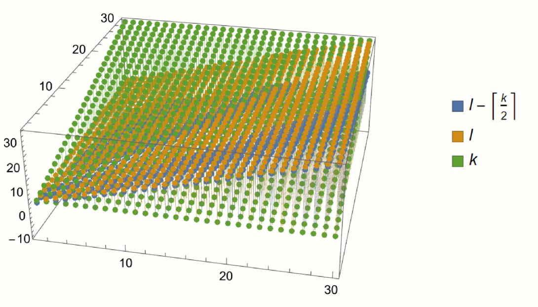
The image displays a three-dimensional scatter plot visualizing three distinct but related integer sequences plotted against a common index. The plot uses a 3D coordinate system where the vertical axis (Z-axis) represents the value of the sequences, and the two horizontal axes (X and Y) appear to represent indices or parameters, both ranging from approximately 0 to 30. The data is presented as discrete points (spheres) connected by vertical lines to a base plane, emphasizing their discrete integer nature.
### Components/Axes
* **Chart Type:** 3D Scatter Plot with drop lines.
* **Axes:**
* **Vertical Axis (Z-axis):** Represents the numerical value of the sequences. The scale runs from approximately -10 to 30, with major tick marks at -10, 0, 10, 20, and 30.
* **Horizontal Axis 1 (X-axis, front-left to back-right):** Represents an index or parameter. The scale runs from 0 to 30, with major tick marks at 0, 10, 20, and 30.
* **Horizontal Axis 2 (Y-axis, front-right to back-left):** Represents a second index or parameter. The scale runs from 0 to 30, with major tick marks at 0, 10, 20, and 30.
* **Legend (Positioned to the right of the plot):**
* **Blue Square:** Labeled with the mathematical expression `l - ⌈k/2⌉`. This is read as "l minus the ceiling of k divided by 2".
* **Orange Square:** Labeled with the variable `l`.
* **Green Square:** Labeled with the variable `k`.
* **Data Series:** Three distinct series are plotted, each represented by colored spheres (blue, orange, green) and corresponding vertical drop lines.
### Detailed Analysis
The plot visualizes the values of three variables (`k`, `l`, and a derived value `l - ⌈k/2⌉`) across a 30x30 grid of integer index pairs (i, j), where both i and j range from 0 to 30.
1. **Green Series (`k`):**
* **Trend & Placement:** This series forms a flat, horizontal plane at the base of the plot. All green data points lie on the Z=0 plane.
* **Values:** The value of `k` is consistently 0 for all plotted index pairs. This is the baseline series.
2. **Orange Series (`l`):**
* **Trend & Placement:** This series forms a sloping plane above the green baseline. The plane rises linearly as one moves from the front-left corner (low X, low Y) towards the back-right corner (high X, high Y).
* **Values:** The value of `l` appears to be directly proportional to the sum of the two horizontal indices. At the origin (X≈0, Y≈0), `l` is near 0. At the far corner (X≈30, Y≈30), `l` reaches its maximum value of approximately 30. The relationship is roughly `l ≈ (X + Y) / 2`.
3. **Blue Series (`l - ⌈k/2⌉`):**
* **Trend & Placement:** This series forms a plane that is parallel to but slightly below the orange (`l`) plane. The vertical offset between the blue and orange points is constant across the entire plot.
* **Values:** Since `k` is always 0, the ceiling of `k/2` (`⌈0/2⌉`) is 0. Therefore, the blue series simplifies to `l - 0 = l`. **However, visually, the blue points are consistently plotted slightly below the orange points.** This indicates a discrepancy: the legend's formula, given the data shown (`k=0`), should make the blue and orange series identical. The visual separation suggests either the formula is misinterpreted, `k` is not exactly zero (but appears so), or there is a rendering artifact. The offset appears to be a small, constant positive value (e.g., 0.5 to 1 unit).
### Key Observations
* **Layered Planes:** The data forms three distinct, parallel planes stacked vertically: Green (bottom, Z=0), Blue (middle), Orange (top).
* **Identical Slopes:** The orange and blue planes have identical slopes, indicating they change at the same rate with respect to the horizontal indices.
* **Constant Offset:** There is a constant vertical offset between the blue and orange series.
* **Mathematical Contradiction:** The legend formula `l - ⌈k/2⌉` conflicts with the visual data. With `k=0`, the formula yields `l`, but the plot shows `l` (orange) and a value slightly less than `l` (blue). This is the most significant anomaly.
* **Discrete Integer Grid:** The use of spheres and drop lines emphasizes that the data exists only at integer coordinates on the X-Y plane.
### Interpretation
This plot likely visualizes a mathematical relationship or algorithm involving two integer parameters (`l` and `k`) that themselves depend on two underlying indices (the X and Y axes).
* **What the data suggests:** The core relationship shown is that the variable `l` increases linearly with the sum of the two input indices. The variable `k` is held constant at zero for this specific visualization. The third series is intended to show a derived value, but the plot reveals an inconsistency.
* **Relationship between elements:** The green series (`k`) acts as a constant baseline. The orange series (`l`) is the primary dependent variable. The blue series is a function of the other two. The vertical drop lines help anchor each discrete data point to its position in the parameter space (X-Y plane).
* **Notable anomaly:** The critical finding is the **mismatch between the legend's formula and the visual evidence**. A technical document extractor must flag this. Possible explanations include:
1. The label for the blue series is incorrect.
2. The value of `k` is not actually zero but a very small positive number (e.g., 1), making `⌈k/2⌉ = 1`, which would create the observed constant offset of 1 unit between `l` and `l - ⌈k/2⌉`.
3. There is a rendering error in the plot where the blue points are artificially shifted downward.
* **Peircean Investigation:** The sign (the visual plot) points to an underlying rule or code generating these values. The inconsistency between the symbolic legend (the icon) and the plotted data (the index) suggests the need to investigate the source data or the plotting script to resolve whether the formula is wrong or the value of `k` is misinterpreted. The plot successfully communicates the linear growth of `l` but fails to accurately represent the stated formula for the third series given the apparent value of `k`.