\n
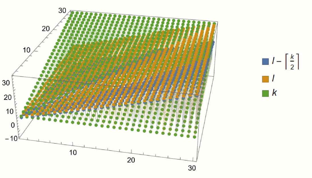
## 3D Scatter Plot: Visualization of k, l, and | -[k/2] |
### Overview
The image depicts a 3D scatter plot with three distinct data series represented by different colors: green, orange, and blue. The plot appears to visualize relationships between three variables, with axes ranging from approximately -10 to 30 along each dimension. The data points are arranged in a grid-like pattern, suggesting a structured or discrete relationship between the variables.
### Components/Axes
* **X-axis:** Ranges from approximately -10 to 30.
* **Y-axis:** Ranges from approximately -10 to 30.
* **Z-axis:** Ranges from approximately 0 to 30.
* **Legend:** Located in the top-right corner.
* Blue: `l - [k/2]`
* Orange: `l`
* Green: `k`
### Detailed Analysis or Content Details
The plot consists of three distinct sets of points:
* **Green Points (k):** These points are distributed across the entire range of the x and y axes, with a relatively constant z-value around 10. They form a plane parallel to the x-y plane.
* **Orange Points (l):** These points also span the range of the x and y axes, but their z-values are generally higher than the green points, ranging from approximately 10 to 30. They also form a plane parallel to the x-y plane.
* **Blue Points (l - [k/2]):** These points are concentrated in a diagonal band, with their z-values ranging from approximately 0 to 10. They appear to be positioned between the green and orange points.
The data appears to be structured in a grid, with points spaced at regular intervals along each axis. The x and y coordinates seem to be identical for the green and orange points, while the blue points have coordinates related to both.
### Key Observations
* The green points (k) have the lowest z-values, followed by the blue points (l - [k/2]), and then the orange points (l).
* The blue points appear to be a function of both the green and orange points, as indicated by the legend.
* The data is not continuous; it consists of discrete points arranged in a grid.
* There is a clear separation between the three data series, with minimal overlap.
### Interpretation
The plot likely represents a relationship between three variables, `k`, `l`, and `l - [k/2]`. The consistent z-values for `k` and `l` suggest that these variables are independent of the x and y coordinates. The `l - [k/2]` variable appears to be a linear combination of `k` and `l`, and its position between the other two series indicates that its values are intermediate.
The grid-like structure of the data suggests that the variables are discrete or quantized. This could represent a simulation or a model with a limited number of states. The plot could be used to visualize the behavior of a system where `k` and `l` are inputs, and `l - [k/2]` is an output.
The plot does not provide any information about the units of the variables or the specific context of the data. However, it does suggest a clear and well-defined relationship between the three variables. The consistent spacing of the points indicates a regular pattern, which could be exploited for further analysis or prediction.