## Line Chart: Importance Ratio vs. Ratio of Particles or WCET
### Overview
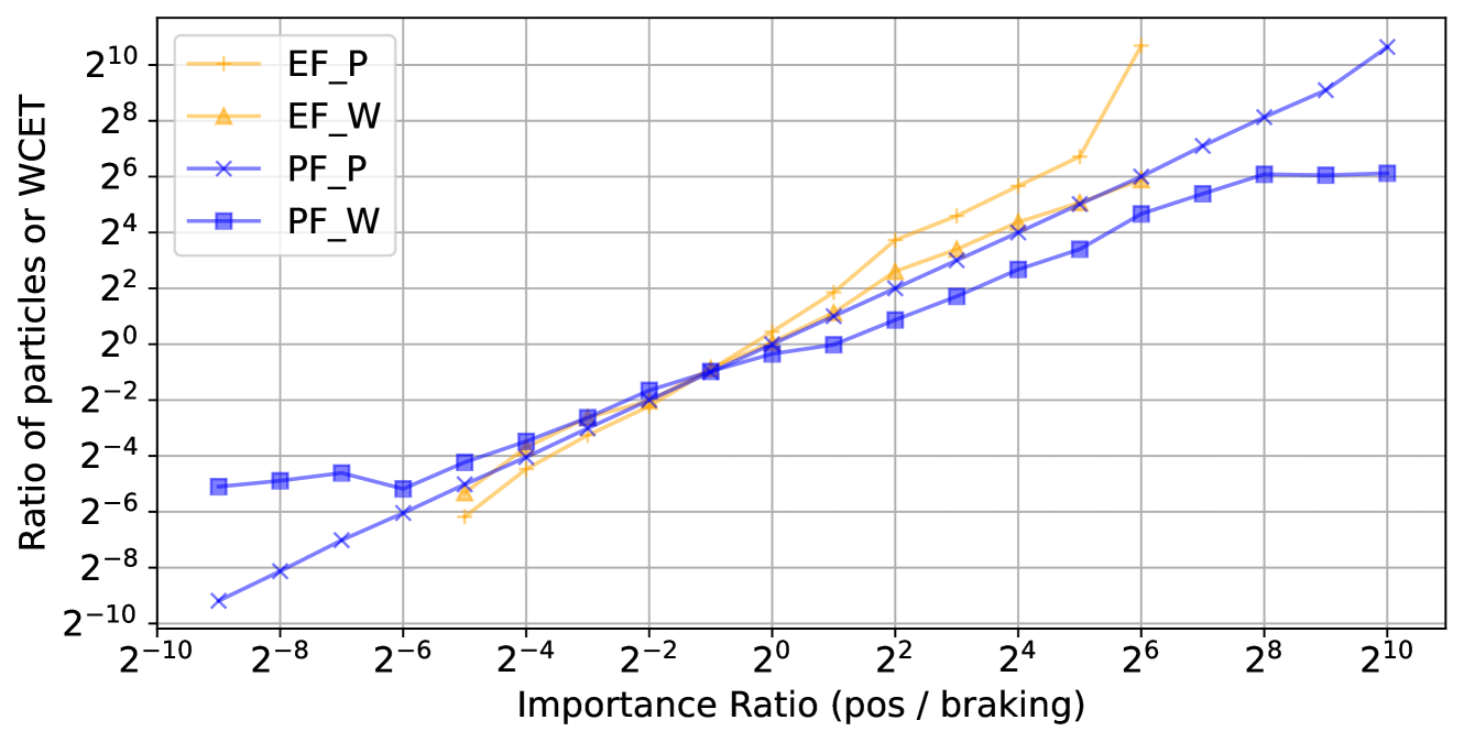
This is a line chart plotted on a log-log scale (base 2). It displays the relationship between an "Importance Ratio (pos / braking)" on the x-axis and a "Ratio of particles or WCET" on the y-axis. Four distinct data series are plotted, each representing a different method or condition (EF_P, EF_W, PF_P, PF_W). The chart demonstrates how the output ratio (y-axis) changes as the input importance ratio (x-axis) varies over a wide range.
### Components/Axes
* **X-Axis:**
* **Label:** `Importance Ratio (pos / braking)`
* **Scale:** Logarithmic (base 2).
* **Range & Ticks:** From `2^-10` to `2^10`. Major ticks are labeled at every power of 2: `2^-10`, `2^-8`, `2^-6`, `2^-4`, `2^-2`, `2^0`, `2^2`, `2^4`, `2^6`, `2^8`, `2^10`.
* **Y-Axis:**
* **Label:** `Ratio of particles or WCET`
* **Scale:** Logarithmic (base 2).
* **Range & Ticks:** From `2^-10` to `2^10`. Major ticks are labeled at every power of 2: `2^-10`, `2^-8`, `2^-6`, `2^-4`, `2^-2`, `2^0`, `2^2`, `2^4`, `2^6`, `2^8`, `2^10`.
* **Legend:**
* **Position:** Top-left corner of the chart area.
* **Entries:**
1. `EF_P`: Yellow line with plus (`+`) markers.
2. `EF_W`: Yellow line with upward-pointing triangle (`▲`) markers.
3. `PF_P`: Blue line with cross (`x`) markers.
4. `PF_W`: Blue line with square (`■`) markers.
### Detailed Analysis
**Trend Verification & Data Point Extraction (Approximate Values):**
1. **EF_P (Yellow, `+` markers):**
* **Trend:** Shows the steepest upward slope. It starts low, crosses the other lines near the center, and continues to rise sharply, exceeding the chart's upper bound at the highest x-values.
* **Key Points (x, y):** (~`2^-5`, ~`2^-6`), (~`2^0`, ~`2^0`), (~`2^2`, ~`2^4`), (~`2^4`, ~`2^6`), (~`2^6`, >`2^10`).
2. **EF_W (Yellow, `▲` markers):**
* **Trend:** Follows a similar upward trajectory to EF_P but diverges after `x=2^0`, growing at a slightly slower rate.
* **Key Points (x, y):** (~`2^-5`, ~`2^-6`), (~`2^0`, ~`2^0`), (~`2^2`, ~`2^3`), (~`2^4`, ~`2^4`), (~`2^6`, ~`2^6`).
3. **PF_P (Blue, `x` markers):**
* **Trend:** Exhibits a consistent, nearly linear upward slope on this log-log plot across the entire range. It starts as the lowest series and ends as one of the highest.
* **Key Points (x, y):** (~`2^-9`, ~`2^-10`), (~`2^-6`, ~`2^-6`), (~`2^0`, ~`2^0`), (~`2^4`, ~`2^4`), (~`2^8`, ~`2^8`), (~`2^10`, ~`2^10`).
4. **PF_W (Blue, `■` markers):**
* **Trend:** Increases initially but then plateaus. It shows the most significant saturation effect at higher x-values.
* **Key Points (x, y):** (~`2^-9`, ~`2^-5`), (~`2^-6`, ~`2^-5`), (~`2^0`, ~`2^0`), (~`2^4`, ~`2^3`), (~`2^6`, ~`2^6`), (~`2^8`, ~`2^6`), (~`2^10`, ~`2^6`).
**Component Isolation & Spatial Grounding:**
* **Intersection Point:** All four lines converge and intersect in a tight cluster near the chart's center, at approximately `(x=2^0, y=2^0)`.
* **Low X-Region (Left, x < 2^0):** The series are ordered from highest to lowest y-value as: PF_W > EF_W ≈ EF_P > PF_P.
* **High X-Region (Right, x > 2^4):** The series order changes significantly. EF_P becomes the highest, followed by PF_P, then EF_W, with PF_W being the lowest and flat.
### Key Observations
1. **Divergence After Intersection:** The most notable pattern is the dramatic divergence of the four series after they intersect near `(2^0, 2^0)`. This indicates that the system's behavior is highly sensitive to the "Importance Ratio" around a value of 1.
2. **Saturation of PF_W:** The `PF_W` series clearly saturates, reaching a maximum y-value of approximately `2^6` and not increasing further even as the importance ratio increases by several orders of magnitude.
3. **Super-Linear Growth of EF_P:** The `EF_P` series grows faster than linearly (on the log-log scale) for `x > 2^2`, suggesting a potentially exponential or high-polynomial relationship in that regime.
4. **Consistent Scaling of PF_P:** The `PF_P` series maintains a near-constant power-law relationship (linear on log-log) across the entire 20-order-of-magnitude range of the x-axis.
### Interpretation
This chart likely compares the performance or resource usage (measured by "Ratio of particles or WCET") of four different algorithms or system configurations (EF_P, EF_W, PF_P, PF_W) as a key parameter, the "Importance Ratio (pos / braking)," is varied.
* **What the data suggests:** The "EF" methods (yellow) appear more sensitive to changes in the importance ratio, especially at higher values, with EF_P showing extreme scaling. The "PF" methods (blue) are more stable, with PF_W being particularly robust (or limited) as it hits a performance ceiling. The intersection at `(1,1)` is a critical operating point where all methods yield the same output ratio.
* **How elements relate:** The x-axis parameter acts as a control knob. Moving from left to right (increasing pos/braking importance) generally increases the output ratio for all methods, but the *rate* of increase is the key differentiator. The choice of method (EF vs. PF) and condition (P vs. W) dictates the system's scalability and upper limits.
* **Notable Anomalies:** The plateau of `PF_W` is a significant anomaly, indicating a fundamental constraint or optimal operating point for that configuration. The super-linear growth of `EF_P` could be a warning sign of poor scalability or a desired feature for extreme prioritization, depending on the context. The chart effectively visualizes a trade-off: methods that scale aggressively (EF_P) may lack stability, while stable methods (PF_W) may have limited peak performance.