## Log-Log Plot: Ratio of Particles or WCET vs. Importance Ratio
### Overview
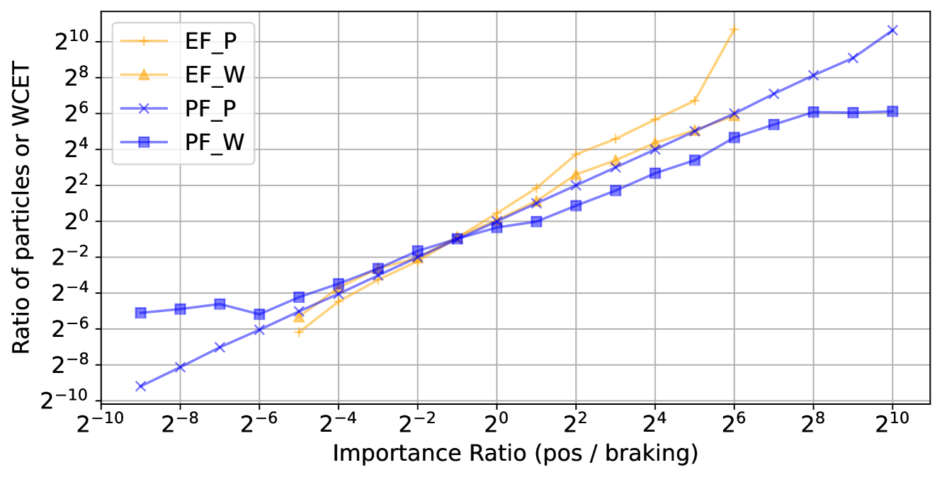
The image is a log-log plot comparing the ratio of particles or Worst-Case Execution Time (WCET) against the importance ratio (positive / braking). Four different data series are plotted: EF_P, EF_W, PF_P, and PF_W. The plot shows how these ratios change with varying importance ratios.
### Components/Axes
* **X-axis:** Importance Ratio (pos / braking). The x-axis is scaled logarithmically with base 2, ranging from 2<sup>-10</sup> to 2<sup>10</sup>. The x-axis markers are: 2<sup>-10</sup>, 2<sup>-8</sup>, 2<sup>-6</sup>, 2<sup>-4</sup>, 2<sup>-2</sup>, 2<sup>0</sup>, 2<sup>2</sup>, 2<sup>4</sup>, 2<sup>6</sup>, 2<sup>8</sup>, 2<sup>10</sup>.
* **Y-axis:** Ratio of particles or WCET. The y-axis is scaled logarithmically with base 2, ranging from 2<sup>-10</sup> to 2<sup>10</sup>. The y-axis markers are: 2<sup>-10</sup>, 2<sup>-8</sup>, 2<sup>-6</sup>, 2<sup>-4</sup>, 2<sup>-2</sup>, 2<sup>0</sup>, 2<sup>2</sup>, 2<sup>4</sup>, 2<sup>6</sup>, 2<sup>8</sup>, 2<sup>10</sup>.
* **Legend:** Located in the top-left corner of the plot.
* **EF_P:** Orange line with '+' markers.
* **EF_W:** Yellow-orange line with triangle markers.
* **PF_P:** Light blue line with 'x' markers.
* **PF_W:** Blue line with square markers.
### Detailed Analysis
* **EF_P (Orange, '+'):** Initially, the line is at approximately 2<sup>-6</sup> at x=2<sup>-8</sup>. The line generally slopes upward, increasing more rapidly after x=2<sup>0</sup>. At x=2<sup>6</sup>, the value is approximately 2<sup>9</sup>. At x=2<sup>10</sup>, the value is approximately 2<sup>10</sup>.
* **EF_W (Yellow-Orange, Triangle):** Starts at approximately 2<sup>-6</sup> at x=2<sup>-8</sup>. The line generally slopes upward, increasing more rapidly after x=2<sup>0</sup>. At x=2<sup>6</sup>, the value is approximately 2<sup>6</sup>. At x=2<sup>10</sup>, the value is approximately 2<sup>9</sup>.
* **PF_P (Light Blue, 'x'):** Starts at approximately 2<sup>-10</sup> at x=2<sup>-10</sup>. The line generally slopes upward. At x=2<sup>6</sup>, the value is approximately 2<sup>5</sup>. At x=2<sup>10</sup>, the value is approximately 2<sup>9</sup>.
* **PF_W (Blue, Square):** Starts at approximately 2<sup>-5</sup> at x=2<sup>-10</sup>. The line is relatively flat until x=2<sup>-4</sup>, then slopes upward. The line plateaus again after x=2<sup>4</sup>. At x=2<sup>6</sup>, the value is approximately 2<sup>5</sup>. At x=2<sup>10</sup>, the value is approximately 2<sup>6</sup>.
### Key Observations
* For lower importance ratios (left side of the plot), PF_P has the lowest ratio of particles or WCET, while EF_P and EF_W have similar values. PF_W starts higher than PF_P, but remains relatively flat for a while.
* As the importance ratio increases (right side of the plot), all lines generally increase, but at different rates. EF_P shows the most rapid increase, followed by EF_W and PF_P. PF_W increases the least and plateaus.
* The lines for EF_P and EF_W are very close to each other, suggesting a similar relationship between importance ratio and the ratio of particles or WCET.
* The lines for PF_P and PF_W diverge significantly as the importance ratio increases, indicating different behaviors.
### Interpretation
The plot illustrates the relationship between the importance ratio (positive / braking) and the ratio of particles or WCET for four different configurations (EF_P, EF_W, PF_P, PF_W). The data suggests that:
* The "EF" configurations (EF_P, EF_W) are more sensitive to changes in the importance ratio than the "PF" configurations (PF_P, PF_W), especially at higher importance ratios. This is evident from the steeper slopes of the EF_P and EF_W lines.
* The "PF_W" configuration appears to be less affected by the importance ratio, as its line plateaus at higher importance ratios. This could indicate a saturation effect or a different underlying mechanism.
* The "PF_P" configuration shows a more gradual increase with the importance ratio compared to "EF_P" and "EF_W", suggesting a more stable or predictable behavior.
* The initial differences at low importance ratios suggest that the configurations have different baseline performance characteristics.
The plot highlights the trade-offs between different configurations and how their performance varies with the importance ratio. This information can be used to select the most appropriate configuration for a given application or scenario.