TECHNICAL ASSET FINGERPRINT
25c3b45b3a9f674ae340506a
Click to view fullscreen
Press ESC or click to close
FOUND IN PAPERS
EXPERT: gemini-2.0-flash VERSION 1
RUNTIME: nugit/gemini/gemini-2.0-flash
INTEL_VERIFIED
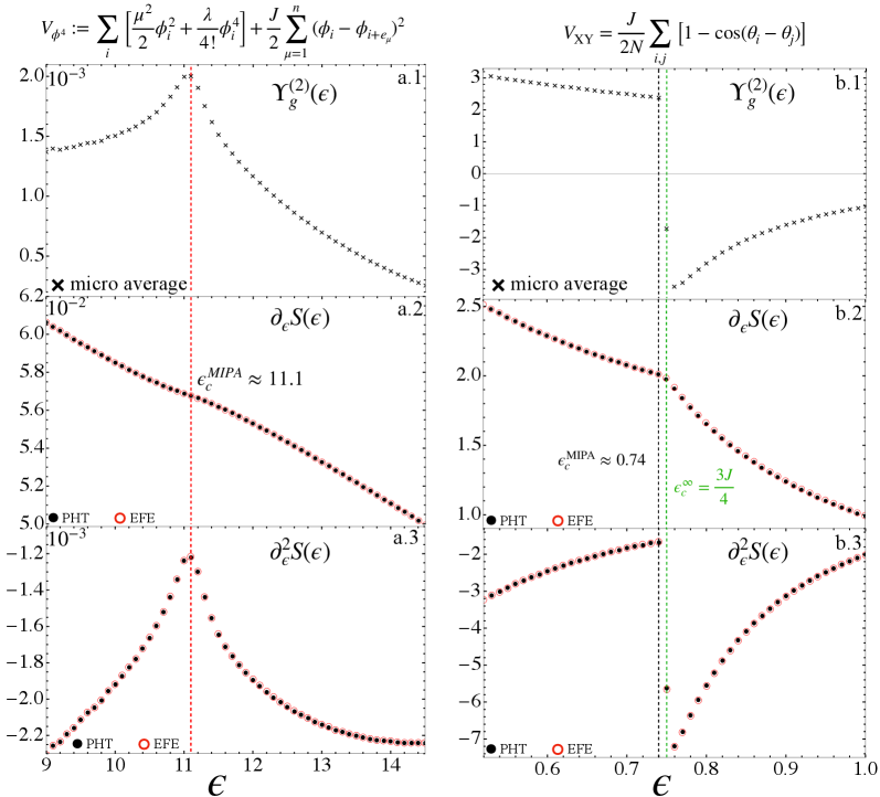
## Combined Chart: Energy Landscape Analysis
### Overview
The image presents six plots arranged in two columns (left and right), each containing three subplots (top, middle, bottom). The plots depict the energy landscape analysis, showing the relationships between energy (epsilon) and various functions related to the system's state. The left column (a.1, a.2, a.3) focuses on one set of parameters, while the right column (b.1, b.2, b.3) focuses on another. Each subplot displays data points from two methods, PHT (solid black circles) and EFE (open red circles), along with a "micro average" (black x markers). Vertical lines indicate critical energy values.
### Components/Axes
**General Layout:**
* Two columns of plots, labeled 'a' (left) and 'b' (right).
* Each column has three subplots, labeled '1', '2', and '3' from top to bottom.
* Each subplot contains data from two methods: PHT (black filled circles) and EFE (red open circles).
* Each subplot contains data from "micro average" (black x markers).
* Legend: PHT (black filled circle), EFE (red open circle), micro average (black x marker)
**Left Column (a):**
* X-axis (all subplots): ε (epsilon), ranging from approximately 9 to 14.
* a.1: Y-axis: γg(2)(ε), ranging from 0 to 2.0 x 10^-3.
* a.2: Y-axis: ∂εS(ε), ranging from 5.0 x 10^-2 to 6.2 x 10^-2.
* a.3: Y-axis: ∂ε2S(ε), ranging from -2.2 x 10^-3 to -1.2 x 10^-3.
* Vertical dashed red line at εcMIPA ≈ 11.1.
**Right Column (b):**
* X-axis (all subplots): ε (epsilon), ranging from approximately 0.6 to 1.0.
* b.1: Y-axis: γg(2)(ε), ranging from -3 to 3.
* b.2: Y-axis: ∂εS(ε), ranging from 1.0 to 2.5.
* b.3: Y-axis: ∂ε2S(ε), ranging from -7 to -2.
* Vertical dashed green line at εc∞ = 3J/4, approximately at ε ≈ 0.74.
* Horizontal line at y = 0 in b.1
**Equations (Top of Image):**
* Left: Vφ4 := Σi [μ2/2 φi2 + λ/4! φi4] + J/2 Σμ=1n (φi - φi+eμ)2
* Right: VXY = J/2N Σij [1 - cos(θi - θj)]
### Detailed Analysis
**Left Column (a):**
* **a.1: γg(2)(ε):** The "micro average" data (black x markers) initially decreases slightly from ε = 9 to approximately ε = 10.5, then sharply increases to a peak near the vertical red line (ε ≈ 11.1), and then decreases steadily as ε increases to 14.
* **a.2: ∂εS(ε):** Both PHT (black filled circles) and EFE (red open circles) data points form a single line. The line slopes downward linearly from approximately (9, 0.062) to (14, 0.050). The value of εcMIPA is indicated as approximately 11.1.
* **a.3: ∂ε2S(ε):** Both PHT (black filled circles) and EFE (red open circles) data points form a single line. The line starts at approximately -2.2 x 10^-3 at ε = 9, rises sharply to a peak near the vertical red line (ε ≈ 11.1), and then decreases steadily as ε increases to 14, approaching -2.2 x 10^-3.
**Right Column (b):**
* **b.1: γg(2)(ε):** The "micro average" data (black x markers) starts at approximately 3 at ε = 0.6, decreases to a minimum near ε = 0.8, and then increases as ε approaches 1.0.
* **b.2: ∂εS(ε):** Both PHT (black filled circles) and EFE (red open circles) data points form a single line. The line slopes downward linearly from approximately (0.6, 2.5) to (1.0, 1.1). The value of εcMIPA is indicated as approximately 0.74, and εc∞ = 3J/4 is indicated by a vertical green line.
* **b.3: ∂ε2S(ε):** Both PHT (black filled circles) and EFE (red open circles) data points form a single line. The line starts at approximately -7 at ε = 0.6, rises sharply to a peak near the vertical green line (ε ≈ 0.74), and then decreases steadily as ε increases to 1.0, approaching -2.
### Key Observations
* The plots show the behavior of different functions with respect to energy (epsilon).
* The vertical lines in both columns indicate critical energy values (εcMIPA and εc∞).
* The PHT and EFE methods produce nearly identical results for ∂εS(ε) and ∂ε2S(ε).
* The "micro average" data (black x markers) in γg(2)(ε) shows distinct trends in both columns.
* The functions ∂εS(ε) show a linear decrease with increasing epsilon in both columns.
* The functions ∂ε2S(ε) show a peak near the critical energy values in both columns.
### Interpretation
The data presented in these plots likely represents a theoretical analysis of a physical system, possibly related to phase transitions or critical phenomena. The functions γg(2)(ε), ∂εS(ε), and ∂ε2S(ε) likely represent different physical quantities or derivatives of a physical quantity with respect to energy. The critical energy values (εcMIPA and εc∞) indicate points where the system undergoes a significant change in behavior. The agreement between the PHT and EFE methods suggests that these methods are consistent in their predictions. The trends observed in the plots provide insights into the system's behavior near the critical points. The peaks in ∂ε2S(ε) near the critical energy values suggest that the system's sensitivity to energy changes is highest at these points.
DECODING INTELLIGENCE...
EXPERT: gemma-3-27b-it-free VERSION 1
RUNTIME: google-free/gemma-3-27b-it
INTEL_VERIFIED
## Charts: Correlation Functions and Susceptibility
### Overview
The image presents six sub-charts (a.1 through b.3) displaying correlation functions and susceptibility values as a function of a parameter denoted by 'ε' (epsilon). The charts appear to relate to a physical system, potentially magnetic or related to fluctuations, based on the labels. The charts are arranged in a 2x3 grid.
### Components/Axes
* **X-axis (all charts):** ε (epsilon). The scales vary between charts.
* **Y-axis:** Varies per chart, representing different correlation functions or susceptibility measures.
* **Legends:** Each chart has a legend indicating the data series represented by different marker styles (dots, crosses).
* **Labels:**
* a.1: Y<sub>g</sub><sup>(2)</sup>(ε)
* a.2: ∂<sub>ε</sub>S(ε)
* a.3: ∂<sup>2</sup><sub>ε</sub>S(ε)
* b.1: Y<sub>g</sub><sup>(2)</sup>(ε)
* b.2: ∂<sub>ε</sub>S(ε)
* b.3: ∂<sup>2</sup><sub>ε</sub>S(ε)
* **Markers:**
* 'x' - micro average
* '•' - PHT
* 'o' - EFE
* **Vertical Lines:** Red dashed vertical lines are present in a.1 and b.1, indicating specific values of ε.
* **Text Annotations:**
* a.2: ε<sup>MIPA</sup> ≈ 11.1
* b.2: ε<sup>MIPA</sup> ≈ 0.74
* b.3: ε<sub>c</sub><sup>∞</sup> = 3J/4
### Detailed Analysis or Content Details
**a.1: Y<sub>g</sub><sup>(2)</sup>(ε)**
* X-axis range: 9 to 14
* Y-axis range: approximately -0.002 to 0.002
* Data Series 1 (crosses): Starts at approximately (9, 0.0017), decreases to approximately (11, 0.0002), then increases to approximately (14, 0.0015). The line exhibits a minimum around ε = 11.
* Vertical dashed line at approximately ε = 11.1.
**a.2: ∂<sub>ε</sub>S(ε)**
* X-axis range: 9 to 14
* Y-axis range: approximately 5.0 to 6.2
* Data Series 1 (dots): Starts at approximately (9, 5.8), decreases to approximately (11.1, 5.2), then increases to approximately (14, 5.4).
* Markers: PHT at approximately (9, 5.7), EFE at approximately (9, 5.1).
**a.3: ∂<sup>2</sup><sub>ε</sub>S(ε)**
* X-axis range: 9 to 14
* Y-axis range: approximately -2.2 to 0.001
* Data Series 1 (dots): Starts at approximately (9, -2.1), decreases to approximately (11.1, -2.2), then increases to approximately (14, -1.2).
* Markers: PHT at approximately (9, -1.9), EFE at approximately (9, -2.0).
**b.1: Y<sub>g</sub><sup>(2)</sup>(ε)**
* X-axis range: 0.6 to 1.0
* Y-axis range: approximately -3 to 3
* Data Series 1 (crosses): Starts at approximately (0.6, 2.5), decreases to approximately (0.74, -0.5), then increases to approximately (1.0, 2.5). The line exhibits a minimum around ε = 0.74.
* Vertical dashed line at approximately ε = 0.74.
**b.2: ∂<sub>ε</sub>S(ε)**
* X-axis range: 0.6 to 1.0
* Y-axis range: approximately 1.0 to 2.5
* Data Series 1 (dots): Starts at approximately (0.6, 2.2), decreases to approximately (0.74, 1.5), then increases to approximately (1.0, 2.0).
* Markers: PHT at approximately (0.6, 2.1), EFE at approximately (0.6, 1.7).
**b.3: ∂<sup>2</sup><sub>ε</sub>S(ε)**
* X-axis range: 0.6 to 1.0
* Y-axis range: approximately -7 to 1.0
* Data Series 1 (dots): Starts at approximately (0.6, -5.5), decreases to approximately (0.74, -6.5), then increases to approximately (1.0, -2.0).
* Markers: PHT at approximately (0.6, -5.0), EFE at approximately (0.6, -6.0).
* Text Annotation: ε<sub>c</sub><sup>∞</sup> = 3J/4
### Key Observations
* All charts show a similar trend: a peak or minimum around a specific value of ε, followed by a change in direction.
* The vertical dashed lines in a.1 and b.1 highlight critical values of ε, potentially representing phase transitions or critical points.
* The markers PHT and EFE appear to represent specific conditions or points of interest within the system.
* The values of ε<sup>MIPA</sup> are indicated in a.2 and b.2.
* The value of ε<sub>c</sub><sup>∞</sup> is indicated in b.3.
### Interpretation
The charts likely represent the behavior of a system's correlation functions and susceptibility as a function of a control parameter ε. The correlation functions (Y<sub>g</sub><sup>(2)</sup>(ε)) indicate how correlated fluctuations are at different scales. The susceptibility (∂<sub>ε</sub>S(ε) and ∂<sup>2</sup><sub>ε</sub>S(ε)) measures the system's response to changes in ε.
The peaks and minima in the charts suggest the presence of critical points or phase transitions. The vertical lines at ε ≈ 11.1 and ε ≈ 0.74 likely mark these critical points. The different data series (PHT and EFE) may represent different conditions or configurations of the system, and their positions relative to each other provide insights into how these conditions affect the system's behavior.
The annotation ε<sub>c</sub><sup>∞</sup> = 3J/4 in b.3 suggests a connection to an infinite-range model, where J represents an interaction strength. The MIPA values (11.1 and 0.74) likely represent critical exponents or other parameters related to the system's critical behavior. The overall pattern suggests a system exhibiting a transition from one state to another as ε is varied, with the specific details depending on the system's parameters and conditions.
DECODING INTELLIGENCE...
EXPERT: healer-alpha-free VERSION 1
RUNTIME: free/openrouter/healer-alpha
INTEL_VERIFIED
## Multi-Panel Scientific Figure: Critical Behavior Analysis
### Overview
The image is a composite scientific figure containing two mathematical equations at the top and six plots arranged in a 3x2 grid below. The left column (labeled a.1, a.2, a.3) and the right column (labeled b.1, b.2, b.3) present related analyses for two different systems or parameter regimes. The plots show the behavior of various functions with respect to a parameter ε (epsilon). Key features include vertical dashed lines indicating critical points and annotations for specific values.
### Components/Axes
**Equations (Top):**
1. **Left Equation:** `V_φψ := Σ_i [ (μ²/2)φ_i² + (λ/4!)φ_i⁴ ] + (J/2) Σ_{μ=1}^n (φ_i - φ_{i+e_μ})²`
2. **Right Equation:** `V_XY = (J/2N) Σ_{i,j} [1 - cos(θ_i - θ_j)]`
**Plot Grid Structure:**
* **X-axis (All plots):** Labeled `ε` (epsilon).
* **Column a (Left):** Range approximately 9 to 14.5.
* **Column b (Right):** Range approximately 0.55 to 1.0.
* **Y-axes (By Row):**
* **Row 1 (a.1, b.1):** Labeled `γ_g^(2)(ε)`. Scale is linear.
* **Row 2 (a.2, b.2):** Labeled `∂_ε S(ε)`. Scale is linear.
* **Row 3 (a.3, b.3):** Labeled `∂_ε^2 S(ε)`. Scale is linear.
* **Legends & Annotations:**
* **"micro average"**: Marked with a black 'x' symbol in plots a.1 and b.1.
* **"PHT"**: Represented by a solid black circle (●). Appears in the legend of plots a.2, a.3, b.2, b.3.
* **"EFE"**: Represented by a red open circle (○). Appears in the legend of plots a.2, a.3, b.2, b.3.
* **Vertical Dashed Lines:**
* **Column a:** A red vertical dashed line at `ε ≈ 11.1`. Annotated in plot a.2 as `ε_c^MIPA ≈ 11.1`.
* **Column b:** A green vertical dashed line at `ε ≈ 0.74`. Annotated in plot b.2 as `ε_c^MIPA ≈ 0.74`. An additional green text annotation in plot b.2 states `ε_c^∞ = 3J/4`.
* **Data Series:** Plots in rows 2 and 3 contain two data series: black dots (presumably for "PHT") and red circles (presumably for "EFE").
### Detailed Analysis
**Column a (Left Side):**
* **a.1 (`γ_g^(2)(ε)`):** The curve (gray 'x' markers) shows a sharp peak at the critical point `ε ≈ 11.1`. The value rises from ~1.4x10⁻³ at ε=9 to a peak of ~2.0x10⁻³, then decays.
* **a.2 (`∂_ε S(ε)`):** Both data series (black dots/PHT and red circles/EFE) show a nearly linear, decreasing trend. The values drop from ~6.2x10⁻² at ε=9 to ~5.0x10⁻² at ε=14.5. The two series are nearly indistinguishable. The critical point `ε_c^MIPA ≈ 11.1` is marked.
* **a.3 (`∂_ε^2 S(ε)`):** The data shows a pronounced, sharp peak (a cusp) at the critical point `ε ≈ 11.1`. The value rises from ~-2.2x10⁻³ at ε=9 to a peak of ~-1.2x10⁻³, then decays back down. The black (PHT) and red (EFE) series overlap closely.
**Column b (Right Side):**
* **b.1 (`γ_g^(2)(ε)`):** The curve (gray 'x' markers) shows a discontinuity or very sharp change at the critical point `ε ≈ 0.74`. The value is high (~2.8) for ε < 0.74, drops abruptly, and then increases from ~-3.5 to ~-1.0 for ε > 0.74.
* **b.2 (`∂_ε S(ε)`):** Both data series show a decreasing trend. The values drop from ~2.5 at ε=0.55 to ~1.0 at ε=1.0. The slope appears to change near the critical point `ε_c^MIPA ≈ 0.74`. The annotation `ε_c^∞ = 3J/4` is present.
* **b.3 (`∂_ε^2 S(ε)`):** The data shows a sharp, downward cusp (a minimum) at the critical point `ε ≈ 0.74`. The value falls from ~-3.0 at ε=0.55 to a minimum of ~-7.0, then rises back to ~-2.0 at ε=1.0. The black (PHT) and red (EFE) series overlap closely.
### Key Observations
1. **Critical Points:** Both systems exhibit critical behavior at specific ε values (`~11.1` for column a, `~0.74` for column b), marked by vertical lines and singularities in the plotted functions.
2. **Nature of Singularity:** The singularity manifests differently. In column a, `γ_g^(2)` shows a peak and `∂_ε^2 S` shows a cusp. In column b, `γ_g^(2)` shows a discontinuity and `∂_ε^2 S` shows a sharp minimum.
3. **Data Series Agreement:** The "PHT" (black dots) and "EFE" (red circles) data series are in very close agreement across all plots where they appear (rows 2 and 3), suggesting two different methods or approximations yield nearly identical results for these quantities.
4. **Equation Context:** The equations at the top define potentials (`V_φψ` and `V_XY`) for what appear to be field theories (possibly φ⁴ theory and an XY model), providing the theoretical context for the analyzed data.
### Interpretation
This figure presents a comparative analysis of critical phenomena in two different statistical mechanical or field-theoretic models. The left column (a) likely corresponds to a system with a continuous (second-order) phase transition, evidenced by the continuous but non-differentiable cusp in the second derivative of entropy (`∂_ε^2 S`). The right column (b) suggests a system with a more abrupt transition, possibly first-order or of a different universality class, indicated by the apparent discontinuity in `γ_g^(2)`.
The parameter ε is the control parameter driving the system through its critical point (`ε_c`). The functions plotted—`γ_g^(2)` (likely a correlation function or susceptibility), the first derivative of entropy `∂_ε S` (related to specific heat or a response function), and its second derivative `∂_ε^2 S`—are standard quantities for characterizing phase transitions. The sharp features at `ε_c` are hallmarks of critical behavior, where correlation lengths diverge and the system becomes scale-invariant.
The close match between "PHT" and "EFE" data suggests the figure is validating a theoretical or computational method (perhaps "EFE" stands for an Effective Field Theory approach) against another standard ("PHT"). The annotation `ε_c^∞ = 3J/4` in plot b.2 provides an analytical prediction for the critical point in a certain limit (∞), which the numerical/data-driven `ε_c^MIPA ≈ 0.74` approximates. The overall purpose is to demonstrate and quantify the critical behavior of these models, locate their critical points, and compare different calculational approaches.
DECODING INTELLIGENCE...
EXPERT: nemotron-free VERSION 1
RUNTIME: free/nvidia/nemotron-nano-12b-v2-vl:free
INTEL_VERIFIED
## Chart/Diagram Type: Dual-Axis Graphs with Subplots
### Overview
The image contains two side-by-side graphs (labeled **a** and **b**), each divided into three subplots (a.1, a.2, a.3 and b.1, b.2, b.3). These graphs depict mathematical functions and their derivatives as functions of a parameter **ε** (epsilon). Key elements include legends, vertical dashed lines, and annotations for critical points.
---
### Components/Axes
#### Left Graph (a):
- **a.1**:
- **X-axis**: **ε** (epsilon), ranging from 9 to 14.
- **Y-axis**: **V_φ4** (top plot), **Γ_g^(2)(ε)** (middle plot), **δ_εS(ε)** (bottom plot).
- **Legend**:
- **PHT**: Black dots (bottom-left corner).
- **EFE**: Red circles (bottom-left corner).
- **Annotations**:
- Vertical red dashed line at **ε_c^MIPA ≈ 11.1**.
- Micro average marked with a cross (x) at **ε ≈ 10.5**.
- **a.2**:
- **X-axis**: **ε** (epsilon), same range as a.1.
- **Y-axis**: **δ_εS(ε)** (top plot), **δ²_εS(ε)** (bottom plot).
- **a.3**:
- **X-axis**: **ε** (epsilon), same range as a.1.
- **Y-axis**: **δ²_εS(ε)** (bottom plot).
#### Right Graph (b):
- **b.1**:
- **X-axis**: **ε** (epsilon), ranging from 0.6 to 1.0.
- **Y-axis**: **V_XY** (top plot), **Γ_g^(2)(ε)** (middle plot).
- **Legend**:
- **PHT**: Black dots (bottom-left corner).
- **EFE**: Red circles (bottom-left corner).
- **Annotations**:
- Vertical green dashed line at **ε_c^∞ = 3J/4**.
- Micro average marked with a cross (x) at **ε ≈ 0.75**.
- **b.2**:
- **X-axis**: **ε** (epsilon), same range as b.1.
- **Y-axis**: **δ_εS(ε)** (top plot), **δ²_εS(ε)** (bottom plot).
- **b.3**:
- **X-axis**: **ε** (epsilon), same range as b.1.
- **Y-axis**: **δ²_εS(ε)** (bottom plot).
---
### Detailed Analysis
#### Left Graph (a):
1. **a.1**:
- **V_φ4**: Peaks near **ε ≈ 10.5**, then declines.
- **Γ_g^(2)(ε)**: Dips sharply at **ε ≈ 10.5**, then rises.
- **δ_εS(ε)**: Decreases monotonically from **ε = 9** to **ε = 14**.
- **δ²_εS(ε)**: Shows a sharp minimum at **ε ≈ 10.5**, with values dropping to **-2.2**.
2. **a.2**:
- **δ_εS(ε)**: Decreases from **6.0** at **ε = 9** to **5.0** at **ε = 14**.
- **δ²_εS(ε)**: Peaks at **ε ≈ 10.5** (value ~-1.6), then declines.
3. **a.3**:
- **δ²_εS(ε)**: Minimum at **ε ≈ 10.5** (value ~-2.2), with a secondary minimum at **ε ≈ 14**.
#### Right Graph (b):
1. **b.1**:
- **V_XY**: Peaks at **ε ≈ 0.7**, then declines.
- **Γ_g^(2)(ε)**: Rises sharply at **ε ≈ 0.7**, then plateaus.
- **δ_εS(ε)**: Decreases from **2.5** at **ε = 0.6** to **1.0** at **ε = 1.0**.
- **δ²_εS(ε)**: Peaks at **ε ≈ 0.7** (value ~-5), then declines.
2. **b.2**:
- **δ_εS(ε)**: Decreases from **2.5** at **ε = 0.6** to **1.0** at **ε = 1.0**.
- **δ²_εS(ε)**: Peaks at **ε ≈ 0.7** (value ~-5), then declines.
3. **b.3**:
- **δ²_εS(ε)**: Minimum at **ε ≈ 0.7** (value ~-5), with a secondary minimum at **ε ≈ 1.0**.
---
### Key Observations
1. **Critical Points**:
- Left graph: **ε_c^MIPA ≈ 11.1** (red dashed line) marks a phase transition or critical threshold.
- Right graph: **ε_c^∞ = 3J/4** (green dashed line) indicates a theoretical limit.
2. **Micro Averages**:
- Crosses (x) in both graphs highlight averaged values at **ε ≈ 10.5** (left) and **ε ≈ 0.75** (right).
3. **Function Behavior**:
- **V_φ4** and **V_XY** exhibit peaks near their respective critical points.
- **δ²_εS(ε)** in both graphs shows minima at critical points, suggesting stability or optimal conditions.
4. **Legend Consistency**:
- **PHT** (black dots) and **EFE** (red circles) are consistently placed in the bottom-left corner of all subplots.
---
### Interpretation
The graphs likely represent a physical or mathematical model where **ε** governs system behavior. The critical points (**ε_c^MIPA** and **ε_c^∞**) demarcate distinct regimes:
- **Left Graph (a)**: Dominated by **V_φ4** and **Γ_g^(2)(ε)**, with **δ²_εS(ε)** minima indicating stability at **ε ≈ 10.5**.
- **Right Graph (b)**: Governed by **V_XY** and **Γ_g^(2)(ε)**, with **δ²_εS(ε)** minima at **ε ≈ 0.7**, suggesting a phase transition or optimal parameter range.
The equations embedded in the plots (e.g., **V_φ4 = Σ[μ²φ_i²/2 + λ/4!φ_i⁴] + J/2 Σ(φ_i - φ_{i+ε})²**) imply interactions between variables, possibly in a lattice or network model. The **PHT** and **EFE** markers may represent different experimental or theoretical datasets, with **EFE** showing sharper transitions near critical points.
The **δ²_εS(ε)** minima in both graphs highlight regions of minimal variance, critical for understanding system stability or phase behavior. The **micro averages** (crosses) suggest averaged trends over a range of **ε**, contrasting with the detailed data points (dots and circles).
This analysis underscores the interplay between **ε**, critical thresholds, and system stability, with potential applications in statistical mechanics, material science, or complex systems theory.
DECODING INTELLIGENCE...