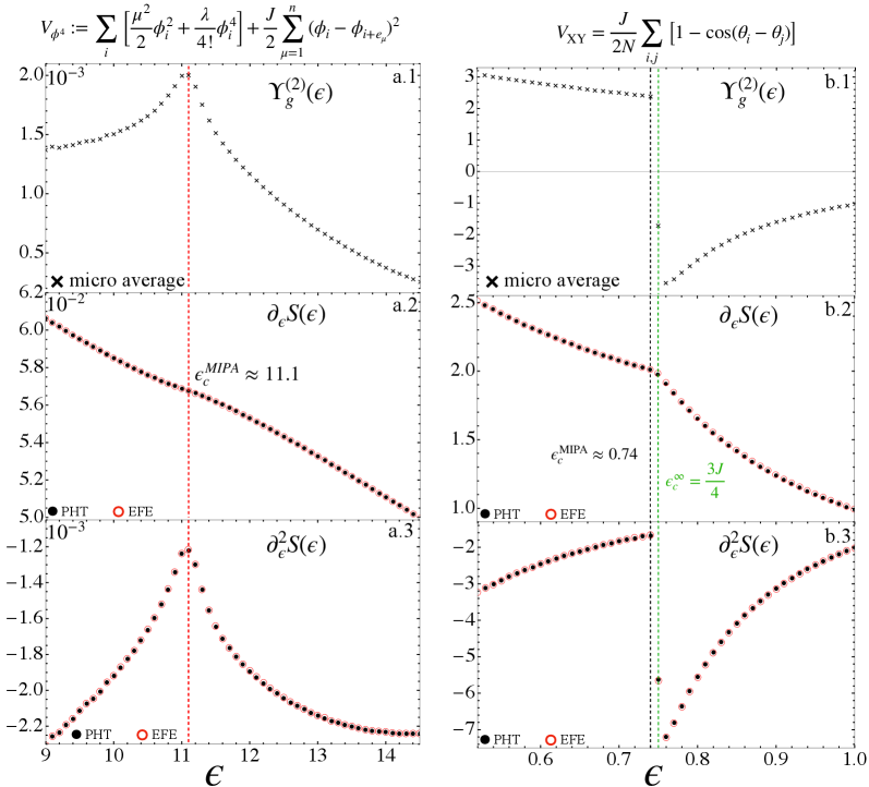
## Combined Chart: Energy Landscape Analysis
### Overview
The image presents six plots arranged in two columns (left and right), each containing three subplots (top, middle, bottom). The plots depict the energy landscape analysis, showing the relationships between energy (epsilon) and various functions related to the system's state. The left column (a.1, a.2, a.3) focuses on one set of parameters, while the right column (b.1, b.2, b.3) focuses on another. Each subplot displays data points from two methods, PHT (solid black circles) and EFE (open red circles), along with a "micro average" (black x markers). Vertical lines indicate critical energy values.
### Components/Axes
**General Layout:**
* Two columns of plots, labeled 'a' (left) and 'b' (right).
* Each column has three subplots, labeled '1', '2', and '3' from top to bottom.
* Each subplot contains data from two methods: PHT (black filled circles) and EFE (red open circles).
* Each subplot contains data from "micro average" (black x markers).
* Legend: PHT (black filled circle), EFE (red open circle), micro average (black x marker)
**Left Column (a):**
* X-axis (all subplots): ε (epsilon), ranging from approximately 9 to 14.
* a.1: Y-axis: γg(2)(ε), ranging from 0 to 2.0 x 10^-3.
* a.2: Y-axis: ∂εS(ε), ranging from 5.0 x 10^-2 to 6.2 x 10^-2.
* a.3: Y-axis: ∂ε2S(ε), ranging from -2.2 x 10^-3 to -1.2 x 10^-3.
* Vertical dashed red line at εcMIPA ≈ 11.1.
**Right Column (b):**
* X-axis (all subplots): ε (epsilon), ranging from approximately 0.6 to 1.0.
* b.1: Y-axis: γg(2)(ε), ranging from -3 to 3.
* b.2: Y-axis: ∂εS(ε), ranging from 1.0 to 2.5.
* b.3: Y-axis: ∂ε2S(ε), ranging from -7 to -2.
* Vertical dashed green line at εc∞ = 3J/4, approximately at ε ≈ 0.74.
* Horizontal line at y = 0 in b.1
**Equations (Top of Image):**
* Left: Vφ4 := Σi [μ2/2 φi2 + λ/4! φi4] + J/2 Σμ=1n (φi - φi+eμ)2
* Right: VXY = J/2N Σij [1 - cos(θi - θj)]
### Detailed Analysis
**Left Column (a):**
* **a.1: γg(2)(ε):** The "micro average" data (black x markers) initially decreases slightly from ε = 9 to approximately ε = 10.5, then sharply increases to a peak near the vertical red line (ε ≈ 11.1), and then decreases steadily as ε increases to 14.
* **a.2: ∂εS(ε):** Both PHT (black filled circles) and EFE (red open circles) data points form a single line. The line slopes downward linearly from approximately (9, 0.062) to (14, 0.050). The value of εcMIPA is indicated as approximately 11.1.
* **a.3: ∂ε2S(ε):** Both PHT (black filled circles) and EFE (red open circles) data points form a single line. The line starts at approximately -2.2 x 10^-3 at ε = 9, rises sharply to a peak near the vertical red line (ε ≈ 11.1), and then decreases steadily as ε increases to 14, approaching -2.2 x 10^-3.
**Right Column (b):**
* **b.1: γg(2)(ε):** The "micro average" data (black x markers) starts at approximately 3 at ε = 0.6, decreases to a minimum near ε = 0.8, and then increases as ε approaches 1.0.
* **b.2: ∂εS(ε):** Both PHT (black filled circles) and EFE (red open circles) data points form a single line. The line slopes downward linearly from approximately (0.6, 2.5) to (1.0, 1.1). The value of εcMIPA is indicated as approximately 0.74, and εc∞ = 3J/4 is indicated by a vertical green line.
* **b.3: ∂ε2S(ε):** Both PHT (black filled circles) and EFE (red open circles) data points form a single line. The line starts at approximately -7 at ε = 0.6, rises sharply to a peak near the vertical green line (ε ≈ 0.74), and then decreases steadily as ε increases to 1.0, approaching -2.
### Key Observations
* The plots show the behavior of different functions with respect to energy (epsilon).
* The vertical lines in both columns indicate critical energy values (εcMIPA and εc∞).
* The PHT and EFE methods produce nearly identical results for ∂εS(ε) and ∂ε2S(ε).
* The "micro average" data (black x markers) in γg(2)(ε) shows distinct trends in both columns.
* The functions ∂εS(ε) show a linear decrease with increasing epsilon in both columns.
* The functions ∂ε2S(ε) show a peak near the critical energy values in both columns.
### Interpretation
The data presented in these plots likely represents a theoretical analysis of a physical system, possibly related to phase transitions or critical phenomena. The functions γg(2)(ε), ∂εS(ε), and ∂ε2S(ε) likely represent different physical quantities or derivatives of a physical quantity with respect to energy. The critical energy values (εcMIPA and εc∞) indicate points where the system undergoes a significant change in behavior. The agreement between the PHT and EFE methods suggests that these methods are consistent in their predictions. The trends observed in the plots provide insights into the system's behavior near the critical points. The peaks in ∂ε2S(ε) near the critical energy values suggest that the system's sensitivity to energy changes is highest at these points.