## Grouped Bar Chart: Performance Metrics by Step Count
### Overview
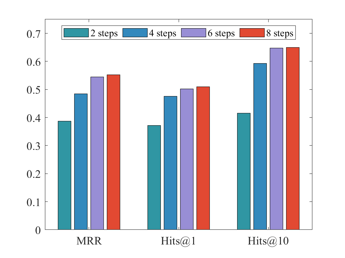
The image displays a grouped bar chart comparing the performance of a system across three different evaluation metrics (MRR, Hits@1, Hits@10) as a function of the number of steps (2, 4, 6, 8). The chart demonstrates a clear positive correlation between the number of steps and the performance score for all three metrics.
### Components/Axes
* **Chart Type:** Grouped Bar Chart.
* **X-Axis (Categories):** Three distinct metric categories are labeled at the bottom:
* `MRR` (Mean Reciprocal Rank)
* `Hits@1`
* `Hits@10`
* **Y-Axis (Scale):** A linear numerical scale on the left side, ranging from `0` to `0.7` with major tick marks at intervals of `0.1` (0, 0.1, 0.2, 0.3, 0.4, 0.5, 0.6, 0.7).
* **Legend:** Positioned at the top-center of the chart area, enclosed in a box. It defines four data series by color:
* Teal bar: `2 steps`
* Blue bar: `4 steps`
* Purple bar: `6 steps`
* Red bar: `8 steps`
* **Data Series:** For each of the three x-axis categories, there is a cluster of four bars, one for each step count, ordered from left to right as 2, 4, 6, and 8 steps.
### Detailed Analysis
**Trend Verification:** For every metric (MRR, Hits@1, Hits@10), the bar height increases monotonically with the number of steps. The trend is consistently upward from 2 steps to 8 steps.
**Approximate Data Points (Visual Estimation):**
1. **MRR Category (Leftmost cluster):**
* 2 steps (Teal): ~0.39
* 4 steps (Blue): ~0.49
* 6 steps (Purple): ~0.55
* 8 steps (Red): ~0.555 (Slightly higher than 6 steps)
2. **Hits@1 Category (Center cluster):**
* 2 steps (Teal): ~0.37
* 4 steps (Blue): ~0.48
* 6 steps (Purple): ~0.50
* 8 steps (Red): ~0.51
3. **Hits@10 Category (Rightmost cluster):**
* 2 steps (Teal): ~0.42
* 4 steps (Blue): ~0.595
* 6 steps (Purple): ~0.65
* 8 steps (Red): ~0.655 (Marginally higher than 6 steps)
### Key Observations
* **Consistent Improvement:** Performance improves with more steps across all metrics. The jump from 2 to 4 steps is the most significant for each metric.
* **Diminishing Returns:** The performance gain from 6 to 8 steps is very small for all metrics, suggesting a plateau effect.
* **Metric Comparison:** The `Hits@10` metric achieves the highest absolute values (peaking ~0.655), followed by `MRR` (~0.555), and then `Hits@1` (~0.51). This is expected, as Hits@10 is a less strict metric than Hits@1.
* **Relative Performance:** The ranking of step counts (2 < 4 < 6 < 8) is perfectly preserved across all three evaluation metrics.
### Interpretation
This chart presents strong empirical evidence that increasing the number of steps in the evaluated process leads to better system performance, as measured by ranking quality (MRR) and accuracy (Hits@k). The data suggests an optimal operating point may lie around 6 steps, as the marginal benefit of adding two more steps (to 8) is minimal. The consistent trend across different metrics reinforces the robustness of the finding. The chart effectively communicates that computational investment (more steps) yields measurable returns in output quality, but with clear saturation.