## Line Charts: Overlaps vs. HMC Steps (Two Plots)
### Overview
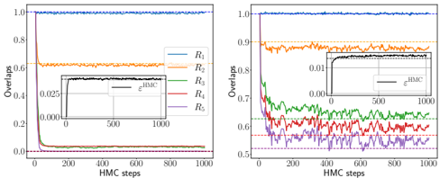
The image contains two line charts, each plotting "Overlaps" on the y-axis against "HMC steps" on the x-axis. Both charts display five data series, labeled R1 through R5, and an inset plot showing a series labeled "εHMC". The charts appear to compare the convergence behavior of different methods or parameters related to Hybrid Monte Carlo (HMC).
### Components/Axes
**Both Charts Share the Following:**
* **X-axis:** "HMC steps", ranging from 0 to 1000.
* **Y-axis:** "Overlaps", ranging from 0.0 to 1.0.
* **Legend:** Located in the top-right of the left chart, indicating the data series R1 (blue), R2 (orange), R3 (green), R4 (red), and R5 (purple). The legend is implied to be the same for the right chart.
* **Inset Plot:** Located in the center of each chart, showing "εHMC" (black) plotted against "HMC steps".
**Left Chart:**
* **Y-axis Markers:** 0.0, 0.2, 0.4, 0.6, 0.8, 1.0
* **Inset Plot X-axis:** 0 to 1000 HMC steps
* **Inset Plot Y-axis:** 0.000, 0.025
* **Horizontal Dashed Lines:** At approximately 0.0, 0.65, and 1.0
**Right Chart:**
* **Y-axis Markers:** 0.5, 0.6, 0.7, 0.8, 0.9, 1.0
* **Inset Plot X-axis:** 0 to 1000 HMC steps
* **Inset Plot Y-axis:** 0.00, 0.01
* **Horizontal Dashed Lines:** At approximately 0.52, 0.57, 0.63, 0.75, 0.89, and 1.0
### Detailed Analysis
**Left Chart:**
* **R1 (blue):** Starts at approximately 1.0 and remains stable around 1.0 throughout the HMC steps.
* **R2 (orange):** Starts at approximately 1.0, rapidly decreases to approximately 0.65 within the first 50 HMC steps, and then remains stable around 0.65.
* **R3 (green):** Starts at approximately 1.0, rapidly decreases to approximately 0.0 within the first 50 HMC steps, and then remains stable around 0.0.
* **R4 (red):** Starts at approximately 1.0, rapidly decreases to approximately 0.0 within the first 50 HMC steps, and then remains stable around 0.0.
* **R5 (purple):** Starts at approximately 1.0, rapidly decreases to approximately 0.0 within the first 50 HMC steps, and then remains stable around 0.0.
* **εHMC (black, inset):** Starts at approximately 0.0, increases rapidly to approximately 0.025 within the first 200 HMC steps, and then remains stable around 0.025.
**Right Chart:**
* **R1 (blue):** Starts at approximately 1.0 and remains stable around 1.0 throughout the HMC steps.
* **R2 (orange):** Starts at approximately 0.9, fluctuates between 0.85 and 0.9 throughout the HMC steps.
* **R3 (green):** Starts at approximately 0.7, decreases to approximately 0.65 within the first 200 HMC steps, and then fluctuates between 0.6 and 0.7 throughout the HMC steps.
* **R4 (red):** Starts at approximately 0.8, decreases to approximately 0.6 within the first 200 HMC steps, and then fluctuates between 0.58 and 0.65 throughout the HMC steps.
* **R5 (purple):** Starts at approximately 0.7, decreases to approximately 0.55 within the first 200 HMC steps, and then fluctuates between 0.5 and 0.6 throughout the HMC steps.
* **εHMC (black, inset):** Starts at approximately 0.0, increases rapidly to approximately 0.012 within the first 200 HMC steps, and then remains stable around 0.012.
### Key Observations
* In both charts, R1 (blue) maintains a high overlap value close to 1.0, indicating stable behavior.
* In the left chart, R3, R4, and R5 converge rapidly to near-zero overlap, suggesting a loss of correlation or a failure to maintain the desired state.
* In the right chart, R2, R3, R4, and R5 exhibit more dynamic behavior, fluctuating around different overlap values.
* The inset plots show that εHMC converges to a stable value in both charts, but the stable value is different between the two charts.
### Interpretation
The charts likely compare the performance of different HMC configurations or parameters. The "Overlaps" metric probably measures the similarity between the current state of the HMC simulation and some target distribution or reference state.
The left chart suggests that the configurations corresponding to R3, R4, and R5 are not effective, as they quickly lose overlap. The right chart shows more nuanced behavior, with R2, R3, R4, and R5 maintaining some level of overlap, albeit with fluctuations.
The εHMC metric, shown in the inset plots, might represent an error or convergence measure for the HMC algorithm. The fact that it converges to different values in the two charts suggests that the overall performance of the HMC simulation differs significantly between the two scenarios represented by the charts.
The horizontal dashed lines likely represent target values or thresholds for the overlap metric.