\n
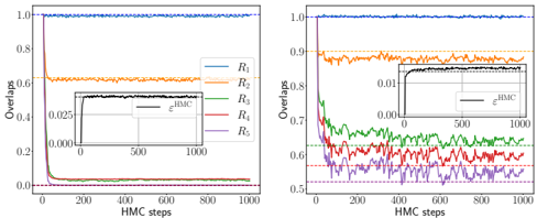
## Chart: Overlaps vs. HMC Steps
### Overview
The image presents two line charts displaying the relationship between "Overlaps" (y-axis) and "HMC steps" (x-axis). Both charts depict the behavior of five different lines, labeled R1 through R5, representing different overlap values as the number of HMC steps increases. Each chart also contains an inset plot focusing on a smaller range of HMC steps (0-1000) and overlap values (0-0.025 or 0-0.01). The inset plots are labeled with "HMC".
### Components/Axes
* **X-axis:** "HMC steps" ranging from 0 to 1000.
* **Y-axis:** "Overlaps" ranging from 0 to 1.1.
* **Legend:** Located in the top-left corner of each chart, listing the lines:
* R1 (Blue)
* R2 (Orange)
* R3 (Green)
* R4 (Red)
* R5 (Purple)
* **Inset Plots:** Smaller charts within each main chart, focusing on the initial HMC steps. They share the same axes labels as the main charts.
### Detailed Analysis or Content Details
**Chart 1 (Left)**
* **R1 (Blue):** The line is nearly flat, maintaining an overlap value of approximately 1.0 throughout all HMC steps.
* **R2 (Orange):** The line fluctuates around an overlap value of approximately 0.75, with minor variations.
* **R3 (Green):** The line starts at approximately 0.7 and decreases slightly to around 0.65 over the 1000 HMC steps.
* **R4 (Red):** The line starts at approximately 0.7 and decreases slightly to around 0.65 over the 1000 HMC steps.
* **R5 (Purple):** The line rapidly decreases from approximately 0.2 to near 0 within the first 200 HMC steps, then remains close to 0 for the rest of the steps.
* **Inset Plot:** Shows a more detailed view of the initial overlap values. The lines appear similar to the main chart, but with a more focused scale.
**Chart 2 (Right)**
* **R1 (Blue):** Similar to Chart 1, the line is nearly flat at approximately 1.0.
* **R2 (Orange):** The line fluctuates around an overlap value of approximately 0.9, with minor variations.
* **R3 (Green):** The line starts at approximately 0.85 and decreases to around 0.7 over the 1000 HMC steps.
* **R4 (Red):** The line starts at approximately 0.85 and decreases to around 0.7 over the 1000 HMC steps.
* **R5 (Purple):** The line rapidly decreases from approximately 0.65 to around 0.55 within the first 200 HMC steps, then fluctuates around 0.6 for the rest of the steps.
* **Inset Plot:** Shows a more detailed view of the initial overlap values. The lines appear similar to the main chart, but with a more focused scale.
### Key Observations
* R1 consistently exhibits high overlap (close to 1.0) in both charts, indicating stability.
* R5 demonstrates a rapid decrease in overlap in both charts, suggesting a quick loss of correlation or convergence.
* R2 shows relatively stable overlap values, but slightly lower than R1.
* R3 and R4 exhibit similar decreasing trends in overlap, suggesting a shared behavior.
* The inset plots provide a magnified view of the initial behavior, confirming the trends observed in the main charts.
### Interpretation
The charts likely represent the convergence behavior of a Markov Chain Monte Carlo (HMC) algorithm, where "Overlaps" indicate the correlation between different chains or samples. The "HMC steps" represent the iterations of the algorithm.
* **R1's** high and stable overlap suggests a well-mixed and converged chain.
* **R5's** rapid decrease in overlap indicates a chain that is not converging or is experiencing issues with mixing.
* **R2, R3, and R4** show intermediate behavior, potentially indicating slower convergence or partial mixing.
The differences between the two charts might represent different parameter settings or initial conditions for the HMC algorithm. The inset plots highlight the initial stages of convergence, which are crucial for assessing the algorithm's performance. The data suggests that the algorithm converges differently for each R value, and that R5 is the most problematic. The consistent behavior of R1 across both charts suggests it is the most robust configuration.