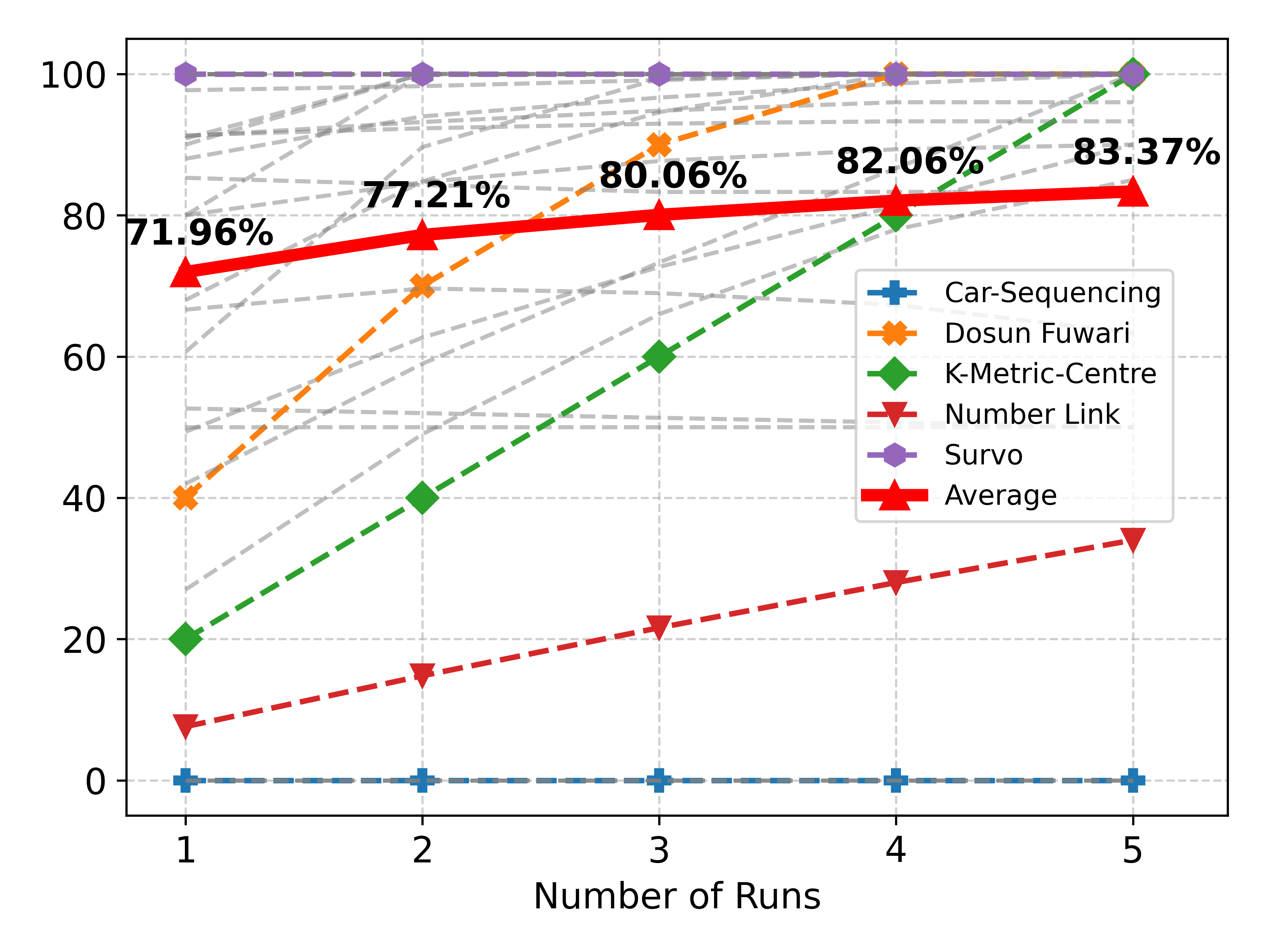
## Line Chart: Performance Metrics Across Number of Runs
### Overview
The chart displays performance metrics (percentage values) for six different methods across five runs. The y-axis represents percentage values (0-100%), and the x-axis represents the number of runs (1-5). Each line corresponds to a specific method, with distinct colors and markers. The "Average" line (red triangles) shows an overall upward trend, while other lines exhibit varying patterns.
### Components/Axes
- **X-axis**: "Number of Runs" (1 to 5, integer scale)
- **Y-axis**: Percentage values (0-100%, with gridlines at 20% intervals)
- **Legend**: Located on the right side, with the following entries:
- **Car-Sequencing**: Blue cross (`+`)
- **Dosun Fuwari**: Orange cross (`x`)
- **K-Metric-Centre**: Green diamond (`◇`)
- **Number Link**: Red triangle (`▲`)
- **Survo**: Purple pentagon (`⬤`)
- **Average**: Red solid line with triangles (`▲`)
### Detailed Analysis
1. **Car-Sequencing** (blue `+`):
- Flat line at 0% for all runs.
- No visible data points above the baseline.
2. **Dosun Fuwari** (orange `x`):
- Starts at 40% (run 1) and increases steadily to 100% (run 5).
- Data points: 40%, 70%, 90%, 95%, 100%.
3. **K-Metric-Centre** (green `◇`):
- Starts at 20% (run 1) and rises sharply to 83.37% (run 5).
- Data points: 20%, 40%, 60%, 80%, 83.37%.
4. **Number Link** (red `▲`):
- Starts at 10% (run 1) and increases linearly to 35% (run 5).
- Data points: 10%, 15%, 20%, 25%, 35%.
5. **Survo** (purple `⬤`):
- Flat line at 100% for all runs.
- No variation across runs.
6. **Average** (red solid line with `▲`):
- Starts at 71.96% (run 1) and increases to 83.37% (run 5).
- Data points: 71.96%, 77.21%, 80.06%, 82.06%, 83.37%.
### Key Observations
- **Survo** consistently achieves 100% performance, suggesting it is the optimal method.
- **Dosun Fuwari** and **K-Metric-Centre** show significant improvement over runs, with Dosun Fuwari reaching 100% by run 5.
- **Number Link** starts at the lowest performance (10%) but improves steadily.
- The **Average** line reflects a gradual upward trend, indicating overall performance improvement across methods.
- **Car-Sequencing** remains at 0%, possibly indicating a baseline or control group.
### Interpretation
The chart demonstrates that performance improves with more runs for most methods, except **Survo** (already optimal) and **Car-Sequencing** (no improvement). **Dosun Fuwari** and **K-Metric-Centre** show the most dramatic gains, while **Number Link** starts weak but catches up. The **Average** line highlights a general trend of improvement, suggesting that iterative runs enhance outcomes. The flat lines for **Survo** and **Car-Sequencing** imply these methods are either already optimal or ineffective, respectively. This data could inform decisions about resource allocation or method selection in iterative processes.