## Scatter Plot: A-mem vs. Base Distribution
### Overview
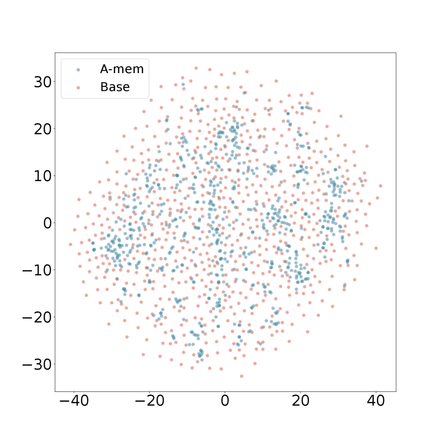
The image is a 2D scatter plot comparing the spatial distribution of two data series, labeled "A-mem" and "Base". The plot displays a large number of individual data points plotted against a common, unlabeled coordinate system. The primary visual information is the relative density and spread of the two point clouds.
### Components/Axes
* **Legend:** Located in the top-left corner of the plot area.
* **A-mem:** Represented by blue/teal colored dots.
* **Base:** Represented by pink/salmon colored dots.
* **X-Axis:** Horizontal axis with numerical markers. The visible range is from approximately -40 to +40, with major tick marks at intervals of 20 (-40, -20, 0, 20, 40). There is no axis title or label.
* **Y-Axis:** Vertical axis with numerical markers. The visible range is from approximately -30 to +30, with major tick marks at intervals of 10 (-30, -20, -10, 0, 10, 20, 30). There is no axis title or label.
* **Plot Area:** A white background containing the two overlaid point clouds.
### Detailed Analysis
* **Data Series - A-mem (Blue):**
* **Trend/Distribution:** The blue points form a relatively dense, roughly circular cluster centered near the origin (0,0). The distribution appears tighter and more concentrated.
* **Spatial Extent:** The points are primarily contained within the range of approximately -25 to +25 on the x-axis and -20 to +20 on the y-axis. The density is highest near the center and decreases outward.
* **Data Series - Base (Pink):**
* **Trend/Distribution:** The pink points are much more widely dispersed, forming a larger, more diffuse cloud that encompasses the A-mem cluster.
* **Spatial Extent:** The points span nearly the entire visible plot area, from approximately -40 to +40 on the x-axis and -30 to +30 on the y-axis. The distribution is less dense overall compared to the A-mem series.
* **Overlap and Relationship:** The A-mem (blue) cluster is almost entirely contained within the broader Base (pink) cloud. There is significant overlap in the central region, but the Base series has many points in the periphery where A-mem points are absent.
### Key Observations
1. **Distinct Distributions:** The two series exhibit fundamentally different spatial distributions. A-mem is centralized and compact, while Base is expansive and diffuse.
2. **Containment:** The A-mem distribution appears to be a subset of the Base distribution in terms of spatial coverage.
3. **Density Gradient:** The A-mem series shows a clear density gradient, peaking at the center. The Base series has a more uniform, though still centrally weighted, density across a much larger area.
4. **Missing Information:** The plot lacks a title, axis titles, and units, which limits the contextual interpretation of what the coordinates represent.
### Interpretation
This scatter plot visually demonstrates a significant difference in the variance or spread between two groups or models, labeled "A-mem" and "Base". Assuming the axes represent some form of feature space, latent variable, or error metric:
* The **A-mem** system/model produces outputs or has characteristics that are highly consistent and clustered around a central mean (near 0,0). This suggests lower variance, higher precision, or a more constrained operational range.
* The **Base** system/model exhibits much higher variance, with outputs spread across a wider range of values. This indicates less consistency, greater diversity in results, or a broader operational scope.
* The relationship suggests that "A-mem" might be a refined, regularized, or specialized version of the "Base" system, where the modifications have the effect of reducing output variability and centering it around a target (the origin). The "Base" represents the unrefined or original state with inherent, wider dispersion.
**Note on Language:** All text in the image is in English.