\n
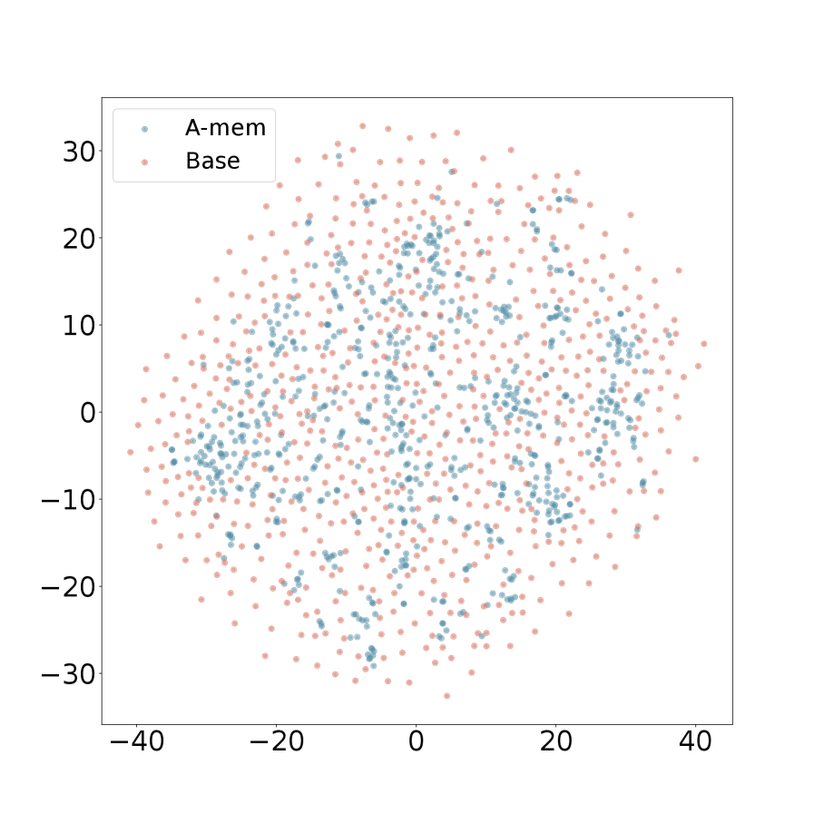
## Scatter Plot: A-mem vs. Base
### Overview
The image presents a scatter plot comparing two datasets, labeled "A-mem" and "Base". The plot displays the distribution of data points across a two-dimensional space, with the horizontal axis ranging from approximately -40 to 40 and the vertical axis ranging from approximately -30 to 30. The data points appear randomly distributed, suggesting a lack of strong correlation.
### Components/Axes
* **X-axis:** Ranges from approximately -40 to 40. No explicit label is provided.
* **Y-axis:** Ranges from approximately -30 to 30. No explicit label is provided.
* **Legend:** Located in the top-left corner.
* "A-mem" - Represented by blue circles.
* "Base" - Represented by orange circles.
### Detailed Analysis
The plot contains a large number of data points for both "A-mem" and "Base". Due to the density of points, precise numerical values cannot be extracted. However, we can describe the distribution:
* **A-mem (Blue):** The data points are distributed across the entire range of the x-axis, with a slight concentration around the y-axis (x values close to 0). The points are spread relatively evenly between approximately -10 and 10 on the y-axis.
* **Base (Orange):** The data points are also distributed across the entire range of the x-axis. There appears to be a slightly higher density of points in the positive x-axis region (x > 0) compared to the negative region. The points are spread relatively evenly between approximately -20 and 20 on the y-axis.
There is no clear linear trend visible in either dataset. Both datasets appear to be randomly scattered.
### Key Observations
* The distributions of both datasets are roughly symmetrical around the y-axis.
* There is significant overlap between the "A-mem" and "Base" datasets, indicating a considerable degree of similarity in their distributions.
* The data does not suggest a strong correlation between the x and y values for either dataset.
### Interpretation
The scatter plot suggests that there is no strong relationship between the two variables being measured for either the "A-mem" or "Base" datasets. The random distribution of points indicates that the variables are likely independent or that any relationship is obscured by a high degree of noise. The overlap between the two datasets suggests that the underlying distributions are similar, although there might be subtle differences in their spread or density. Without knowing what the axes represent, it's difficult to draw more specific conclusions. The plot could be visualizing the results of a simulation, experimental measurements, or statistical analysis. The lack of a clear trend suggests that the factors influencing these variables are complex and not easily captured by a simple linear model.