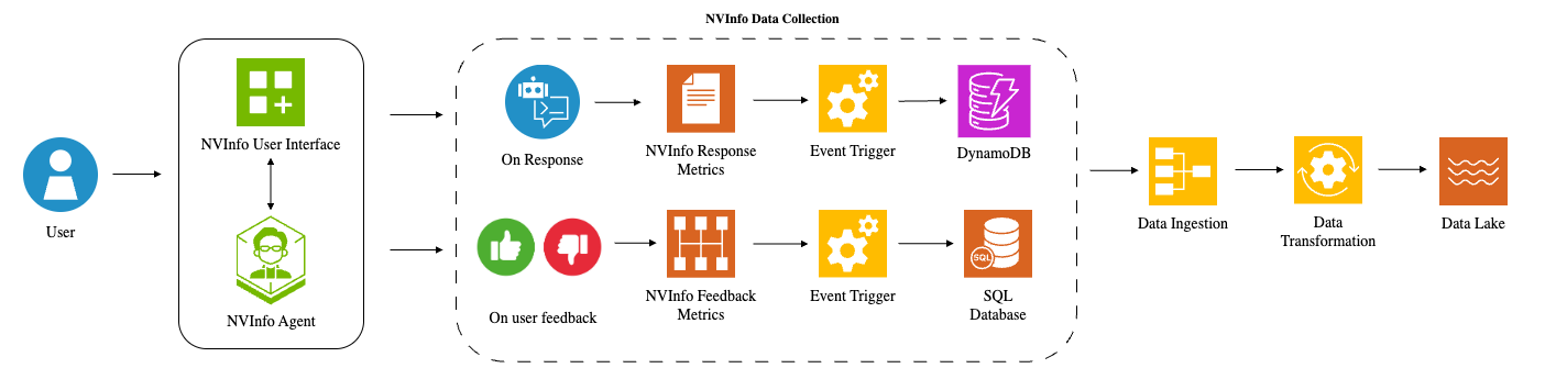
## System Architecture Diagram: NVInfo Data Collection Pipeline
### Overview
This image is a technical system architecture diagram illustrating the data flow for the "NVInfo" system. It depicts how user interactions and feedback are captured, processed through metrics and triggers, stored in databases, and ultimately ingested and transformed into a centralized data lake. The diagram flows from left to right, starting with the user and ending with the data lake.
### Components/Axes
The diagram is composed of several distinct components connected by directional arrows indicating data flow. There are no traditional chart axes. The key components are:
1. **User**: Represented by a blue circular icon with a white person silhouette on the far left.
2. **NVInfo Interface Layer**: A rounded rectangle containing two sub-components:
* **NVInfo User Interface**: A green square icon with a grid and a plus sign.
* **NVInfo Agent**: A green hexagonal icon with a stylized person wearing glasses.
* A double-headed vertical arrow connects these two, indicating bidirectional interaction.
3. **NVInfo Data Collection (Dashed Box)**: A central dashed rectangle containing two parallel data collection pathways.
* **Pathway 1 (Top - Response Flow)**:
* **On Response**: A blue circular icon with a white chat bubble and robot head.
* **NVInfo Response Metrics**: An orange document icon.
* **Event Trigger**: A yellow gear icon.
* **DynamoDB**: A purple database cylinder icon with a lightning bolt.
* **Pathway 2 (Bottom - Feedback Flow)**:
* **On user feedback**: A circular icon split into green (thumbs-up) and red (thumbs-down) halves.
* **NVInfo Feedback Metrics**: An orange grid/table icon.
* **Event Trigger**: A yellow gear icon (identical to the one above).
* **SQL Database**: An orange database cylinder icon with a "SQL" label.
4. **Data Processing Pipeline**: Three sequential components to the right of the dashed box.
* **Data Ingestion**: A yellow icon showing connected boxes in a flow.
* **Data Transformation**: A yellow gear icon with circular arrows around it.
* **Data Lake**: An orange icon with wavy horizontal lines.
### Detailed Analysis
The diagram details a specific data collection and processing workflow:
1. **Initiation**: The process begins with a **User** interacting with the system.
2. **Interaction Layer**: The user's actions are handled by the **NVInfo User Interface** and the **NVInfo Agent**, which communicate with each other.
3. **Data Collection Triggers**: Two types of user events trigger data collection within the **NVInfo Data Collection** module:
* **On Response**: When the system provides a response, it generates **NVInfo Response Metrics**. This event triggers an **Event Trigger** that writes data to **DynamoDB**.
* **On user feedback**: When a user provides explicit feedback (e.g., thumbs-up/down), it generates **NVInfo Feedback Metrics**. This event triggers a separate **Event Trigger** that writes data to a **SQL Database**.
4. **Data Pipeline**: Data from both DynamoDB and the SQL Database flows into a unified pipeline:
* **Data Ingestion**: The first step collects the raw data from the source databases.
* **Data Transformation**: The ingested data is then processed and transformed.
* **Data Lake**: The final, transformed data is stored in a centralized **Data Lake** for further analysis.
### Key Observations
* **Dual-Path Architecture**: The system has a clear separation between collecting metrics based on system responses and collecting metrics based on direct user feedback.
* **Database Heterogeneity**: Different database technologies are used for different data types: DynamoDB (a NoSQL database) for response metrics and a SQL Database for feedback metrics.
* **Centralized Storage**: Despite originating from different sources and databases, all data ultimately converges into a single **Data Lake**, suggesting it serves as the unified analytical repository.
* **Iconography**: The diagram uses consistent color-coding and iconography (e.g., gears for triggers/processing, cylinders for databases) to enhance readability.
### Interpretation
This diagram outlines a robust telemetry and feedback loop system for the NVInfo application. Its primary purpose is to systematically capture two critical types of data: performance/usage metrics from system interactions (**Response Metrics**) and qualitative user satisfaction signals (**Feedback Metrics**).
The architecture suggests a focus on data-driven improvement. By separating the collection paths, the system can independently track operational performance and user sentiment. The use of event triggers implies an asynchronous, scalable design. The final convergence into a **Data Lake** indicates that the organization intends to perform integrated analysis, likely to correlate system performance with user feedback, identify areas for improvement, and measure the impact of changes. The flow from user action to centralized data storage represents a complete "data supply chain" for product analytics and machine learning model training.