## 3D Scatter Plot: Signal vs Noise Distribution Across Token and Channel
### Overview
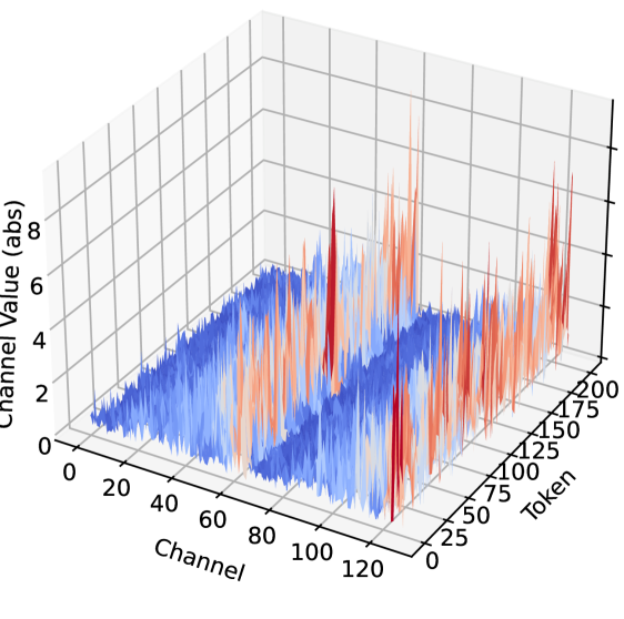
The image depicts a 3D scatter plot visualizing the distribution of "Signal" (red) and "Noise" (blue) data points across three dimensions: Token (x-axis), Channel (y-axis), and Channel Value (z-axis). The plot reveals spatial clustering patterns and intensity differences between the two data types.
### Components/Axes
- **X-axis (Token)**: Ranges from 0 to 200, labeled "Token."
- **Y-axis (Channel)**: Ranges from 0 to 120, labeled "Channel."
- **Z-axis (Channel Value)**: Ranges from 0 to 8, labeled "Channel Value (abs)."
- **Legend**: Located in the top-right corner, with red representing "Signal" and blue representing "Noise."
### Detailed Analysis
1. **Signal (Red) Clusters**:
- **Cluster 1**:
- Token: 50–150
- Channel: 40–80
- Z-axis: Peaks up to ~7.5 (abs)
- Density: High concentration of points with sharp vertical spikes.
- **Cluster 2**:
- Token: 100–150
- Channel: 80–120
- Z-axis: Peaks up to ~6.5 (abs)
- Overlap: Partially overlaps with Noise cluster in this region.
- **Cluster 3**:
- Token: 150–200
- Channel: 100–120
- Z-axis: Peaks up to ~5.5 (abs)
- Lower intensity compared to Cluster 1.
2. **Noise (Blue) Distribution**:
- **Cluster 1**:
- Token: 0–100
- Channel: 0–80
- Z-axis: Uniform spread between 2–6 (abs)
- Density: Evenly distributed with no sharp peaks.
- **Cluster 2**:
- Token: 100–200
- Channel: 80–120
- Z-axis: Spread between 3–5 (abs)
- Overlap: Intersects with Signal Cluster 2 but with lower z-values.
### Key Observations
- **Signal Intensity**: Signal data points exhibit significantly higher z-axis values (up to 7.5) compared to Noise (max ~6.5).
- **Spatial Localization**: Signal clusters are tightly grouped in specific Token/Channel ranges, while Noise is more uniformly distributed.
- **Overlap**: In the Token 100–150 and Channel 80–120 region, Signal and Noise clusters intersect, but Signal maintains higher z-values.
- **Noise Uniformity**: Noise data shows minimal variation in z-axis values, forming a flat, dispersed layer.
### Interpretation
The plot demonstrates that **Signal** is characterized by localized, high-intensity spikes in specific Token/Channel regions, suggesting targeted or structured data. In contrast, **Noise** is broadly distributed with lower, more uniform values, indicating random or background interference. The overlap in Cluster 2 suggests potential contamination or co-occurrence of Signal and Noise in this region, which may require further filtering. The third Signal cluster (Token 150–200) shows reduced intensity, possibly reflecting weaker or degraded signals at higher Token values. This distribution could inform noise reduction strategies or signal prioritization in data processing pipelines.