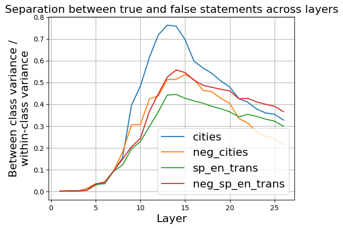
## Chart Type: Line Graph
### Overview
The image is a line graph that illustrates the separation between true and false statements across different layers. The y-axis represents the ratio of between-class variance to within-class variance, while the x-axis represents the layer number. Four different data series are plotted, each representing a different category: "cities", "neg_cities", "sp_en_trans", and "neg_sp_en_trans".
### Components/Axes
* **Title:** "Separation between true and false statements across layers"
* **X-axis:**
* Label: "Layer"
* Scale: 0 to 25, with tick marks at intervals of 5.
* **Y-axis:**
* Label: "Between class variance / within-class variance"
* Scale: 0.0 to 0.8, with tick marks at intervals of 0.1.
* **Legend:** Located in the bottom-right corner of the chart.
* "cities" - Blue line
* "neg\_cities" - Orange line
* "sp\_en\_trans" - Green line
* "neg\_sp\_en\_trans" - Red line
### Detailed Analysis
* **"cities" (Blue line):**
* Trend: Initially flat near 0, then increases sharply from layer 6 to a peak around layer 14 (approximately 0.76), then decreases gradually.
* Data Points:
* Layer 1: ~0.0
* Layer 6: ~0.04
* Layer 10: ~0.47
* Layer 14: ~0.76
* Layer 20: ~0.48
* Layer 26: ~0.33
* **"neg\_cities" (Orange line):**
* Trend: Initially flat near 0, then increases from layer 6 to a peak around layer 15 (approximately 0.55), then decreases.
* Data Points:
* Layer 1: ~0.0
* Layer 6: ~0.03
* Layer 10: ~0.31
* Layer 15: ~0.55
* Layer 20: ~0.47
* Layer 26: ~0.24
* **"sp\_en\_trans" (Green line):**
* Trend: Initially flat near 0, then increases from layer 6 to a peak around layer 14 (approximately 0.45), then decreases.
* Data Points:
* Layer 1: ~0.0
* Layer 6: ~0.04
* Layer 10: ~0.23
* Layer 14: ~0.45
* Layer 20: ~0.40
* Layer 26: ~0.32
* **"neg\_sp\_en\_trans" (Red line):**
* Trend: Initially flat near 0, then increases from layer 6 to a peak around layer 15 (approximately 0.56), then decreases.
* Data Points:
* Layer 1: ~0.0
* Layer 6: ~0.04
* Layer 10: ~0.30
* Layer 15: ~0.56
* Layer 20: ~0.44
* Layer 26: ~0.37
### Key Observations
* All four data series start at approximately the same point near 0 and increase sharply between layers 6 and 15.
* The "cities" data series (blue line) has the highest peak value, indicating the greatest separation between true and false statements for this category.
* The "sp\_en\_trans" data series (green line) has the lowest peak value among the four.
* All data series decrease after reaching their peak values.
### Interpretation
The graph suggests that the separation between true and false statements varies across different layers of the model. The "cities" category exhibits the highest degree of separation, implying that the model is most effective at distinguishing between true and false statements related to cities. The peak values around layer 14/15 indicate that these layers are most crucial for differentiating between true and false statements across all categories. The subsequent decrease in separation suggests that later layers may not contribute as significantly to this differentiation. The data could be used to optimize the model architecture by focusing on the layers that contribute most to the separation between true and false statements.