\n
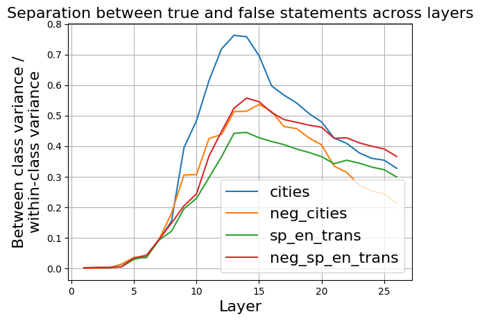
## Line Chart: Separation between true and false statements across layers
### Overview
The image presents a line chart illustrating the separation between true and false statements across different layers. The chart displays four data series, each representing a different condition or dataset, plotted against the layer number. The y-axis represents the "Between class variance / within-class variance" ratio, indicating the degree of separation between classes.
### Components/Axes
* **Title:** "Separation between true and false statements across layers" (Top-center)
* **X-axis:** "Layer" (Bottom-center), ranging from 0 to approximately 27.
* **Y-axis:** "Between class variance / within-class variance" (Left-center), ranging from 0 to 0.8.
* **Legend:** Located in the bottom-right corner, containing the following labels and corresponding colors:
* "cities" - Blue
* "neg\_cities" - Orange
* "sp\_en\_trans" - Green
* "neg\_sp\_en\_trans" - Red
* **Grid:** A light gray grid is present across the entire chart area.
### Detailed Analysis
The chart displays four distinct lines, each representing a different data series.
* **cities (Blue):** This line starts at approximately 0 at layer 0, rises sharply between layers 8 and 12, peaking at approximately 0.76 at layer 12. It then declines gradually, reaching approximately 0.38 at layer 27.
* **neg\_cities (Orange):** This line begins at approximately 0 at layer 0, and increases steadily, reaching a peak of approximately 0.55 at layer 15. It then decreases, leveling off around 0.38 at layer 27.
* **sp\_en\_trans (Green):** This line starts at approximately 0 at layer 0, and increases more gradually than the others, reaching a peak of approximately 0.42 at layer 17. It then declines slightly, ending at approximately 0.35 at layer 27.
* **neg\_sp\_en\_trans (Red):** This line starts at approximately 0 at layer 0, and increases steadily, reaching a peak of approximately 0.52 at layer 14. It then declines, leveling off around 0.4 at layer 27.
### Key Observations
* The "cities" data series exhibits the highest separation ratio, peaking significantly higher than the other series.
* All four series show an increasing trend in separation ratio up to a certain layer, followed by a decline.
* The "neg\_cities" and "neg\_sp\_en\_trans" series show similar trends, with "neg\_cities" consistently higher.
* The "sp\_en\_trans" series has the lowest overall separation ratio.
### Interpretation
The chart suggests that the separation between true and false statements, as measured by the between-class variance to within-class variance ratio, increases with layer depth up to a certain point, and then begins to decrease. The "cities" dataset demonstrates the strongest separation, indicating that the model is most effective at distinguishing between true and false statements related to cities. The negative counterparts ("neg\_cities" and "neg\_sp\_en\_trans") also show separation, but to a lesser extent. The "sp\_en\_trans" dataset exhibits the weakest separation, suggesting that this type of statement is more difficult for the model to differentiate. The peak in separation ratio around layers 12-17 suggests an optimal layer depth for maximizing the distinction between true and false statements. The subsequent decline could indicate overfitting or diminishing returns as the model becomes more complex. The consistent relationship between the negative datasets suggests a systematic bias or pattern in how the model handles negated statements.