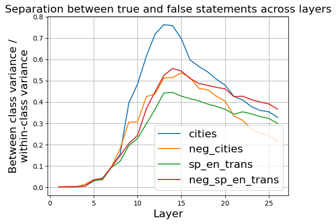
## Line Chart: Separation between true and false statements across layers
### Overview
The image is a line chart titled "Separation between true and false statements across layers." It plots a metric called "Between class variance / within-class variance" on the y-axis against "Layer" on the x-axis for four different data series. The chart shows how the separability between true and false statements evolves across the layers of a model (likely a neural network), with all series exhibiting a peak in the middle layers before declining.
### Components/Axes
* **Title:** "Separation between true and false statements across layers" (top center).
* **Y-Axis:**
* **Label:** "Between class variance / within-class variance" (rotated vertically on the left).
* **Scale:** Linear scale from 0.0 to 0.8, with major tick marks at 0.1 intervals.
* **X-Axis:**
* **Label:** "Layer" (centered at the bottom).
* **Scale:** Linear scale from 0 to 25, with major tick marks at intervals of 5.
* **Legend:** Positioned in the bottom-right quadrant of the chart area. It contains four entries, each with a colored line sample and a label:
* Blue line: `cities`
* Orange line: `neg_cities`
* Green line: `sp_en_trans`
* Red line: `neg_sp_en_trans`
* **Grid:** A light gray grid is present, aligned with the major tick marks on both axes.
### Detailed Analysis
The chart displays four data series, each represented by a smooth, colored line. All series follow a similar general trend: starting near zero, rising to a peak between layers 10-15, and then declining.
1. **`cities` (Blue Line):**
* **Trend:** Shows the most pronounced peak and the highest overall values. It rises steeply from layer 5, peaks sharply, and then declines steadily.
* **Key Data Points (Approximate):**
* Layer 5: ~0.03
* Layer 10: ~0.40
* **Peak:** Between layers 13-14, reaching a maximum of ~0.76.
* Layer 20: ~0.48
* Layer 25: ~0.32
2. **`neg_cities` (Orange Line):**
* **Trend:** Follows a similar shape to the blue line but with a lower peak magnitude. It rises, peaks, and then declines, generally staying below the blue line after layer 10.
* **Key Data Points (Approximate):**
* Layer 5: ~0.03
* Layer 10: ~0.31
* **Peak:** Around layer 14, reaching ~0.52.
* Layer 20: ~0.40
* Layer 25: ~0.22
3. **`sp_en_trans` (Green Line):**
* **Trend:** Exhibits the lowest peak and the shallowest decline among the four series. It rises more gradually and maintains a flatter profile after its peak.
* **Key Data Points (Approximate):**
* Layer 5: ~0.03
* Layer 10: ~0.25
* **Peak:** Around layer 13, reaching ~0.45.
* Layer 20: ~0.35
* Layer 25: ~0.30
4. **`neg_sp_en_trans` (Red Line):**
* **Trend:** Peaks slightly higher and later than the orange line. Its decline is more gradual than the blue line but steeper than the green line.
* **Key Data Points (Approximate):**
* Layer 5: ~0.03
* Layer 10: ~0.28
* **Peak:** Around layer 14, reaching ~0.56.
* Layer 20: ~0.46
* Layer 25: ~0.37
### Key Observations
* **Common Pattern:** All four metrics peak in the middle layers (approximately layers 13-14), suggesting this is where the model's internal representations are most effective at distinguishing between true and false statements for these tasks.
* **Magnitude Hierarchy:** The separation metric is consistently highest for the `cities` task (blue), followed by `neg_sp_en_trans` (red), `neg_cities` (orange), and lowest for `sp_en_trans` (green). This indicates the model achieves greater between-class variance relative to within-class variance for the `cities` domain.
* **Early Layers:** All lines are tightly clustered and near zero for the first ~5 layers, indicating minimal separation in the initial processing stages.
* **Late Layers:** The separation metric decreases for all series in the final layers (20-25), but does not return to zero. The ordering of the series (blue > red > green > orange) is largely maintained, though the green and orange lines converge near layer 25.
### Interpretation
This chart visualizes a concept from machine learning interpretability: how well a model's internal activations (at different layers) can separate data points from two classes (here, "true" vs. "false" statements). The y-axis metric is a classic measure of class separability.
The data suggests that for the evaluated tasks (`cities`, `neg_cities`, `sp_en_trans`, `neg_sp_en_trans`), the model's **discriminative power is not linear**. Instead, it follows an inverted-U shape across depth. The **middle layers (13-14) appear to be the "sweet spot"** where the model has processed the input enough to form highly distinct representations for true vs. false statements, but before later layers potentially refine or compress this information for final output generation.
The consistent hierarchy (`cities` > `neg_sp_en_trans` > `neg_cities` > `sp_en_trans`) implies that the **nature of the task significantly impacts separability**. The model finds it easier to separate true/false statements related to concrete entities like "cities" compared to tasks involving translation (`sp_en_trans`). The "neg_" prefix variants (likely negated statements) show intermediate separability. This could reflect differences in training data, task complexity, or how the model encodes these specific concepts. The fact that separation remains above zero in the final layers indicates that some discriminative information persists all the way to the model's output stages.