## Line Chart: Average k vs. Number of Interferers
### Overview
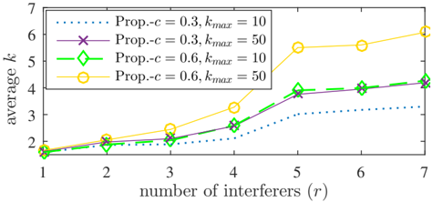
This image presents a line chart illustrating the relationship between the average value of 'k' and the number of interferers ('r'). The chart compares four different parameter settings: two different values for 'Prop.-c' (0.3 and 0.6) combined with two different values for 'kmax' (10 and 50).
### Components/Axes
* **X-axis:** "number of interferers (r)", ranging from 1 to 7, with tick marks at each integer value.
* **Y-axis:** "average k", ranging from 1 to 7, with tick marks at each integer value.
* **Legend:** Located in the top-left corner, identifying four data series:
* "Prop.-c = 0.3, kmax = 10" (represented by a dotted blue line)
* "Prop.-c = 0.3, kmax = 50" (represented by a purple line with 'x' markers)
* "Prop.-c = 0.6, kmax = 10" (represented by a green line with diamond markers)
* "Prop.-c = 0.6, kmax = 50" (represented by a yellow line with circle markers)
### Detailed Analysis
Here's a breakdown of each data series, including observed trends and approximate data points:
1. **Prop.-c = 0.3, kmax = 10 (Dotted Blue Line):** This line shows a generally increasing trend, but with diminishing returns.
* r = 1: k ≈ 1.8
* r = 2: k ≈ 2.1
* r = 3: k ≈ 2.4
* r = 4: k ≈ 2.7
* r = 5: k ≈ 3.0
* r = 6: k ≈ 3.2
* r = 7: k ≈ 3.4
2. **Prop.-c = 0.3, kmax = 50 (Purple Line with 'x' Markers):** This line also increases, but at a faster rate than the previous one, and appears to plateau towards the end.
* r = 1: k ≈ 1.9
* r = 2: k ≈ 2.2
* r = 3: k ≈ 2.6
* r = 4: k ≈ 3.1
* r = 5: k ≈ 3.6
* r = 6: k ≈ 4.0
* r = 7: k ≈ 4.2
3. **Prop.-c = 0.6, kmax = 10 (Green Line with Diamond Markers):** This line shows a moderate increasing trend.
* r = 1: k ≈ 1.8
* r = 2: k ≈ 2.1
* r = 3: k ≈ 2.5
* r = 4: k ≈ 3.0
* r = 5: k ≈ 3.4
* r = 6: k ≈ 3.8
* r = 7: k ≈ 4.0
4. **Prop.-c = 0.6, kmax = 50 (Yellow Line with Circle Markers):** This line exhibits the most significant increase, especially between r = 4 and r = 6.
* r = 1: k ≈ 1.9
* r = 2: k ≈ 2.2
* r = 3: k ≈ 2.6
* r = 4: k ≈ 3.4
* r = 5: k ≈ 5.2
* r = 6: k ≈ 5.5
* r = 7: k ≈ 5.7
### Key Observations
* Increasing 'kmax' from 10 to 50 generally leads to higher average 'k' values for both 'Prop.-c' settings.
* Increasing 'Prop.-c' from 0.3 to 0.6 also tends to increase average 'k', but the effect is more pronounced when 'kmax' is higher.
* The most dramatic increase in 'k' occurs when 'Prop.-c' is 0.6 and 'kmax' is 50, particularly as the number of interferers increases.
* The dotted blue line (Prop.-c = 0.3, kmax = 10) shows the smallest increase in 'k' across all values of 'r'.
### Interpretation
The chart demonstrates the impact of 'Prop.-c' and 'kmax' on the average value of 'k' as the number of interferers increases. 'k' likely represents some measure of performance or cost, and 'r' represents the level of interference. The data suggests that increasing 'kmax' and 'Prop.-c' can mitigate the negative effects of interference (higher 'r'), leading to improved performance (higher 'k').
The significant jump in the yellow line (Prop.-c = 0.6, kmax = 50) between r=4 and r=6 suggests a threshold effect. Beyond a certain level of interference, increasing both 'Prop.-c' and 'kmax' becomes crucial for maintaining performance. The relatively flat slope of the blue line indicates that with low values of both parameters, the system is highly susceptible to interference.
The choice of 'Prop.-c' and 'kmax' appears to be a trade-off. Higher values may improve performance under interference, but could also introduce other costs or complexities not reflected in this chart. Further investigation would be needed to understand the implications of these parameter settings in a broader context.